5 1/2 Examples of Experimental Music Notation
In the 1950s progressive composers broke from the 5 line music staff to experiment with new, more expressive forms of graphic music notation
/https://tf-cmsv2-smithsonianmag-media.s3.amazonaws.com/filer/Design-Decoded-Experimental-Music-631.jpg)
![]()
With the development of music notation, music was set free from the delicate bonds of oral and aural traditions. A standardized, underlying structure meant that everything from Gregorian chant to “Johnny B Goode” could be preserved and proliferated with relative ease. However, beginning in the years after World War II, some more progressive musicians and composers began to think that the music staff might be more restricting than liberating and began to experiment with new, more expressive forms of graphic music notation.
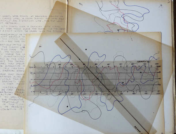
American composer John Cage explored the use chance and indeterminacy in his musical compositions with the aim of erasing his own subjectivity from his music, the hand of the artists, as it were. To communicate his indeterminate “compositions,” to use the term loosely, Cage developed elaborate methods of graphic notation involving a series of transparencies. He first used this method in the 1958 score for “Variations I,” which consisted of six transparent squares – one with 27 points representing sound and five with five lines, representing any assigned musical value. The composition was derived by placing the squares on top of one another in any combination. Cage would continue to develop and expand this method throughout the 1950s and ’60s, as seen in the top image depicting the somewhat more elaborate score for “Fontana Mix.” Cage’s notation consists of four multi-channel cassette tapes, ten transparencies inscribed with tiny dots, one transparency bearing a straight line and ten sheets of paper on which colored squiggly lines were drawn, and a graph paper-like “staff.” The transparencies were used to derive coordinates that were then used to determine which tape was used, as well as the values of the sound from teh tape: length (in inches), volume, timbre, and so on. According to the All Music Guide to Classical Music, Cage described the score as “a camera from which anyone can take a photograph.”

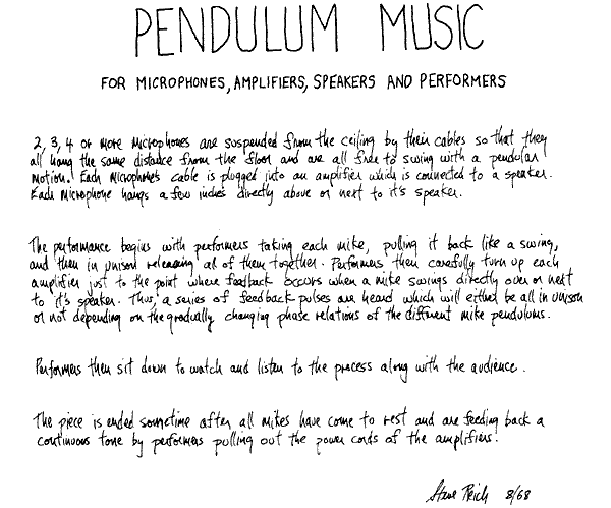
Steve Reich’s score for “Pendulum Music” is a straightforward, written set of instructions describing how the piece is staged and performed. The above recording was made by Sonic Youth for their 1999 album SYR4: Goodbye 20th Century. Parts of the handwritten score are a little difficult to read so here’s a transcription:
“2, 3, 4 or more microphones are suspended from the ceiling by their cables so that they all hang the same distance from the floor and are all free to swing with a pendular motion. Each microphone’s cable is plugged into an amplifier which is connected to a speaker. Each microphone hangs a few inches directly above or next to it’s speaker.
The performance begins with performers taking each mike, pulling it back like a swing, and then in unison releasing all of them together. Performers then carefully turn up each amplifier just to the point where feedback occurs when a mike swings directly over or next to it’s speaker. Thus, a series of feedback pulses are headed which will either be all in unison or not depending on the gradually changing phase relations of the different mike pendulums.
Performers then sit down to watch and listen to the process along with the audience.
The piece is ended sometime after all mikes have come to rest and are feeding back a continuous tone by performers pulling out the power cords of the amplifiers.”
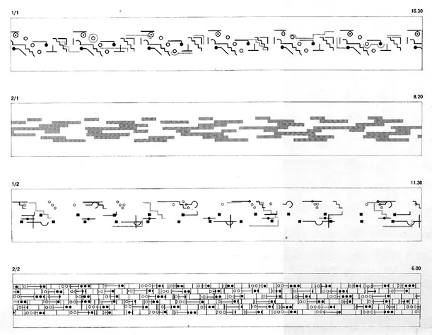
In 1978 musician Brian Eno created the seminal album Ambient 1: Music for Airports. Eno coined the term “ambient” to describe this atmospheric soundscape and distinguish it from the canned “elevator music” pioneered by Muzak. In so doing, he created not just an album, but an entire genre of music. Eno was inspired by composers like Cage and Reich, but had no formal music training. When asked by an interview why he never learned to read music, Eno, who preferred to composes directly onto tape, replied:
“It wouldn’t be very useful for me. There have been one or two occasions where I was stuck somewhere without my tape recorder and had an idea, tried to memorize it, and since a good idea nearly always relies on some unfamiliar nuance it is therefore automatically hard to remember. So on those very rare occasions I’ve thought, ‘God, if only I could write this down.’ But in fact, quite a lot of what I do has to do with sound texture, and you can’t notate that anyway … That’s because musical notation arose at a time when sound textures were limited. If you said violins and woodwind that defined the sound texture, if I say synthesizer and guitar it means nothing – you’re talking about 28,000 variables.”
In lieu of traditional notation then, Eno created the graphics seen above, which seem to be more concerned with communicating a visual impression of the music and aren’t truly intended to be used as a guide for actually playing the music.
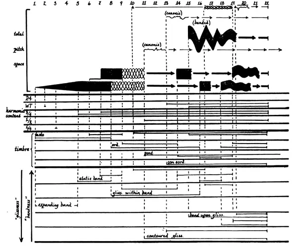
Krzysztof Penderecki’s “Polymorphia” was commissioned by the North German Radio Hamburg in 1961. As the name suggests, the piece does indeed take various forms and changes dramatically from section to section. With “Polymorphia,” Penderecki was searching for new sonic possibilities and, if those possibilities include “terrifying haunted house music,” he absolutely nailed it. The composition is intended for 48 string instruments and emphasizes timbre rather than pitch, and the collision of sound generating bodies made of metal, wood, or leather – what music scholar Danuta Mirka refers to as the composer’s “primary materials”. The notation was inspired, in part, by electroencephalograms –visual measurements of brain activity. It eschews traditional measures in favor of a score divided into sections of variable length and, in some sections, further vertical divisions to mark each second, with a “total pitch space” describing the relative pitch of each instrument.
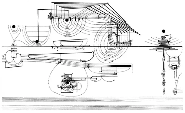
English composer Cornelius Cardew’s “Treatise” was written from 1963-1967. It consists of 193 pages of graphic notation that employs ambiguous numbers, shapes, and symbols that Carew intended to be interpreted by the performer. He suggests that performers agree on their own rules prior to the performance, but provides no other explicit instructions for interpreting the piece. In the “Treatise” handbook, Cardew offers additional, cryptic advice such as “Remember that space does not correspond literally to time” and “There is a great difference between: a) doing anything you like and at the same time reading the notations, and b) reading the notations and trying to translate them into action. Of course you can let the score work on previously given material, but you must have it work actively.” The only constant throughout “Treatise” is the thickly drawn “life line” at the center of the score. It has no intrinsic value but is often used by performers as a baseline reference for pitch or some other musical value. Ultimately, “Treatise” is notation as art form. As Carew says, “The notation is more important than the sound. Not the exactitude and success with which a notation notates a sound; but the musicalness of the notation in its notating.”
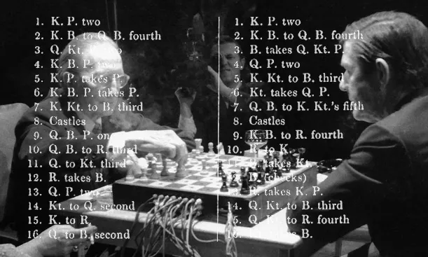
In closing, the half notation. I only count it as half because it uses a traditional notation system, just not a music notation system. In 1968 John Cage played a chess match against Marcel DuChamp as part of the collaborative performance, Reunion (pdf), which also featured electronic music by David Behrman, Gordon Mumma, David Tudor and Lowell Cross. Given his interest in chance, it’s no surprise that Cage conceived of the work, but it was composed by the aforementioned musicians. The board itself was designed by Cross and concealed photo-resistors, contact microphones, and connections to sound generators. During the match the movement of the pieces activated lights and electronic music, transforming the exhibition environment according to the movement of the pieces on the board. The art of the chess transformed into music and light, a sort of strategic synesthesia. It’s a fascinating idea. What would the Sicilian Defense sound like? Or a Queen’s Gambit?
The above examples represent both notation for experimental music and experimental notation for music. But they’re just of few of the many modes of graphic and experimental notation that have been explored by artists over the last 60 or so years. While some artists find restrictions inspiring –even if those restrictions are as seemingly limitless as music notation– others find that progress can only be made by shattering the accepted modes of production and communication. And while the results may not be always enjoyable, they’re undeniably interesting and represent a sincere effort to push an art form into unexplored territory. Avant-garde in the truest sense of the word.
/https://tf-cmsv2-smithsonianmag-media.s3.amazonaws.com/accounts/headshot/Jimmy-Stamp-240.jpg)


/https://tf-cmsv2-smithsonianmag-media.s3.amazonaws.com/accounts/headshot/Jimmy-Stamp-240.jpg)