Groundwater, Gravity and Graphic Design
An important piece of science recently popped up in Times Square, in the form of a 19,000-square-foot interactive map by a Dutch information designer
/https://tf-cmsv2-smithsonianmag-media.s3.amazonaws.com/accounts/headshot/sarah-rich-240.jpg)
/https://tf-cmsv2-smithsonianmag-media.s3.amazonaws.com/filer/20120514123008groundwater_470.jpg)
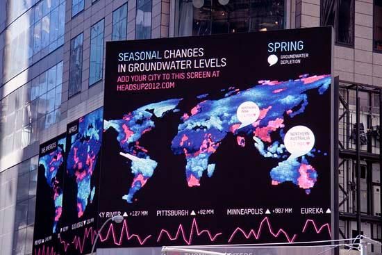
Information design and data visualization form a key bridge for conveying academic research into accessible (visual) language. Over the last month, that link took the form of a 19,000-square-foot screen on the Reuters building in the middle of Times Square, where ten years of research collected by NASA and university scientists appeared as a towering, technicolor display.
The 30-second animation was the winning entry from a competition hosted by HeadsUp! Times Square and visualizing.org, an online community of graphic designers specializing in data. Dutch designer Richard Vijgen created the visualization using data collected through NASA satellites as part of ongoing research at University of California’s Center for Hydrologic Modeling, spearheaded by Dr. James Famiglietti. Watch the video here.
Famiglietti’s research centers around year-round readings from two satellites known as GRACE, which orbit the earth taking gravitational measurements based on the mass of water on the earth’s surface. The distance between the two spacecraft changes slightly in relation to the hydrology below them. As journalist Felicity Barringer explained in a New York Times article last year, “If the mass below the path of the leading satellite increases — because, say, the lower Mississippi basin is waterlogged — that satellite speeds up, and the distance between the two grows. Then the mass tugs on both, and the distance shortens…The measurements of the distance between the craft translate to a measurement of surface mass in any given region.”
By looking at these numbers over the course of ten years, the researchers can see patterns emerging that demonstrate that the earth’s groundwater stores are depleting. In a National Geographic article on his work, Famiglietti states that population growth and poor resource management are to blame for the impending crisis. “The picture that is emerging is one of a profound fingerprint of human water management on global groundwater storage. Groundwater is disappearing on 6 of the 7 continents as we continue to pump it from greater and greater depths to irrigate crops for our ever-growing population.”
One significant question for scientists now, Famiglietti says, is not how dire the situation is—they’re certain it’s dire—but how to get the general public to understand the nature of the problem. This is why the UC team made their data available to designers whose job (and passion) it is to translate obscure findings into beautiful visuals. “A large percentage of the population are visual learners,” explains Famiglietti’s research partner, JT Reager, “They say a picture is worth a thousand words, but a really well made scientific graph is worth much more. Great graphics, like a cool map, can bridge the gap and help to make understanding really intuitive.”
We asked designer Richard Vijgen how he approached this task:
1) Can you describe the initial steps you took once you had all the data in hand, to start thinking about how to translate that material into something visual and understandable?
For this project, two datasets were provided, a 10-year month-by-month groundwater level anomaly chart by James Famiglietti, and a longterm chart by the USGS. The first one (the GRACE dataset) is very spectacular in its detail—both temporal and spatial—and allows you to “see” a phenomenon that was previously unseeable. The overwhelming complexity of nature, the wonder of science’s ability to measure it and the alarming message that groundwater levels are dwindling in several areas were all contained in this one dataset. It just needed to be visualized.
On the other hand, the obvious complexity of natural phenomena that manifests itself in the data made me question my ability to interpret it. The measurements of the GRACE satellite data only span 10 years. That’s why I felt that the longterm data from USGS would allow me to put the GRACE data into context in terms of data gathering but also as a new tool in a 100-year tradition of gathering groundwater data.
2) From a design perpective, how did the features of the site (Times Square) lend themselves to the data you were working with?
Although the two screens of the Nasdaq and the Reuters building are used in tandem, it is difficult to “read” them both at the same time, since they are on opposite side of the square. Therefore I decided to show the relation between seasonal and longterm changes in groundwater levels on both screens. However, both screens have their own hierarchy in the way they are arranged and shaped. In both cases I show a visualization of the seasonal data, a complex spectacle of color and movement, and subsequently try to contextualize it by adding longterm data and explanatory text.
Taking into account perspective and reading direction, I tried to make a different element stand out on each building and capture the audience’s attention. In the case of the Reuters building, this is the tall “gauging rod” showing longterm groundwater levels, that can be seen from far away. The Nasdaq screen, being more rectangular, allowed me to emphasize more on the seasonal world map. Once people notice the visualization, I’m using the parts of the screen that are lower and closer to the street to contextualize. In case of the Nasdaq screen the lower part of the screen shows longterm statistics for key areas. In case of the Reuters screen the lower part consists of nine screens showing seasonal visualizations focusing on individual continents as well as a dynamic “ticker tape” that shows statistics for cities added to the screen by the audience (via a mobile website).
3) How did you select the colors?
The colors (magenta and cyan) represent areas of negative and positive fluctuations in groundwater levels. Magenta for areas where water levels continuously decline over several years and Cyan for areas that experience short bursts of surplus groundwater (mainly rainy seasons around the equator). I wanted to restrict the use of color to these two elementary (CMYK) colors to avoid turning the data into a spectacle just by adding ornament, but try and let the data speak for itself as much as possible and just indicate surplus and shortage.
4) Did you work in static design and then animate, or was the motion always central to the design concept?
When visualizing this kind of data I believe time (motion) should be central to the design concept, because it is central to the data itself. For me, design is more about handling the information than it is about “decorating” it. In order to understand the data and to get a grip on it, I have to use programming code and evaluate animated sketches right from the beginning. The first thing I do when I look at a dataset is apply algorithms to it in order to manipulate it and get a feel of it, pretty much like a sculptor manipulates his clay.
5) If a passerby looked up and saw the animation as they traversed Times Square last month, what do you hope they took away from it? What knowledge might they have gained in 30 seconds of looking at this work?
Just by putting the visualization up on the screens of times square I hope to provide a short contrast with the usual programming that you see in Times Square that is mostly about consumption, about extraction. Times Square is sometimes described as the “crossroads of the world” Putting a data visualization on a screen this large gives you the idea of being in the control room of the world. For the first time you are able to see the complex dynamics of longterm and seasonal groundwater levels. Putting it up on the screen I hope to provide the public with both the spectacle and beauty of these dynamics as well as the realization that now that you know it, you also have a responsibility for it.
/https://tf-cmsv2-smithsonianmag-media.s3.amazonaws.com/accounts/headshot/sarah-rich-240.jpg)