How Nostalgia Plays Into Our Love of Buildings Old and New
Never-before-seen photos reveal that Penn Station wasn’t as pristine as we remember when it was torn down
/https://tf-cmsv2-smithsonianmag-media.s3.amazonaws.com/filer/20131108122037penn-470.jpg)
October 28 marked the 50th anniversary of the beginning of the end for New York’s old Pennsylvania Station. It took three years and countless hours of manpower to tear down what was the fourth-largest building in the world. In remembrance of the station, last Wednesday the Center for Architecture held the event, Lights, Camera, Demolition: Penn Station Recalled on Stage & In Pictures. The highlight was a reading of a The Eternal Space, a new play about the unlikely relationship between two men – a construction worker photographing the station as he tears it down and an aging professor determined to save it. Photographs documenting the entire life of Penn Station–some famous, some never seen–are critical to the play, serving as a background for the actors, silently telling the story of a changing city and offering their own compelling provocations alongside a compelling debate about progress, preservation, and of course, Pennsylvania Station.
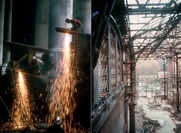
Following a reading of the play, a panel was convened to discuss the station, its legacy, and the photographs that continue to inspire. Panelists included playwright Justin Rivers, myself, noted biographer of Penn Station Lorraine Dhiel, and renown photographer Norman McGrath, whose vast archive of personal photos includes hundreds of never-before-seen images documenting the demolition of Penn Station, photos that feature prominently in the play (and in this post).
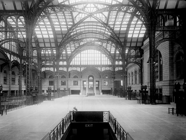
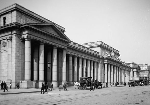
Pennsylvania Station was designed by McKim, Mead, and White in 1902. McKim, a Beaux-Arts educated architect and co-founder of the American Academy in Rome, was the lead designer on the project which was a grand display of his idiosyncratic Beaux-Arts Classicism. He draws inspiration from the great train stations of Europe, the Baths of Caracalla, John Soane’s Bank of England, and surely myriad other sources, all artfully combined into a monumental pink granite structure. It was a testament to the our technological prowess, craftsmanship, and artistry. It was a monument to our culture; a station scaled to the ambitions of a country at the peak of its power – a modern Rome. And indeed, at times it seemed that all tracks lead to New York – or, to be more specific, Penn Station. It was to be a gateway to the city.
But times change. And cities change. By 1963, New York was a very different place and Penn Station was no longer the gateway into the city. New highways and air travel gave travelers more, sometimes better, options. And while automotive infrastructure was being built by governments, privately owned railways were going bankrupt and bleeding passengers. In a time of high speed and efficiency, Pennsylvania Station was a decadent, inspiring and expensive masterpiece. As it fell into decay and disrepair, the owners of the railroad believed they had no choice but to sell the rights to build on their valuable property, making it possible for a new, modern, and incredibly ugly Madison Square Garden to rise where Penn Station stood, while the while the waiting rooms, ticketing areas, and train concourses were pushed underground. The opposition to the demolition was led by a small but local group, but at the time the city was powerless to stop it. And it seems that few New Yorkers held the station in high regard because although the Penn Station that exists in the popular imaginary looks like this:
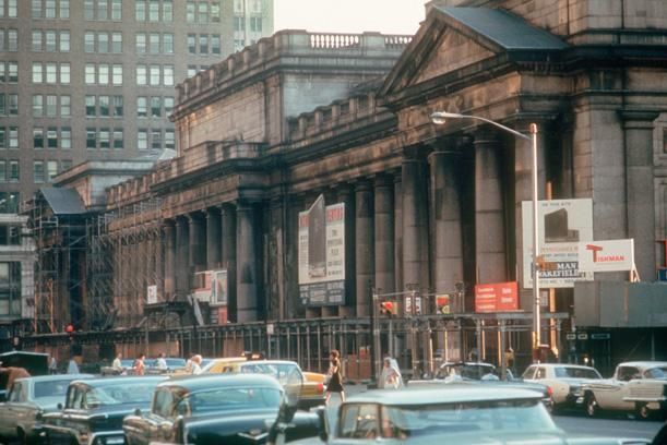
The station was quite a bit worse for wear in 1963:
McGrath’s color photos of Penn Station’s demolition capture the vast spaces in all its Piranesian glory and communicate a sense of its scale in an almost morbid way. The demolition may have been an ignoble end to a truly beautiful building but it was undeniably sublime.
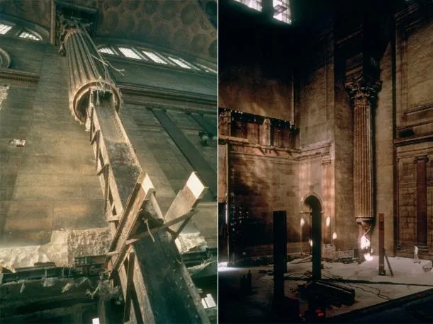
By the time of its demolition, Penn was full of unsightly newspaper kiosks, advertisements, and an jarring, modernist ticket counter that drastically changed the circulation through the building’s waiting room. But that is not the Penn Station we remember. There’s a line in The Eternal Space about a soldier who died in World War II: “how perfect he seems in death.” The same could be said about the station. Penn Station lives on through widely distributed photographs depicting the station at the peak of its monumental grandeur, such as those seen at the top of this post. The Penn Station we miss–even those of us who weren’t even a gleam in our father’s eye at the the time of its demolition–is one that hadn’t existed for a long time. And yet, these photos create a longing.
Wednesday night it occurred to me that contemporary architectural renderings serve a similar purpose. A good rendering of a beautiful design evokes a sort of reverse nostalgia; not a longing for something that’s gone, but a longing for something to exist. They can be incredibly convincing and they can reach a massive audience incredibly quickly. Renderings have become powerful tools for architects, planners, and developers. Are they informative? No doubt. Are they manipulative? Maybe a little.
But that’s not necessarily a bad thing.
After all, the nostalgia-provoking photos of old Penn were/are manipulative in their own way. Images of a pristine Penn Station were used by advocacy groups to sway public sentiment and garner support for new policy, eventually leading to new legislation and the formation of the Landmarks Preservation Commission – the first organization in the city empowered to protect New York’s architectural heritage.
But that’s all in the past. There’s a lot of talk these days about the future of Penn Station thanks to the recent decision by New York City Planning Commission to renew Madison Square Garden’s permit for only 10 years and a design competition recently organized by the Municipal Art Society of New York (MAS), who invited four prominent local architects to submit a vision of Penn Station’s future. These projects are described in length on the MAS site but I just wanted to focus on one project –one image, really– that I think really starts to get at this idea of inverse nostalgia:
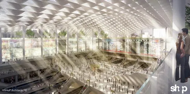
This rendering from Shop feels so well thought-out. It seems to have been carefully designed to imitate the iconic photos of New York’s two great train stations. To speculate a bit, I think architectural renderings in general will become more influential as they evolve to either become 1) more realistic, and/or 2) more artistic – that is to say, able to be considered a work of art, or at the very least to be able to evoke an emotional response. I think the above rendering is more a case of the latter. The soft lighting, the sunbeams, the massive space and sense of scale. It’s beautiful. And it evokes some halcyon past. This photo of Grand Central came immediately to mind:
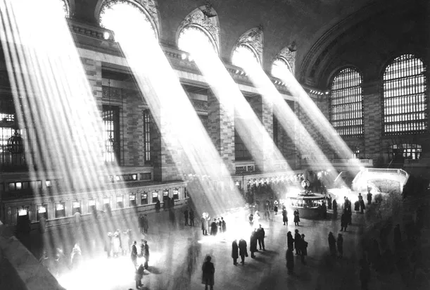
Images have power. Even before this recent discussion about moving Madison Square Garden, Penn Station has had a hold on New Yorkers’ imagination thank largely to its photographs. As for its future – what should a modern Penn Station be like? Should there even be a new Penn Station? Those are questions people will be asking a lot over the next 10 years. Architects will talk about sustainability and new technologies and radical formal possibilities, and civic space –all important considerations to be sure– but at the end of the day, if there is going to be a new Penn Station it should be beautiful. It needs to satiate that longing and mitigate that sense of loss felt every time we see a picture of what was or an image of what could be.
/https://tf-cmsv2-smithsonianmag-media.s3.amazonaws.com/accounts/headshot/Jimmy-Stamp-240.jpg)
/https://tf-cmsv2-smithsonianmag-media.s3.amazonaws.com/accounts/headshot/Jimmy-Stamp-240.jpg)