Rebranding Amsterdam and What It Means to Rebrand a City
To help maintain its position as a popular European destination, Amsterdam embraced marketing with “I amsterdam,” a brand campaign for the city and its residents
![]()

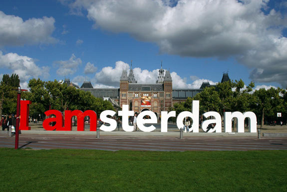
I AMsterdam logo in front of the Rijksmuseum (image: amsterdam mediabank)
Amsterdam has long been a required stop on any European Grand Tour. But in the early 21st century, the city of Amsterdam noticed its position on various international rankings—top tourist destinations, top convention cities, etc.—had fallen due to increased competition from other destinations in Europe, particularly to cities in Spain and Eastern Europe. To maintain the city’s position as a top spot for tourism and business, a private-public partnership was formed to rebrand Amsterdam with a new city marketing campaign. In September 2004, I amsterdam was born. I Amsterdam is a motto and a brand all in one for both the people of Amsterdam and the city itself.

The I AMsterdam logo
We’re all familiar with commercial brands, but what does it mean to brand a city? According to Saffron Brand Consultants, creators of the Saffron European City Brand Barometer (pdf), the “brand” of a place is “the average or common perceptions and associations people have with that place.” It is, of course, a subjective perception based on personal taste and experience but, generally speaking, there is a definite cultural awareness of cities—the idea of a city—that is shaped by media and marketing.
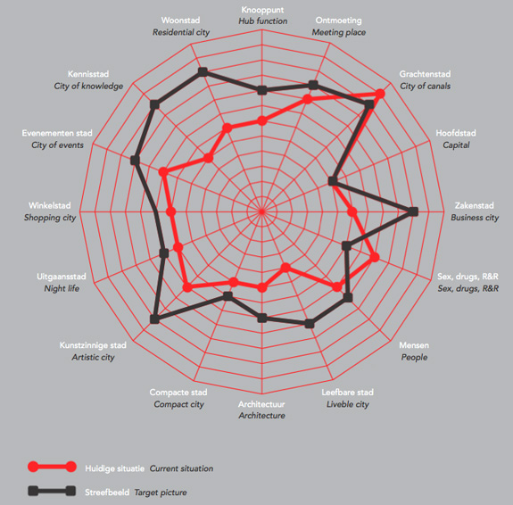
It was the hope of Amsterdam Partners, the public-private partnership formed to market the capital of the Netherlands, to expand and slightly alter that cultural awareness by focusing on what they identified as the core values of their city: creativity (creativiteit), innovation (innovatie), and its spirit of commerce (handelsgeest). Those three defining values were determined after creating a profile of the city based on 16 different facets of Amsterdam, represented in the following diagram as a graphic web that defines the existing perception of the city (in red) and the shift in perception they hoped to engender with the new marketing campaign (in black).

Valuation of the sixteen dimensions of Amsterdam in a spider graph (image: “The Making of…The City Marketing of Amsterdam” via iamsterdam.com)
Amsterdam is not just about sex, drugs and canals. It’s also a great place to live and work. The minds behind I amsterdam believe that their brand can not only serve to spread awareness about the virtues of their city, but also act as a catalyst for real urban change, noting in their promotional materials that “the building blocks of city marketing will likewise be building blocks for important parts of city policy.”
To that end, they wanted a diverse branding concept that would appeal not just to tourists, but to those living in the areas around Amsterdam, as well as to the businesses and individuals in the city proper. Previous city slogans such as “Amsterdam Has It” and “Capital of Sports” and “Small City, Big Business” were either too vague or too focused on one aspect of the city to the detriment of others. “I amsterdam,” however, as has the specific, instantly recognizable quality of Milton Glaser’s famous “I <3 NY logo”, from which it most certainly drew some inspiration. But instead of hearting its city, I amsterdam invites you to become a part of it: I amsterdam and you can be too.
“I amsterdam is the slogan for both people and area. I amsterdam allows the people to voice their pride and confidence while expressing support and love for their city. I amsterdam can be used in many ways, but must always come from the people; this is the slogan’s true power. The people who live here, the people who work here, the people who study here, the people who visit here and the people who come to Amsterdam seeking a better future are, in the end, the best evidence for why Amsterdam is a city of choice. I amsterdam should embody the spirit of Amsterdam, and therefore its use will create a city brand recognized the world over.”
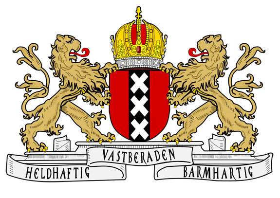
The logo’s colors are drawn from the Amsterdam flag and coat of arms, which depicts three white St. Andrew’s Crosses on a black stripe over a field of red, a symbol dating back to the early sixteenth century when the city was a fisherman’s town.

The coat of arms of Amsterdam
It shares with Glaser’s logo a certain a timeless quality and product-friendly design, perfect for extending the well-regulated brand, which Amsterdam Partners hoped would be embraced by local organizations and businesses as part of their own marketing campaigns. However, anyone hoping to use the registered trademark must first must be approved by Amsterdam Partners, a process to ensure that the logo is consistent in its representation and that the companies who use it are in accord with the new vision of Amsterdam. Of course, there will always be those entrepreneurs unencumbered with any sense of business ethics who are looking to make an illicit buck with bootleg merchandise. But isn’t that just another sign of the brand’s success?

Official I AMsterdam Merchandise (image: iamsterdam.com)
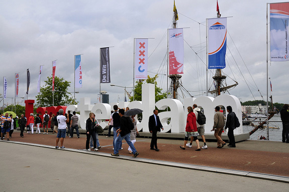
The new identity comes equipped with all the extensions and accessories of every contemporary marketing campaign: an incredibly accessible website, a Twitter account, Facebook page, and even an app. And then there are the two-meter tall red and white letters that spell out the slogan/brand. One set of the letters is kept permanently outside the city’s famed Rijksmuseum, where it became an instantly popular photo opp. Amsterdam Partners estimates that on any given day, the letters are photographed 8,000 times. A second set of letters welcomes visitors at Amsterdam Airport Schiphol, while a third set of I amsterdam letters travels around the city, appearing at major cultural events. I amsterdam has become a part of the city and a part of every tourists’ experience. As a result of their popularity, the I amsterdam brand continues to spread across the web on blogs, magazines, photo sharing sites, and Google image search.

I AMsterdam in situ (image: Johan Wieland via Flickr)
Has I amsterdam worked? It would appear so. Tourism numbers are up, business is good, and Amsterdam has once again cemented its position in the top five European cities based on brand strength and cultural “assets.” In fact, according to Saffron, Amsterdam’s brand is actually better than their assets predict. Perhaps most telling, at least for me personally, is the fact that when I told friends that I was going to be writing about city branding and city marketing, everyone almost immediately recommended I amsterdam. To those who visited the city, the letters made an indelible impression and nearly every single one of them has a photo with the city’s red and white logo. In eight years, I amsterdam has become not only a part of the cultural identity, but a landmark.
/https://tf-cmsv2-smithsonianmag-media.s3.amazonaws.com/accounts/headshot/Jimmy-Stamp-240.jpg)
/https://tf-cmsv2-smithsonianmag-media.s3.amazonaws.com/accounts/headshot/Jimmy-Stamp-240.jpg)