Redesigning The Vote
Bad design can change the results of an election. But several professional design organizations have been working to ensure that every vote counts
![]()

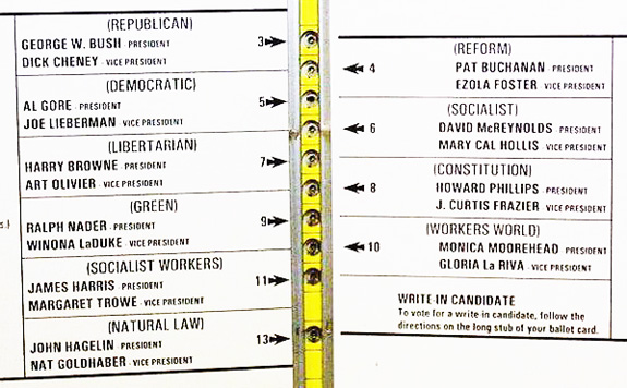
The infamous Florida butterfly ballot from the 2000 election.
Americans head to the polls today to vote for the next President of the United States, as we traditionally have on November Tuesdays since 1845. However, there is no tradition dictating how we vote. In America there is no standard ballot, so depending on where voters live, they may use a pencil, pen, punchcard, lever, or computer. There are thousands of different ballots in America, and while I’m sure many ballots are clear and concise, too many are illegible and confusing. Generally speaking, voting in America is terribly designed. From the queues to the machines to the ballot itself, it seems absolutely absurd that something so important, so absolutely essential to the identity of this nation, should be given so little aesthetic and formal consideration.
“Bad design can change the results of an election,” says Larry Norden of the Brennan Center for Justice in an recent interview with The New York Times. Bad design can lead to mistaken and invalid votes or, perhaps worse, it can deter people from voting at all. In 2008, the Brennan Center released Better Ballots, a publication documenting the ramifications of bad ballot design. After extensive research, they recommended a series of policy and design changes to improve ballot and election design. This year, the Brennan Center expanded their research to include voting machine errors and absentee ballots with a new publication, Better Design, Better Elections, in which they articulate the importance of voting and the role of design:
Some have dismissed the importance of usability in elections, arguing that voters only have themselves to blame if they fail to navigate design flaws. This misunderstands the purpose of elections. They are not a test of voters’ ability to follow confusing designs or complicated instructions; they are, instead, a mechanism by which voters express their preference for candidates and policies. No legitimate public purpose is served by designs that distort voters’ choices.
No legitimate public purpose is served by designs that distort voters’ choices. After the 2000 election, during which the infamous butterfly ballot (see top image) is thought to have distorted many voters’s choice, ballot design suddenly became something that people paid attention to – people including the American Institute of Graphic Arts (AIGA) and legendary design firm IDEO.
The AIGA’s Design for Democracy initiative offers a number of resources to both ballot designers and election officials. Basic design tips include font recommendations and layout advice –use lowercase letters at no less than 12pt, avoid center type, use one typeface and make it sans-serif, etc.– while broader lessons include valuable insights into the minds of voters and officials, such as “good design is the easy part” and the difficulty only comes in when one tries to navigate the maze of governmental bureaucracy necessary to implement real voting change. The AIGA also makes the important note that voters vary in levels of literacy, quality of vision, and learning style. A well designed ballot must be accessible to everyone.
Accessibility is also the main issue addressed by the openIDEO ballot design challenge. OpenIDEO is a collaborative online platform developed by IDEO to promote and encourage design for social good. Their recent design brief called for their online community “to find ways to improve election accessibility for people with disabilities and other limitations.” Reponses came from amateurs and professionals alike, with winning concepts ranging from mobile voting vans to more elaborate online voting networks, to suggestions for the American voting app.
While these competitions are important, their speculative nature limits their real-world application (at least for now, a voting app seems inevitable). There have, however, been some actual success stories with ballot redesign, such as the redesign of the envelope for absentee voters in Minnesota.

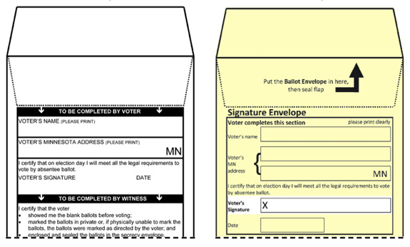
Left: 2008 Minnesota absentee ballot envelope. Right: 2010 Minnesota absentee ballot envelope (image: Brennan Center for Justice)
In 2008, more than 4,000 absentee votes were not counted in Minnesota, largely because voters failed to sign their ballot. The senate contest that year was decided by 312 votes. Those 4,000 votes could have swung the election either way. These numbers made it explicitly clear: every vote counts, and every vote must be counted. To help prevent similar problems in the future, the state government worked with design professionals and usability experts to redesign their voter submission envelope (above image). The improvement is obvious and the results are inarguable. After the redesign, the number of unsigned absentee ballots in 2010 decreased by almost 79 percent. Other problems persisted, however, and the ballot went through some minor design revisions this year. This is an example of how it should work: Professional design reviews and performance analysis lead to redesigned ballots, more accurate results, and a fair election. As one of the more famous voting incidents in recent history, the Minnesota ballot serves as an excellent case study illustrating how design can prevent votes from being dismissed by a technicality.
Since the 2000 election controversy, it seems that a few jurisdictions have caught on and it is becoming more common for election officials to consult design experts. However, it still seems strange that while pundits talk about hacking electronic machines, misleading voters, discounting valid votes, and every other kind of voter fraud imaginable, there is relatively little discussion about voting regulation and design. Will future voters elect the next president with a national ballot or a text message or an app? Only time will tell. A lot of time. Because while change is coming, it only comes in small increments every election cycle.
/https://tf-cmsv2-smithsonianmag-media.s3.amazonaws.com/accounts/headshot/Jimmy-Stamp-240.jpg)
/https://tf-cmsv2-smithsonianmag-media.s3.amazonaws.com/accounts/headshot/Jimmy-Stamp-240.jpg)