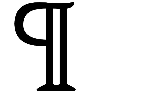
The Origin of the Pilcrow, aka the Strange Paragraph Symbol
It is now nearly invisible in word-processing programs, but it was one of the most elaborate of manuscript ornaments

The pilcrow. The derivation of its name is as complex as its form. It originally comes from the Greek paragraphos(para, “beside” and graphein, “to write”), which led to the Old French paragraph, which evolved into pelagraphe and then pelagreffe. Somehow, the word transformed into the Middle English pylcrafte and eventually became the “pilcrow.”
Here on Design Decoded, we love exploring the signs, symbols and codes embedded in everyday life. These nearly ubiquitous icons and ideograms are immediately identifiable and may be vaguely understood, but their full meanings are known only to a select few equipped with specialized knowledge, and their origins are often lost to history. Software engineer and writer Keith Houston loves such symbols, too. In his book, Shady Characters: The Secret Life of Punctuation, Symbols & Other Typographical Marks, he looks into, well, the secret life of punctuation, symbols and other typographical marks. Most of them are familiar, like “quotation marks” and the @ symbol, but others are less widely used, such as the interrobang and the manicule. The fascinating study in obscure typography opens with the single symbol that inspired the entire book, a symbol that has ties to some of the greatest events in human history, including the rise of the Catholic Church and the invention of the printing press: the pilcrow. Also known as the paragraph mark, the pilcrow, for such a humble, rarely used mark, has a surprisingly complex history. Indeed, as Houston writes, the pilcrow is “intertwined with the evolution of modern writing.”
I’ll spare you the earliest history of writing and skip to 200 A.D., when “paragraphs,” which could loosely be understood as changes in topic, speaker or stanza, were denoted by myriad symbols developed by scribes. There was little consistency. Some used unfamiliar symbols that can’t easily be translated into a typed blog post, some used something as simple as a single line – , while others used the letter K, for kaput, the Latin word for “head.” Languages change, spellings evolve, and by the 12th century, scribes abandoned the K in favor of the C, for capitulum (“little head”) to divide texts into capitula (also known as “chapters”). Like the treble clef, the pilcrow evolved due to the inconsistencies inherent in hand-drawing, and as it became more widely used, the C gained a vertical line (in keeping with the latest rubrication trends) and other, more elaborate embellishments, eventually becoming the character seen at the top of this post.

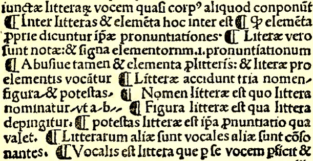
Excerpt of a page from Villanova, Rudimenta Grammaticæ showing several pilcrow signs in the form common at that time, circa 1500 (image: Wikimedia commons).
So how did the pilcrow, once an essential, though ornate, part of any text, become an invisible character scribbled by editors on manuscript drafts or relegated to the background of word-processing programs? As Houston writes, “It committed typographical suicide.” In late medieval writing, the pilcrow had become an ornamental symbol drawn in elaborate style, often in a bright red ink, by specialized rubricators, after a manuscript had been copied by scribes, who left spaces in the document explicitly for such embellishments. Well, sometimes even the most skilled rubricator ran out of time, leaving pages filled with empty white spaces. As Emile Zola wrote, “One forges one’s style on the terrible anvil of daily deadlines.” Apparently the written word itself can be forged on the same anvil. The problem was only exacerbated by the invention of the printing press. Early printed books were designed to accommodate hand-drawn rubrications, including spaces at the beginning of each section for a pilcrow. As demand grew for the printed word and production increased, rubricators just couldn’t keep up and the pilcrow was abandoned, though the spaces remained.

This brief overview only touches on the pilcrow’s fascinating history. If you like our articles on music notation, Benjamin Franklin’s phonetic alphabet or even the secret language of cattle branding, check out Shady Characters.
/https://tf-cmsv2-smithsonianmag-media.s3.amazonaws.com/accounts/headshot/Jimmy-Stamp-240.jpg)
/https://tf-cmsv2-smithsonianmag-media.s3.amazonaws.com/accounts/headshot/Jimmy-Stamp-240.jpg)