Googie: Architecture of the Space Age
The futurist design movement that divided critics and and swept the nation with space age coffee shops
/https://tf-cmsv2-smithsonianmag-media.s3.amazonaws.com/filer/20120615094030todd-lapin-theme-building-470x251.jpg)
Before I moved to Los Angeles (almost 2 years ago now) I had never heard the word Googie. In fact, when a friend — a native Californian — used the term I initially thought it must have something to do with Google. I didn’t know the word, but I definitely knew the style. And I suspect you might too.
Googie is a modern (ultramodern, even) architectural style that helps us understand post-WWII American futurism — an era thought of as a “golden age” of futurist design for many here in the year 2012. It’s a style built on exaggeration; on dramatic angles; on plastic and steel and neon and wide-eyed technological optimism. It draws inspiration from Space Age ideals and rocketship dreams. We find Googie at the 1964 New York World’s Fair, the Space Needle in Seattle, the mid-century design of Disneyland’s Tomorrowland, in Arthur Radebaugh‘s postwar illustrations, and in countless coffee shops and motels across the U.S.
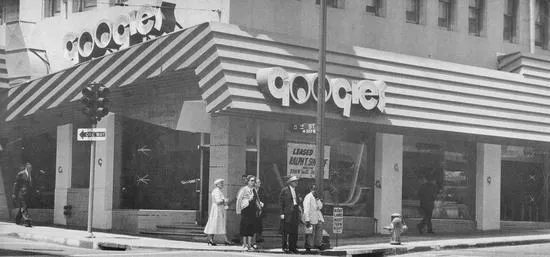
Googie is an odd word; a funny word; a word that feels like it’s doing a few vowel-drenched laps around your tongue before finally flopping out of your mouth. Oddly enough, Googie was used as a deragatory term almost from the start — born in Southern California and named for a West Hollywood coffee shop designed in 1949 by John Lautner, a student of Frank Lloyd Wright. Architecture critic Douglas Haskell was the first to use “Googie” to describe the architectural movement, after driving by the West Hollywood coffee shop and finally feeling like he had found a name for this style that was flourishing in the postwar era.
But Haskell was no fan of Googie and wrote a scathing (by architecture critic standards) satire of the style in the February 1952 issue of House and Home magazine. The New York-based Haskell wrote part of his article, “Googie Architecture,” in the voice of a fictional Professor Thrugg, whose over-the-top praise was an indictment of Googie’s popular appeal. Haskell was an advocate of modernism, but a modernism constrained by his ideas of taste and refinement. Haskell, writing sarcastically as Professor Thrugg:
“You underestimate the seriousness of Googie. Think of it! — Googie is produced by architects, not by ambitious mechanics, and some of these architects starve for it. After all, they are working in Hollywood, and Hollywood has let them know what it expects of them.”
Haskell’s disdain for Googie was clearly rooted in his hatred for the flourishes and perceived tackiness of Hollywood.
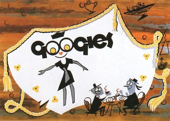
Perhaps no one has studied Googie and its relationship to mid-20th century futurism more closely than Alan Hess: an architect, historian and the author of Googie Redux: Ultramodern Roadside Architecture (2004) and Googie: Fifties Coffee Shop Architecture (1985). I spoke with Mr. Hess by phone at his home in Irvine, California.
“Googie started after WWII as a definable style and it caught on fire in the culture and lasted for a good 25 years or so,” Hess says.
Googie is undeniably the super-aesthetic of 1950s and ’60s American retro-futurism — a time when America was flush with cash and ready to deliver the technological possibilities that had been promised during WWII. “I really feel that Googie made the future accessible to everyone,” Hess says. As he explains it, Googie was an unpretentious aesthetic meant to appeal to the average, middle-class American: ”One of the key things about Googie architecture was that it wasn’t custom houses for wealthy people — it was for coffee shops, gas stations, car washes, banks… the average buildings of everyday life that people of that period used and lived in. And it brought that spirit of the modern age to their daily lives.”
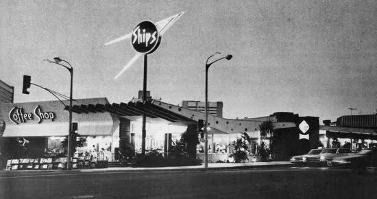
Hess insists that Googie was a realization of the future rather than simply a promise of things to come. “Since the 19th century and Jules Verne — coming up into the 1920s and 1930s — there had been these future-oriented movies and novels and so forth which looked to the future with great promise,” Hess says. “But after WWII, a lot of that promise was actually fulfilled not only in the buildings but also the automobiles that the average American used during that time. I really feel it did not only capture the future, but it brought it in a meaningful way to people. And you see this interest in these futuristic ideas not only in architecture or car design but in cartoons like The Jetsons and places like amusements parks like Disneyland’s Tomorrowland — in advertisements, in magazines, and so forth, certainly in the movies as well. So this interest, this intrigue, this appeal of living in the future just went all across the culture.”
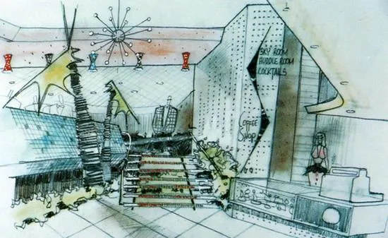
Googie was born in southern California and much like the billboard scene here, owes some of its popularity to something very practical: driving in a car causes you to miss a lot of commercial activity. Which is to say, businesses want your attention, so they need to stand out through increased size and a certain degree of weirdness. As Philip Langdon notes in his 1986 book Orange Roofs, Golden Arches: The Architecture of American Chain Restaurants, the laissez-faire expanse of California freeways contributed to the rise of Googie:
California, unlike eastern and midwestern states, did not build toll roads and make travelers captive to restaurants that had been commissioned to operate at designated rest stops. California was the land of the freeway, with the choice to eat at competing restaurants at one interchange after another, so the restaurants’ need for a conspicuous profile was especially intense. The question confronting restaurant operators by the late fifties was: What would catch the eye of fast-moving motorists?
Hess elaborates on the experimental spirit of postwar Los Angeles: “Yes, it really did start in Southern California, though it was a national phenomenon. Texas, Florida, New Jersey, Michigan, all of these areas also had Googie architecture. But Los Angeles — because it was one of the fastest growing cities at that time — had a tradition of experimental modern architecture. So the seeds of it were in Los Angeles.”
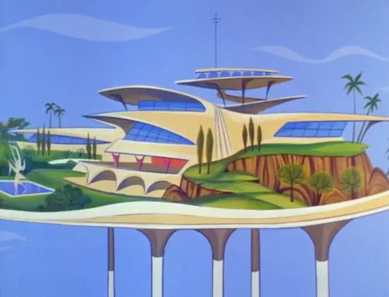
The 1962-63 version of The Jetsons was so dripping with Googie that you could argue Hanna-Barbera didn’t really exaggerate the style — they copied it. Googie at its most flamboyant and cartoonish is almost beyond parody. And it’s pretty clear that the artists behind The Jetsons were inspired by the style that surrounded them in Southern California.
The artists and animators working on The Jetsons really didn’t need to drive too far to become inspired by the Googie of Los Angeles. The Hanna-Barbera Studio was in Hollywood at 3400 Cahuenga Blvd (I think it’s the site of an LA Fitness now) and buildings all across Los Angeles in the late 1950s and early 1960s screamed Googie. The Los Angeles International Airport had (and still has) the Googie-tastic Theme Building, featured in the October 19 1962 issue of Life magazine — a special issue devoted completely to Americans’ mid-century fascination with California. Ship’s coffee shop opened in 1958 at 10877 Wilshire Blvd, just south of UCLA. Pann’s, my personal favorite breakfast spot in L.A. (try the biscuits and gravy, seriously), is at 6710 La Tijera Boulevard. Hanna-Barbera was also just a short drive from Anaheim, where you could see the Monsanto House of the Future at Disneyland, which opened in 1957. And of course there was the streamlined, Space Age version of Disneyland’s early-’60s Tomorrowland.
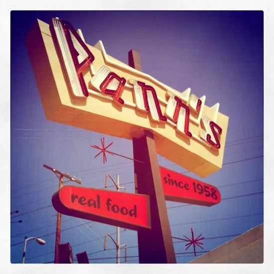
The future had arrived for those in Southern California and it was a symbol of even greater things to come. From Hess’s 1985 book Googie: Fifties Coffee Shop Architecture:
Los Angeles in the 1950s was a modern city. The opportunities of the postwar boom in the freedom of Los Angeles allowed architects ranging from John Lautner to Richard Neutra full rein in a new phase of Modernism. The optimistic exploration of materials and structures for the new age continued. But as widely publicized as were Lautner’s Silvertop, or the series of Case Study houses sponsored by Arts and Architecture magazine, or other high art buildings, they were only a fraction of the architecture that filled tracts and lined commercial strips. The roadside buildings gave anyone driving Los Angeles streets the sense that this was indeed a new era, that the long-promised future of benevolent technology and prosperity had at last arrived to deliver the good life to all.
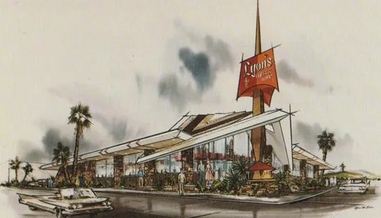
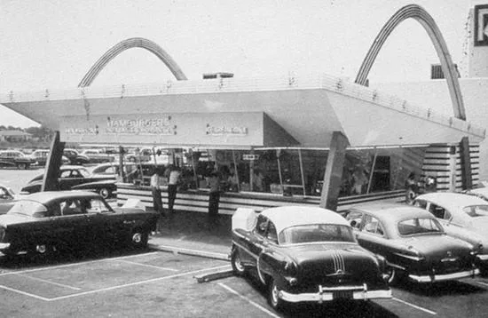
But by 1970, Hess says the architectural culture had changed. ”The interest in the future, the gee-whiz factor about plastics and nuclear power and space flight, travel to the moon, all of these things that had been new and exciting in the 1950s had become more mundane — we landed on the moon in 1969 and then it was over. And also at that time new ideas came in — specifically the ecology movement which began to say that we do have limits on how we can use our resources. And an interest in more lower-scale, residential, traditional, architecture came into fashion. You see this transition in tastes in popular culture I think most vividly in the change of the McDonald’s prototype. In 1953 the prototype was Googie all the way — it was bright, shiny, bold colors, big arches, very dynamic upswept roof, neon, etc…”
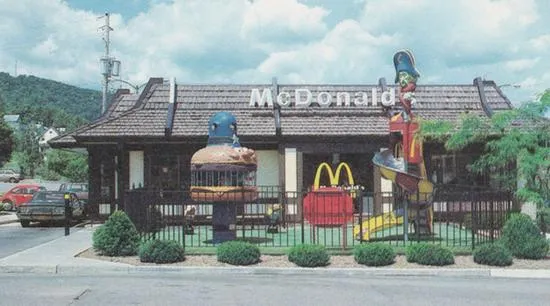
“But in the late-1960s,” Hess says, “McDonald’s introduced a new prototype which used brick as its walls and a mansard roof — a very traditional form. McDonald’s felt that it would appeal to their customers at this time, and it did. Those are some of the reasons why Googie eventually faded as a popular style. But then of course it’s ressurected as a popular style in the last 20 years or so.”
The style known as Googie, in fact, has many names. It’s sometimes known as Populuxe, and in some circles is just considered modern architecture. But it seems to me most fitting to call the style by the term used by its most famous detractor. Googie is both the future we long for and the future we never asked for.
So we tip our hats to the believers and non-believers alike — both Lautner and Haskell and all the other weirdos of the mid-20th century, jostling for their own vision of our American landscape. These beautiful, bizarre competing visions of our future — or our future that never was.
Update: A transcription error originally quoted Hess describing a “mansford” roof rather than a mansard roof.
/https://tf-cmsv2-smithsonianmag-media.s3.amazonaws.com/accounts/headshot/matt-novak-240.jpg)
/https://tf-cmsv2-smithsonianmag-media.s3.amazonaws.com/accounts/headshot/matt-novak-240.jpg)