These Maps Reveal How Slavery Expanded Across the United States
As the hunger for more farmland stretched west, so too did the demand for enslaved labor
/https://tf-cmsv2-smithsonianmag-media.s3.amazonaws.com/filer/71/42/71424d2d-631d-428c-b54f-0623594831ed/hergesheimer-map.png)
In September of 1861, the U.S. Coast Survey published a large map, approximately two feet by three feet, titled a "Map showing the distribution of the slave population of the southern states of the United States." Based on the population statistics gathered in the 1860 Census, and certified by the superintendent of the Census Office, the map depicted the percentage of the population enslaved in each county. At a glance, the viewer could see the large-scale patterns of the economic system that kept nearly 4 million people in bondage: slavery was concentrated along the Chesapeake Bay and in eastern Virginia; along the South Carolina and Georgia coasts; in a crescent of lands in Georgia, Alabama and Mississippi; and most of all, in the Mississippi River Valley. With each county labeled with the exact percentage of people enslaved, the map demanded some closer examination.
The Coast Survey map of slavery was one of many maps drawn from data produced in 19th-century America. As historian Susan Schulten has shown, this particular map was created by a federal government agency from statistics gathered by the Census. Abraham Lincoln consulted it throughout the Civil War. A banner on the map proclaims that it was "sold for the benefit of the Sick and Wounded Soldiers of the U.S. Army." The data map was an instrument of government, as well as a new technology for representing knowledge.
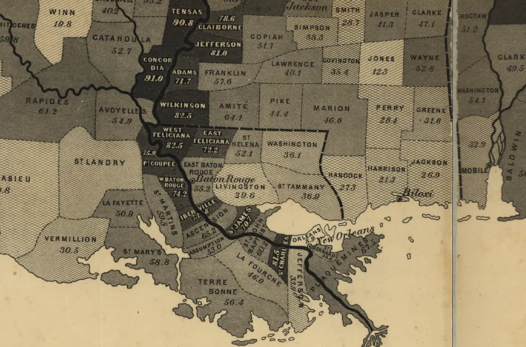
Though thematic mapping had its origins in the 19th century, the technique is useful for understanding history in our own day. One of the fundamental problems of history is scale: how can historians move between understanding the past in terms of a single life and in the lives of millions; within a city and at the bounds of continents; over a period of days and over the span of centuries? Maps can't tell us everything, but they can help, especially interactive web maps that can zoom in and out, represent more than one subject, and be set in motion to show change over time.
To help show the big patterns of American slavery, I have created an interactive map of the spread of slavery. Where the Coast Survey map showed one measure, the interactive map shows the population of slaves, of free African Americans, of all free people, and of the entire United States, as well as each of those measure in terms of population density and the percentage of the total population. The map extends from the first Census in 1790 to the Census taken in 1860 on the eve of the Civil War. You can explore the map for yourself, but below I have created animations to highlight some of the major patterns.
When looking at all of these maps together, it's noticable that even as the total number of enslaved peoples in the United States increased between 1790 and 1860, the multitudes were dispersed across the increasing expanse of the United States, rather than becoming more concentrated in areas where slavery was well established.
In counties along the Atlantic Coast in 1790 and 1800, the population of slaves at any one time was nearly at its peak. (This is all the more remarkable since many slaves fled to the British during the Revolutionary War.) Take for example, Charleston County, South Carolina. In 1790, almost 51,000 people were enslaved in that county. In 1840, the slave population reached its peak of nearly 59,000 people; by 1860, there were 37,000 enslaved people, just 63 percent as many slaves as two decades earlier.
The total number of slaves in the eastern seaboard states did, however, grow slowly over time, but not at anything like the rate of growth for free people in the North. The free white population in the North grew in already settled places and spread to the West.
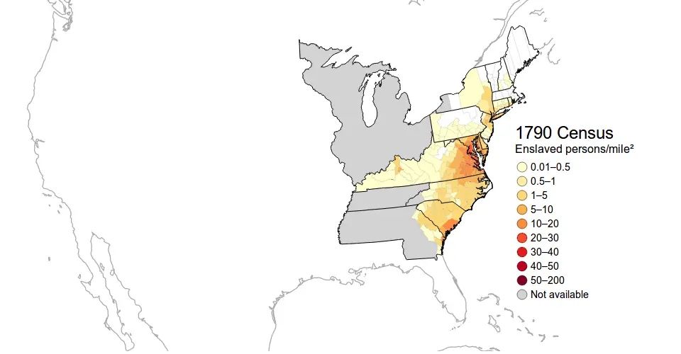
The slave population had a different dynamic. It grew in intensity in places around the Chesapeake Bay, even as slavery was gradually abolished in the North. But for the most part the slave population spread westward to the lands opened for settlement by the Louisiana Purchase, the dispossession of the Indian nations of the Southeast, the war with Mexico, and the distribution of public lands. Slavery spread rather than grew because it was an agricultural rather than industrial form of capitalism, so it needed new lands.
And slavery spread because enslaved African Americans were forced to migrate. Historian Steven Deyle estimates "that between 1820 and 1860 at least 875,000 American slaves were forcibly removed from the Upper South to the Lower South." A minority of that migration happened because white planters migrated along with the people that they owned. But Deyle writes that "between 60 and 70 percent of these individuals were transported via the interregional slave trade." In other words, slavery was not the paternalist institution that its apologists made it out to be: it was an relentlessly exploitative system where the fundamental relation of owner to enslaved was defined by the markets. The unceasing spread of slavery provoked political crises, eventually leading to the Civil War. As Abraham Lincoln put it in is 1858 "House Divided" speech:
"Either the opponents of slavery, will arrest the further spread of it, and place it where the public mind shall rest in the belief that it is in the course of ultimate extinction; or its advocates will push it forward, till it shall become alike lawful in all the States, old as well as new, North as well as South."
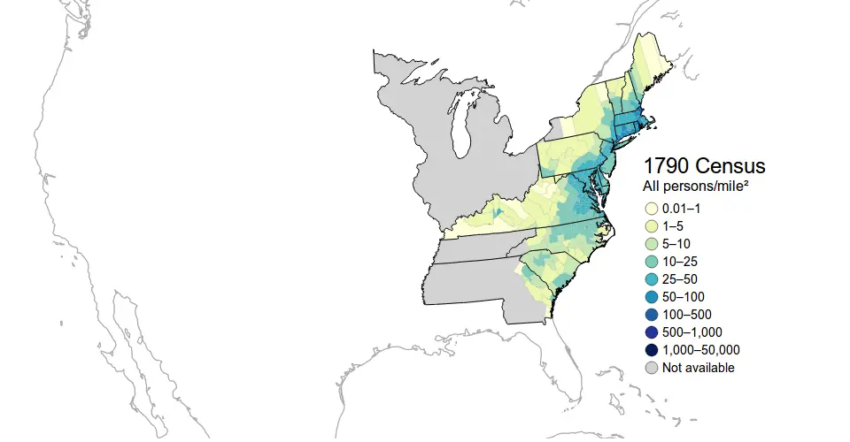
Below you can see two animations comparing the density of the slave population and the density of the total population (keep in mind that the scales are different).
This animation of the density of slave population from 1790 to 1860 shows how slavery expanded more than it grew.
An animation of density of the total population from 1790 to 1860. Notice that population in the north both grows in place and spreads westward.
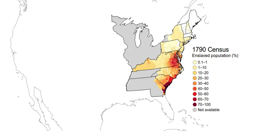
A second observation to make from this map is how pervasive slavery was to the United States. In the first decades of the early republic, the northern states had a significant population of slaves, which only slowly diminished through gradual emancipation laws. In the South, the percentage of the population that was enslaved was extraordinarily high: over 70 percent in most counties along the Mississippi River and parts of the South Carolina and Georgia coast.
This animation shows the percentage of the population enslaved from 1790 to 1860.
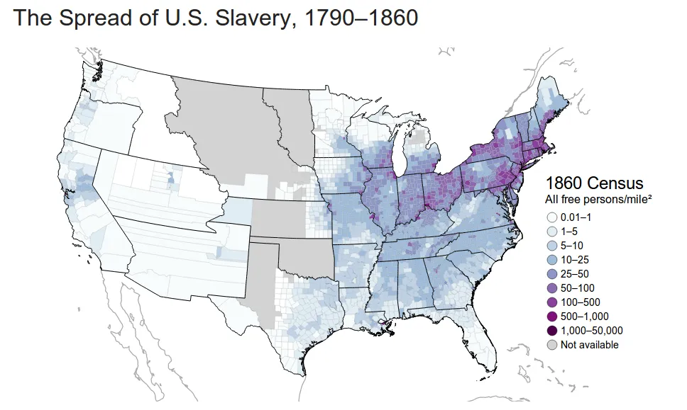
A striking way to see the importance of slavery is to look at a map of the total free population: a photo negative, if you will, of slavery. When looking at the population density of all free persons (below in 1860), large swathes of the South appear virtually depopulated.
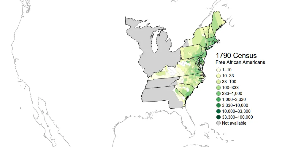
Finally, the dynamics of the free African American population looked more like the free white population than the slave population. The free African American population settled primarily along the Eastern seaboard and especially in the cities of the northern United States. Free African Americans were almost entirely excluded, in part by an extensive system of patrols, from the majority slave populations of the Deep South. This animation shows the free African American population from 1790 to 1860.
This interactive map and the Census data on which it is based can hardly show most of what should be known about slavery. For example, the Census did not count any slaves in Vermont, which abolished slavery in its 1777 constitution. But Harvey Amani Whitfield has shown that some Vermont African Americans were held in bondage. Nor can these maps express anything of the pain of the whip or the escape to freedom, of the exhaustion of labor or the sounds of preaching and shouting at a religious gathering: for that one must read any of scores of excellent histories. But they do give a large overview of the forced labor system which made the nation "half slave and half free."
Sources
Susan Schulten, Mapping the Nation: History and Cartography in Nineteenth-Century America (Chicago: University of Chicago Press, 2012), writes about maps of slavery in chapter 4; see also the book's companion website which offers images of maps of slavery. Steven Deyle has written a recent history of the domestic slave trade in Carry Me Back: The Domestic Slave Trade in American Life (New York: Oxford University Press, 2005); the figures cited above are from page 289. Of the many excellent histories of American slavery, see one of these: on the settlement of the Mississippi River valley, Walter Johnson, River of Dark Dreams: Slavery and Empire in the Cotton Kingdom (Cambridge, Belknap Press of Harvard University Press, 2013); on the life of slaves, Erskine Clarke, Dwelling Place: A Plantation Epic (New Haven: Yale University Press, 2005); on the history of slavery generally, Ira Berlin, Generations of Captivity: A History of African-American Slaves (Cambridge, MA: Belknap Press of Harvard University Press, 2003).
The data in my maps is drawn from the 1790 to 1860 Censuses compiled by the Minnesota Population Center, [National Historical Geographic Information System], version 2.0 (Minneapolis: University of Minnesota, 2011).
U.S. Coast Survey, Map showing the distribution of the slave population of the southern states of the United States (Washington, DC: Henry S. Graham, 1861). Image from the Library of Congress.