The Helvetica Typeface Has Been Redesigned for the Digital Age
Helvetica Now is the first update to the sans serif typeface in 36 years
/https://tf-cmsv2-smithsonianmag-media.s3.amazonaws.com/accounts/headshot/mellon.png)
/https://tf-cmsv2-smithsonianmag-media.s3.amazonaws.com/filer/77/df/77df8595-41b8-43ca-8200-4cc230b3c2a1/mt_fonts_helvetica_now_04.jpg)
The world’s most popular typeface has a new look: Helvetica Now. Four years in the making, it’s the first update to Max Miedinger and Eduard Hoffman’s classic 1957 creation since Helvetica Neue debuted in 1983.
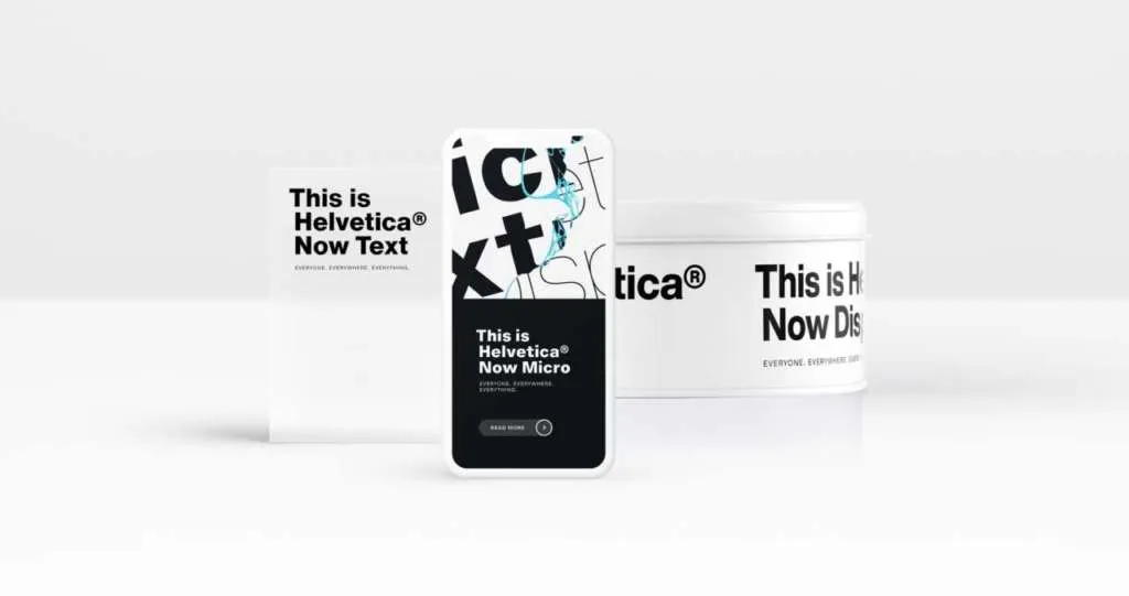
Monotype, the company that now holds the licensing rights to the font, recently announced the typographical facelift. As its name would imply, Helvetica Now is designed for the digital age, with 40,000 individually “redrawn and refit[ted]” characters, as well as 48 fonts available in three optical sizes streamlined for use on tiny screens and giant billboards alike.
Writing for Dezeen, David Braha praises the redesign for combining “clarity, simplicity and neutrality.” The update draws on a bevy of alternate glyphs (including a single-story “a” and a straight-legged capital “R,” according to a press release) and size-specific details to allow for heightened flexibility and legibility. Speaking with Wired’s Arielle Pardes, Monotype director Charles Nix waxes poetic, likening the experience to seeing “someone you love, when the light hits them the perfect way on a Saturday morning, and you suddenly see them like you’ve never seen them before.”
“It’s like falling in love all over again,” he adds.
Depending on who you ask, Helvetica, a sans serif typeface, is alternately loved or reviled. It spawned a 2007 documentary and a 50th anniversary retrospective at New York’s Museum of Modern Art, and it’s also everywhere, found on brands including American Airlines, Panasonic, Toyota and American Apparel. But even those who heap praise onto Helvetica admit the typeface (referring to the entire family of Helvetica fonts, or weighted variations ranging from Thin Italic to Regular, Bold and Black) has its faults: Most prominently, graphic designer Sarah Hyndman explains to NPR’s Scott Simon and Samantha Raphelson, letters bunch together at small sizes, and the kerning, or spacing in between characters, can be uneven.
Part of the problem is that the 1983 update was made from a single master drawing cut at one size. That’s why punctuation and currency symbols often look off-kilter next to smaller characters.
Helvetica Now sets out to correct this flaw. As Nix tells the Verge’s William Joel, the redesign offers a return to the typeface’s original 1957 iteration, capturing the “nuance of optical sizing” found when designers had to physically carve each character out of metal and introducing an array of character options—think “beardless ‘g,’” lowercase “u” without a trailing serif and lowercase “t” without a tailing stroke on the bottom right—that were lost in the move to digital type.
Of the three new optical sizes, “Micro” is best-equipped for producing legible text at extremely small sizes. “Display” is optimized for signage, while “Text” is perfect for everyday writing and design, as well as what Pardes terms “visually crowded environments.”
To the untrained eye, the differences between Helvetica, Helvetica Neue and Helvetica Now may seem negligible, but Nix tells the Boston Globe’s Andy Rosen that the triumph of the redesign can be found in the details. (He personally spent “many hours” tweaking the pound sterling symbol (£) in order to ensure its sharpness at a variety of sizes.)
So far, the reviews of Helvetica Now have been largely positive. Abbott Miller, a partner at design firm Pentagram, lauded the typeface’s “surprisingly, thrillingly contemporary character,” while Fast Company’s Mark Wilson writes that after experimenting with Monotype’s demo site, he found he “couldn’t break the font.”
“The trifecta of micro, display, and text really do feel like they cover everything,” Wilson says.
It remains to be seen how the redesign resonates with Helvetica’s passionate band of detractors—among others, the creators of helveticasux.com and “The Late Show”’s Stephen Colbert. Speaking with the Globe’s Rosen, Martha Rettig, head of the Massachusetts College of Art and Design’s masters of design program, predicts that Helvetica Now’s success just might stoke a new generation of Helvetica resentment. She explains, “We could have a whole new hatred of Helvetica for overuse now.”
/https://tf-cmsv2-smithsonianmag-media.s3.amazonaws.com/accounts/headshot/mellon.png)