:focal(800x602:801x603)/https://tf-cmsv2-smithsonianmag-media.s3.amazonaws.com/filer_public/cd/cb/cdcbb234-bc6a-4476-8388-8db86d72d0b0/ms_magazine_cover_-_spring_1972.jpg)
The National Portrait Gallery’s Portraits podcast wrapped up its fourth season with a look back at the founding of Ms.—“More Than a Magazine, a Movement,” as the publication’s slogan goes. When its preview issue hit newsstands in December 1971, its provocative cover made clear this was a magazine that would challenge the era’s prevailing notion that women’s publications should be devoted to high fashion and weight-loss tips.
Portraits host Kim Sajet speaks with activist and author Gloria Steinem, one of Ms. magazine’s founders, and Suzanne Braun Levine, the publication’s first editor, to get a clear picture of how the two chose to introduce the feminist magazine to the world.
After spending much of the 1960s dealing with sexism in her chosen profession—journalism—Steinem was not interested in creating another advertiser-appeasing publication that depicted women as abstractions, or sex objects, or anodyne and unthreatening nurturers.
“I was rethinking and understanding that perhaps when I delivered a manuscript to the New York Times Sunday magazine, I did not have to put up with the idea that my editor gave me a choice: I could go to a hotel room with him in the afternoon, or I could mail his letters on the way out,” Steinem tells Sajet. “I mailed his letters, but thanks to changed consciousness, I realized it wasn’t right. I didn’t have to put up with it. I could speak up about it.”
/https://tf-cmsv2-smithsonianmag-media.s3.amazonaws.com/filer_public/01/2f/012f232f-cac4-49d9-8efe-1b093f1b2401/npg_2005_121-steinem_hughes-r.jpg)
/https://tf-cmsv2-smithsonianmag-media.s3.amazonaws.com/filer_public/b7/ce/b7ceb5fd-79c7-4d41-b956-1dcb7108c4f2/b7000212c.jpg)
Levine recalls coming into the office her first week at Ms. dressed in jeans and a T-shirt and being rebuked by a man in the elevator, who said her casual dress was inappropriate for the workplace. Even then, she tells Sajet, she understood that what felt like liberation to her was deeply threatening and enraging to others.
Sajet points out that in 1969, Time magazine referred to women’s rights activists as “The Angries.” Ms. was determined to present a more complete and nuanced view of feminism than what was being reported in the era’s general-interest news magazines.
“Anger has always been one of the responses from women that is least encouraged and least welcomed,” Levine says. “You know, you’d walk by construction workers, and they’d say, ‘Why aren’t you smiling, baby?’ It was expected that you were supposed to be agreeable.’”
Sajet and Levine discuss how independent women had traditionally been depicted in magazines as both enraged and solitary. Levine notes that an illustration of Susan B. Anthony on an 1873 cover of the publication The Daily Graphic is so unflattering that it makes her look like “an angry nun.”
/https://tf-cmsv2-smithsonianmag-media.s3.amazonaws.com/filer_public/3e/d4/3ed442d9-01b1-470f-bd35-b4421d24cf7f/service-pnp-ppmsca-55800-55836v.jpg)
Ms.’s debut issue included an article about writing one’s own marriage contract, a piece on raising kids without exposing them to sexist ideology and a bombshell story called “We Have Had Abortions,” signed by tennis champion Billie Jean King, singer Judy Collins and Steinem herself, along with 50 other prominent women. The article included an invitation to readers who’d had an abortion to add their names. That was what helped convince Levine, who’d kept her own abortion a secret up to that point, that Ms. was something she wanted to be part of. She’d end up working for the magazine for 16 years.
How to present a publication this candid and reflective in a marketplace where, as Steinem points out, the idea of even photographing a woman without makeup was unthinkable?
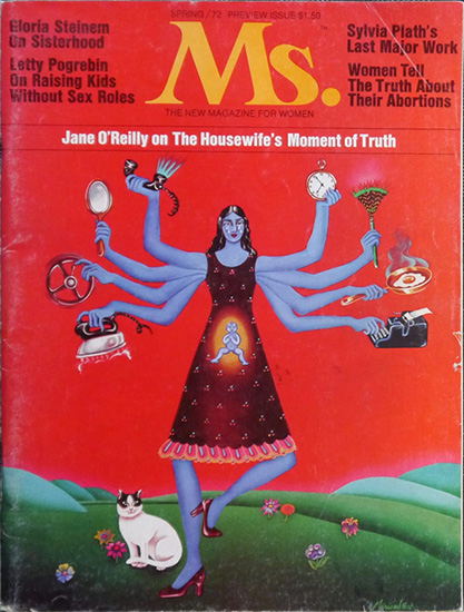
For the cover, she and her collaborators chose artist Miriam Wosk’s illustration of a blue-skinned, eight-armed, multitasking and pregnant woman dancing on a grassy hill in ruby heels, with a black-and-white cat perched near her right ankle.
The first idea was to try to put “an everywoman on the cover,” Steinem tells Sajet. “We had [an illustration of] a large face, and the face was of different skin colors. But the face looked very peculiar; it didn’t work as a visual image. So Miriam arrived at this way of showing a woman patterned on Krishna, the Indian god with many arms. Making her blue was a way of making her universal. She has a baby in her tummy, she has an iron and a typewriter, a mirror to symbolize how good she has to look, a telephone. All these ways in which women were supposed to behave, which is of course why she has tears running down her cheeks.”
Levine provides some additional context for the illustration, which depicts a woman engaged in domestic and workplace tasks simultaneously. “That became sort of a trope, that you can have it all,” she says. “That was never meant to be the message, because everybody realizes you can have it all, but not at the same time. It was almost a way of putting us back in our place, by failing at having it all.”
Elsewhere in the Smithsonian Pod-a-Verse
“A Picture’s Worth 1,000 Words,” the January 12 episode of AirSpace, a podcast from the National Air and Space Museum, reveals how human “image processors” take the data gathered by the James Webb Space Telescope (and other observatories) and convert it into the vibrant, mind-bending pictures that have made all our jaws drop since NASA began releasing images gathered by the space scope last July.
“Astronomers love to call telescopes ‘light buckets,’ because they’re really just gathering light,” astronomer Shauna Edson tells hosts Emily Martin and Matt Shindell.
It isn’t just that the James Webb Space Telescope—to stick with that example—is observing the universe from a vantage point inaccessible to humans, orbiting the sun from the L2 Lagrange Point roughly a million miles from Earth. As an infrared telescope, it collects light on a part of the spectrum that the human eye can’t detect. Translating that imagery into pictures requires a bit of interpretation, and it’s that interpretive work that provides the colors and patterns that have so transfixed us.
The images are interpreted, but no less real. That’s a tricky thing to understand, but Edson offers listeners a clear and compelling explanation: “This isn’t what your eye would see, but it’s all real light. We’re not making anything up. We’re taking this data, this information, this light that the telescope has gathered for us … and we’re visualizing it.”
/https://tf-cmsv2-smithsonianmag-media.s3.amazonaws.com/filer_public/a3/79/a379f0d8-9db8-40d2-bf6e-f2cc488b3c6a/stsci-01g77pkya4t05ykj3edq36nzcx.png)
“We’re giving it color,” she adds, in order to optimize human understanding of the image. “The colors are not what our eyes would see, but the information, the data, the light is all real. … We’re just enhancing what’s already there. So we might make the hydrogen red and the oxygen green to help us see: Where are those [elements] within the nebula? How did the star blow up? Where are the temperatures different? It’s not what your eye would see. It’s better.”
The episode expands on its title—“A Picture’s Worth 1,000 Words”—with a discussion of alt text and other tools intended to make visual documents like astronomical photographs accessible to people who are blind or visually impaired.
Martin and Shindell read examples of florid and even poetic alt text captions and contrast them with more utilitarian ones. Neither version is wrong; one is just a bit more subjective and—to apply a value judgment—more generous than the other. Not everything in science is science, Shindell reminds us. There’s a place for poetry, too.
The Smithsonian Institution offers a wide range of podcasts for all listeners.