The Pioneering Work of Graphic Artist Herbert Bayer
The Bauhaus-trained artist revolutionized the field of graphic design, but he tarnished his legacy by working with the Nazis
/https://tf-cmsv2-smithsonianmag-media.s3.amazonaws.com/accounts/headshot/wendy_new-1.jpeg)
/https://tf-cmsv2-smithsonianmag-media.s3.amazonaws.com/filer/c7/5d/c75d43c5-1783-4a43-9d36-6cdd087cf658/15201927_mflynn.jpg)
Of the many talents who thrived at the revolutionary Bauhaus school in Germany a century ago, perhaps the least celebrated is Herbert Bayer—this might be because he worked with the Third Reich during a period he later called his “purgatory.”
In the myriad current shows and new books honoring the Bauhaus’s centenary, Bayer, an Austrian who became one of the most influential graphic designers of his time, is given short shrift. This is why “Herbert Bayer: Bauhaus Master,” an exhibition at the Cooper Hewitt Smithsonian Design Museum is worth a close look.
Ellen Lupton, the museum’s senior curator of contemporary design and a specialist in graphic design, was inspired by a trove of some 500 pieces of Bayer material that the museum acquired in 2015. Asked why Bayer is not a household name like those of his Bauhaus colleagues, Lipton explains: “Bayer is less famous because graphic design is taken less seriously than architecture. It’s not where the biggest bucks are or the biggest impact on society and the landscape.”
Although Bayer did lecture throughout his life, he was never a full-time professor, which may also explain his lack of fame. “He was not as influential a teacher as Josef Albers, László Moholy-Nagy or Johannes Itten,” Lupton continues. “He was more of a practical, hands-on guy.”
/https://tf-cmsv2-smithsonianmag-media.s3.amazonaws.com/filer/d9/b4/d9b44456-5a0d-4a35-9afa-c4d51e0796cd/herbert_bayer_1.jpg)
/https://tf-cmsv2-smithsonianmag-media.s3.amazonaws.com/filer/2d/de/2dde393f-c5eb-4b0a-947b-6fb44b38c17e/herbert_bayer_2.jpg)
/https://tf-cmsv2-smithsonianmag-media.s3.amazonaws.com/filer/99/7b/997b7a50-dd76-4c82-8c73-17a9572fc11e/herbert_bayer_5.jpg)
/https://tf-cmsv2-smithsonianmag-media.s3.amazonaws.com/filer/cd/da/cddaaa67-53b6-4908-9869-68675d7a1714/herbert_bayer_4.jpg)
/https://tf-cmsv2-smithsonianmag-media.s3.amazonaws.com/filer/26/96/26964f92-c242-41d1-a938-53a48286f303/herbert_bayer_8.jpg)
/https://tf-cmsv2-smithsonianmag-media.s3.amazonaws.com/filer/ba/95/ba9592e3-0c55-4f84-bc21-a363ac5f0374/herbert_bayer_3.jpg)
/https://tf-cmsv2-smithsonianmag-media.s3.amazonaws.com/filer/7e/09/7e092f04-9bc1-49e8-9ffe-215cfa4bf5bd/520199_mflynn.jpg)
Lupton carefully includes some of the not very interesting brochures that Bayer designed for the propaganda arm of the Third Reich. Nevertheless, the show proves what a polymath Bayer was—painter, graphic artist, photographer, exhibition designer, advertising guru, architect and landscape architect.
The show begins in 1921, when Bayer, aged 21, joined the Bauhaus. As a teenager in rural Bavaria, Bayer dreamed of going to art school in Vienna. When his father died, forcing him to get a job at age 17, he apprenticed with three different architects while devouring Kandinsky’s seminal 1911 book, Concerning the Spiritual in Art, which posited the idea that the arts can and should serve society.
Naïve, idealistic Bayer must also have been self-confident because he quit, with no visible means of support, to attend the famous Bauhaus school whose students and professors would influence a generation. Walter Gropius, the German architect who founded the radical art and design school in Weimar, Germany, in 1919, would later go on to become the dean of the Harvard Graduate School of Design, where he produced America’s first generation of modernists. Wassily Kandinsky, a Russian-born Bauhaus professor, would soon be recognized as one of the greatest painters and most influential theorists of the early 20th century. And the Hungarian-born architecture student Marcel Breuer would later design innovative tubular steel chairs that are still avidly collected by vintage furniture enthusiasts.
Like a utopian vocational school, Bauhaus students could take workshops in weaving, carpentry, metalworking, furniture making, stage design, ceramics, painting and, later on, architecture. Gropius’s idea was to foster teamwork, and no one art was considered more important than any other.
Bayer studied mural painting under Kandinsky, who became his mentor. The young artist adopted Kandinsky’s favorite primary colors—red, blue and yellow, and primary forms— circle, square and triangle. This explains why the bold murals Bayer designed in 1923 for the stairwells of the Bauhaus’s classroom building in Weimar feature a blue circle on the ground level, a red square on the second level and a yellow triangle on the third.
After studying topography with Moholy-Nagy, Bayer developed what he called “Universal” lettering, a new sans serif alphabet that employed only lower-case letters. His reasoning? Since speech reveals no difference between upper and lower case, why should written text be any different?
In the Cooper Hewitt show we see the letterheads Bayer designed for the Bauhaus, with bright orange accents, and how radical his sleek lettering was in comparison to the elaborate German Fraktur type. Bayer wrote at the time that the “typographic revolution” of which he was a pioneer was “not an isolated event but went hand in hand with a new social and political consciousness” that followed World War I.
We also see colorful, avant-garde posters, postcards and book covers that Bayer designed for the Bauhaus. The black jacket of a 1923 survey detailing the accomplishments of the school is fully covered in type; letters of the alphabet and dates alternate in shades of red and blue. It was a format Bayer returned to again and again.
In 1923 Bayer left the Bauhaus for 18 months with a fellow student to visit Rome, Naples and Sicily, doing odd jobs like house painting to support themselves along the way. “It was a venture which left a more lasting imprint than my later travels,” he said, because it introduced him to ancient civilization.
He returned to the Bauhaus in 1925, just as it was relocating to Dessau. Gropius offered him a position as “master” of a new typography workshop and adopted Bayer’s “Universal” lettering as the school’s official alphabet. Bayer began doing graphic design and advertising for outside companies to try to make the workshop self-supporting. He also started experimenting with photography, which we see in the show in his surrealistic 1928 cover for the first issue of the Bauhaus Magazine. It combines a still life of an assemblage of forms—sphere, cone, triangle and pencil—photographed in raking light, with an image of a curled-up cover of the same issue of the magazine.
In 1925 he married Irene Bayer-Hecht. They had a daughter but they eventually divorced (Lupton points out that Bayer had an affair with Gropius’s wife, which may be relevant.). In 1928, after the government cut its financial support, Bayer left the Bauhaus to pursue a design career in Berlin. (Gropius, Moholy-Nagy and Breuer also left.)
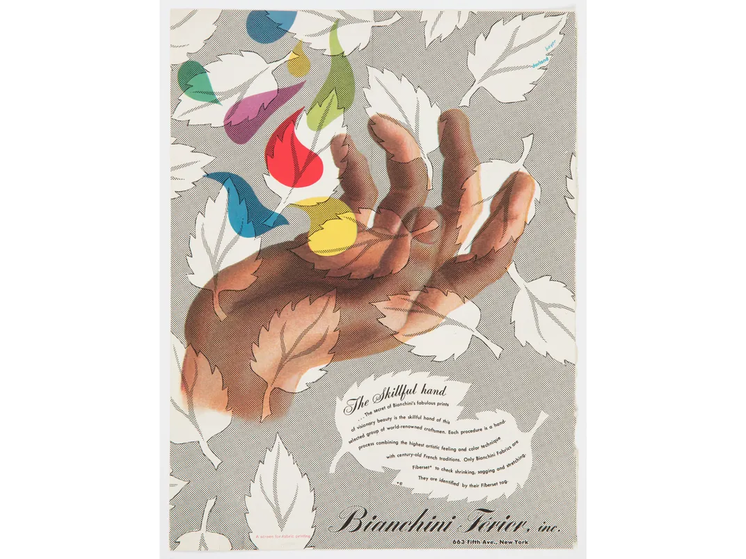
Bayer found success pursuing graphic work for German Vogue and was soon named its art director. When Vogue closed during the Depression, he joined the Dorland Advertising Agency, creating ads for fashion and textiles. We see a full-page ad for a hair dye that employs Sonia Delaunay-inspired swirls of color dancing above the head of a model.
He regularly took to his easel (he always called himself a painter first), but his strength was in graphic design. “He was serious about painting, but for whatever reason, he is not held in the same regard as Albers or Moholy-Nagy,” Lupton says. Asked why she didn’t include any Bayer paintings in the show, she points out that, “our collection is design-focused. We don’t actively collect in that area.”
In 1930 Gropius invited Bayer to collaborate on the design for the “Deutschen Werkbund” section of the Exposition de la Socíeté des Artistes Décorateurs at the Grand Palais in Paris. Bayer designed two of the five rooms, which presented German industrial design, modern furniture and commodities, especially works made at the Bauhaus. It was only one of the many international expositions he designed.
In cosmopolitan Berlin he learned about (and was greatly influenced by) Cubism and Surrealism. He loved how de Chirico and Magritte explored dreams and the subconscious and imitated them. After visiting Greece he freely borrowed from the antiquities he saw there for his advertising work. He used Praxiteles’ bust of Hermes to sell nose drops and Myron’s Discobolus to promote toothpaste.
Bayer, who was not Jewish and not a Nazi, accepted assignments from the Third Reich. We see a brochure for tourists attending the Olympics in Berlin in 1936, which includes a photomontage showing three men’s faces, in sepia, superimposed on a black and white photo of a massive rally of the National Socialists. The text reads: “The Fuhrer speaks to millions…” He went on to produce posters, brochures and official commissions for the government, despite the fact his wife was Jewish. (He later argued he had no choice.)
In 1937 he seems to have fallen out of political favor and lost work and income. He wanted to leave Germany. (He later said he was “appalled how blind” he had been to Nazism.)
But, again, he was in luck. In 1938, Alfred H. Barr, Jr., director of the Museum of Modern Art, asked Gropius to curate an exhibition on the Bauhaus. Gropius subcontracted the job to Bayer, who collected materials in Germany from former teachers and students, shipped it to New York, and then moved to Manhattan to write the catalogue and install the exhibition. His unusual layout scheme drew praise and the exhibition was a great success. It traveled across the country.
Bayer was soon “discovered” in New York. He designed two more landmark exhibitions for MoMA and created magazine covers for Harper’s Bazaar and Fortune. In 1939 he did a memorable lithograph for his client, the Schering pharmaceutical company, entitled “The Menstrual Cycle.”

“He was especially fascinated by bodily mechanisms, from the human eyeball to the female uterus,” Lupton writes. The brochure illustrates the cycle of a woman’s period, promoting hormone-based drugs to doctors to prescribe to treat discomfort and irregularity.
It is a striking image. “He painted the illustration with gouache,” Lupton continues. “The black background evokes the night sky, and tiny moons in each quarter compare the female cycle to the lunar orbit. Thin lines radiate from the center of the womb, counting out the 28 days of the menstrual cycle.”
Bayer became the chief art director for the John Wanamaker Department Store in 1941. Three years later, he joined the J. Walter Thompson Advertising Agency, divorced his wife and married his second wife, Joella Haweis Levy. She was the daughter of the poet and Dada artist Mina Loy and first wife of influential New York art dealer Julien Levy.
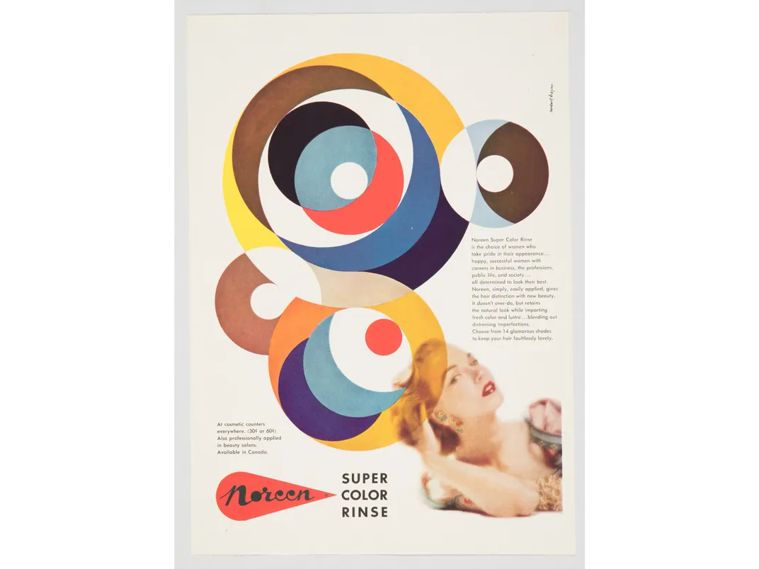
Bayer was a pioneer in eliminating prose in ads, to give the pictures and graphics more impact. He is quoted, in 1939, as saying: “Why is it difficult to be simple?”
“He sought to pare every composition to its essential, with a strong unified image replacing any overstated narrative, no matter how informative it might be,” Gwen Chanzit writes in her definitive 2005 book Herbert Bayer and Modernist Design in America. “What Bayer accomplished in America was the introduction of new design principles into everyday use.”
In the early 1940s Walter Paepcke, chairman of the Chicago-based Container Corporation of America (CCA), asked Bayer to oversee all its design work, from interiors to exhibitions to graphics. The show includes some of the strikingly modern ads he created for CCA.
In 1946 Paepcke asked Bayer to move to Aspen to design a cultural retreat for business executives, intellectuals and music lovers. (The show includes his colorful ski posters for Aspen.)
After less than a decade in America, Bayer was able to realize the Bauhaus ideal of total design in creating the architecture, interiors, graphics and even the landscape of the Aspen Institute of Humanistic Studies. He designed the seminar building, hotel complex, health center, music tent, outdoor sculptures, wall murals, the graphics, even a Noguchi-like park.
Would he have been more famous if he had remained in New York? “It is possible,” Lupton says, “but the work he did in Aspen is truly unique. He had an opportunity there to shape an entire town, which wouldn’t have happened in New York.”
In Daniel Libeskind’s foreword to Chanzit’s book on Bayer, he writes that Bayer did “to 2-D graphic and design work what Mies van der Rohe did to architecture.”
In 1975, for health reasons, Bayer and his wife moved to Montecito, California, where he continued to paint. He died in 1985; she, in 2004, leaving his art and archive to the Denver Art Museum.
Last October Aspen philanthropists Lynda and Stewart Resnick donated $10 million to the Aspen Institute for a center dedicated to Bayer.
“Herbert Bayer: Bauhaus Master,” curated by Ellen Lupton, is on view at the Cooper Hewitt Smithsonian Design Museum in New York City through April 5, 2020.
/https://tf-cmsv2-smithsonianmag-media.s3.amazonaws.com/accounts/headshot/wendy_new-1.jpeg)