A Tribute to a Great Artist: Steve Jobs
Through mastering calligraphy in college, Jobs learned to think like an artist
/https://tf-cmsv2-smithsonianmag-media.s3.amazonaws.com/filer/Steve-Jobs-Macintosh-typography-631.jpg)
Steve Jobs, who died October 5 after resigning in August as CEO of Apple, the company he co-founded, had many talents. But what set him apart from other computer wizards was his artistic sense. He continually used the word “taste” in explaining what was ready to be manufactured at Apple, and what wasn’t ready yet—what he had to reject. The Apple computer, the iPhone, the iPad and the iPod are all strikingly beautiful objects; the clarity of their visual design matches the way they function. It’s clear that Steve Jobs was an artist and that his artistry worked at many levels: it was a visual sensitivity that extended outward to a way of thinking about how things worked and how different variables could interact with each other in a pleasing harmony. Where did this ability come from?
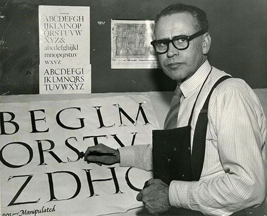
Jobs gave some credit for his success to a seemingly unlikely source—a course on calligraphy that he took as an undergraduate at Reed College, a course established by a maverick professor named Lloyd Reynolds and continued by Father Robert Palladino. In fact, Jobs was not the only “genius” to benefit from Reynolds’ teaching. Other notable students have included the poet Gary Snyder, the poet and Zen master Philip Whalen and the entrepreneur Peter Norton of Norton Utilities, who became a major patron of contemporary art.
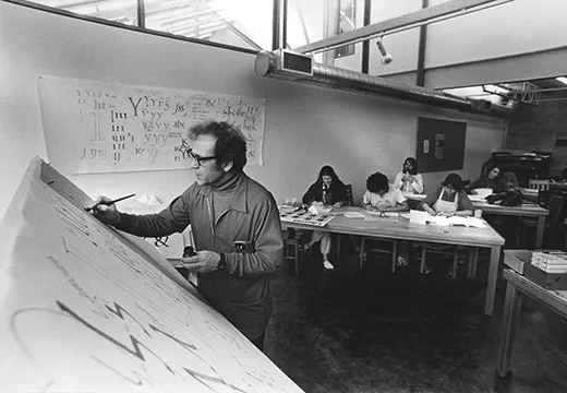
Reynolds began teaching calligraphy at Reed College in 1938 as a no-credit course (it became full-credit in 1948) on the third floor of a building that had just been vacated by the chemistry department. Reynolds’ art credentials were almost nonexistent; he had actually gone to Reed to teach in the English department. His interest in calligraphy went back to 1924, when he had worked briefly for a greeting card and sign company, and largely through self-teaching he had become one of the masters of the art. Reynolds’ calligraphy class eluded simple description. It focused on mastering a hand skill—writing letters—and for that reason was always viewed with suspicion by the rest of the college faculty, since it seemed to them more like calisthenics or lessons in ballroom dancing than a college-level course that involved thinking. But for Reynolds, the skill of writing letters was all-embracing and mystical, and it took thought. To do it properly required a total understanding of the art and culture that gave rise to particular modes of writing. As one of his students, the type-designer Chuck Bigelow, has explained, in summarizing Reynolds’ teachings:
“When you write in an italic hand, you are making the same kinds of motions that Queen Elizabeth I made when she practiced Chancery Cursive as a teenager; the same motions as Poggio Bracciolini, a fifteenth-century chancellor of Florence; the same motions as Michelangelo. And if you write in a Carolingian hand, you are making the same moves as the notable scribes that Charlemagne assembled in his court in the late eighth century: Alcuin of York, Peter of Pisa, Theodulf the Visigoth, Paul the deacon, and Dungal the Irishman.”
Consequently, as Todd Schwartz has commented, in an excellent article about Reynolds in the Reed Alumni Magazine: “Reynolds’s classes were never simply about the thing—they were about everything.” Reynolds’ three greatest enthusiasms were the “Three Bills”: William Blake, the poet and painter of mystical visions; William Morris, the master of Arts and Crafts; and William Shakespeare. But his enthusiasm for “The Big Three” was mixed in with religious interests—he was fascinated by Zen Buddhism—and also tied into leftist politics of some sort: he was once called up in front of the Committee for the Investigation of Un-American Activities.
Learning to write well, for Reynolds, was a key to achieving a mystical, spiritual harmony with the universe as well as to attaining such social goals as ending poverty and racism and achieving world peace. As the graphic designer Michael McPherson, who studied with him, recalls: “He’d jump from Michelangelo to William Blake to Zen Buddhism effortlessly, and it all made sense.” In essence, Reynolds was encouraging his students to think about what’s good and significant and why, in a way that cut across the traditional boundaries between academic fields: to learn to exercise good taste. It was a mode of thinking that would profoundly influence Jobs, who provided us with an interesting definition of taste: “Taste is trying to expose yourself to the best things humans have done and then trying to bring those things into what you are doing.”
But Reynolds’ very successes—huge student attendance, teaching and art awards, even a television show—also attracted enemies, who viewed all this hoopla as proof that what he was doing wasn’t academically rigorous. Each year he had to do battle for the survival of his class against an ever-growing coalition of enemies. Reynolds bowed out when his wife became terminally ill. To continue his legacy he chose a singularly spiritual figure, a former Trappist monk and monastery scribe, Father Robert Palladino, under whose benevolent care calligraphy remained the most popular elective offering at Reed. But Palladino, who had spent much of his life under a vow of silence, had no grasp of how to handle faculty politics and faculty arguments. In 1984, six years after Reynolds’ death, the art department pulled the plug on the calligraphy class, ostensibly because it didn’t fit with the new mission of focusing entirely on “modern art.”
Though seemingly irrational, this pattern of faculty politics is familiar to anyone who has worked in a university. It comes from a love of following the regulations, and inventing new regulations if old ones aren’t already in place, to make teaching tidy, measurable and predictable. The philosopher Plato, who viewed artists as dangerous renegades, wanted to banish them from his ideal Republic, and real artists seem to always exist with the threat of banishment hovering over them—or worse. When the course on calligraphy was eliminated, Reed College was diminished. “There was never another course quite like that,” one of Reynolds’ former students, Georgianna Greenwood, has commented.
Jobs and Calligraphy
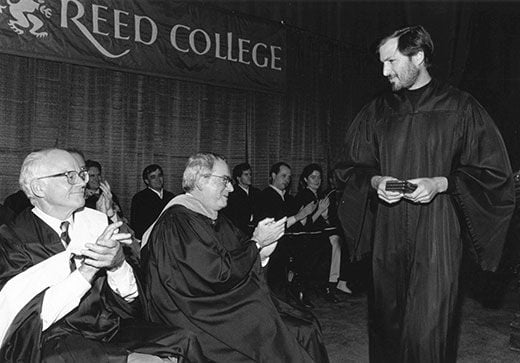
Jobs entered Reed in 1972 and dropped out after six months. But he continued to audit classes for another year, while sleeping on the floor of friends’ rooms, collecting Coke bottles for survival money and getting free meals at the local Hare Krishna temple. The most inspiring classes were calligraphy. As Jobs recalled in his 2005 Stanford commencement address:
“Reed College at that time offered perhaps the best calligraphy instruction in the country. … I learned about serif and san serif typefaces, about varying the amount of space between different letter combinations, about what makes great typography great. It was beautiful, historical, artistically subtle in a way that science can’t capture, and I found it fascinating.”
“None of this had even a hope of any practical application in my life. But ten years later, when we were designing the first Macintosh computer, it all came back to me. And we designed it all into the Mac. It was the first computer with beautiful typography.”
From this statement, it’s clear that the stylish graphics we now take for granted on computers might never have taken hold without the calligraphy class. Indeed, Jobs made comments about this many times. For some reason, it’s a thing in which he took particular pride. But I’d like to propose that what Jobs learned from studying calligraphy went deeper than nice typography.
Typography is a peculiar art, which operates with unusually tight restraints, but is also amazingly free. The basic forms of the letters have stayed pretty much the same for centuries, and the order in which they go is generally fixed by the text. But within those seemingly rigid parameters there’s room for seemingly endless variations of shape and spacing, of shifts from delicate to bold, and of many other things. Seemingly modest changes can completely change the overall effect for good or ill, and can make the letters trigger entirely different emotions. There’s even a bit of time travel involved, since different letter forms evoke different historical periods. Most of all a great piece of typography needs to work as an ensemble. One wrong mark can throw off the entire effect. And a little accent can sometimes lift something that’s harmonious but dull to the level of a masterpiece.
Visual thinking has properties that are a little different from thinking in language. One of its most attractive qualities is that it encourages us to move out of a strictly linear sequence and to take in many variables at once, including variables that are mobile and that exist in shifting configurations. By developing mastery of typography, Jobs developed mastery of design: the ability to think about how hundreds of different variables can coalesce to create a harmonious effect that seems “perfect.” This is the skill that he practiced at Apple, transposing it from the realm of letter forms to that of product design. Jobs explained in an interview with Businessweek in 2004: “Lots of companies have tons of great engineers and smart people. But ultimately, there needs to be some gravitational force that pulls it all together. Otherwise you can get great pieces of technology all floating around the universe.”
What pulls it all together, of course, is art. As the great architect Alvar Aalto once stated: “Nearly every design task involves tens, often hundreds, sometimes thousands of different contradictory elements, which are forced into a functional harmony only by man’s will. This harmony cannot be achieved by any other means than those of art.”
Significantly, Jobs always thought of himself not as a manager but as a leader—an artistic visionary. After the fashion of a great artist, Jobs ultimately based his decisions not on the recommendations of committees or focus groups but on his own intuition—often on factors not easily expressed or analyzed in words. Perhaps most important, at some level, his mastery of visual skills was transposed to another level as well. Visual harmony became a sort of metaphor for what happens when everything works well together: when at a glance we can instantly understand a large field of variables, and see that everything coordinates with everything else and they all work together with a unified purpose.
In short, through mastering calligraphy, Jobs learned to think like an artist. It became the skill that separated him from other computer geniuses and business leaders. It enabled him to move out ahead of the pack, to build out of almost nothing one of the world’s largest corporations and to revolutionize modern life. We usually think of art as essentially a recreational activity: as something that stands apart from the serious business of life. But art does matter. When all is said and done, it’s the thing that makes it possible to have a world that holds together and is beautiful and makes sense.
Genius can never be reduced to a single trick. But let’s take note of the fact that one of the keys to Jobs’ success, to all that he achieved, is that, years ago, at the outset of his amazing career, he took a controversial and inspiring art class.
(Editor's Note, October 7, 2011: We have changed this article from its original version to clarify two errors in the description of Reynolds' and Palladino's careers at Reed College.)
/https://tf-cmsv2-smithsonianmag-media.s3.amazonaws.com/accounts/headshot/henry-adams-240.jpg)


/https://tf-cmsv2-smithsonianmag-media.s3.amazonaws.com/accounts/headshot/henry-adams-240.jpg)