Ansel Adams in Color
As a new book shows, not everything in the photographer’s philosophy was black and white
/https://tf-cmsv2-smithsonianmag-media.s3.amazonaws.com/filer/Ansel-Adams-Sunrise-Death-Valley-631.jpg)
Ansel Adams never made up his mind about color photography. Long before his death in 1984 at age 82, he foresaw that this "beguiling medium" might one day replace his cherished black and white. In notes tentatively dated to 1949, he observed that "color photography is rapidly becoming of major importance."
Yet he once likened working in color to playing an out-of-tune piano. America's regnant Western landscape photographer tried to control every step of picture-making, but for much of his lifetime too many stages of the color process were out of his hands. Kodachrome—the first mass-market color film, introduced in 1935—was so complicated that even Adams, a darkroom wizard, had to rely on labs to develop it. Color printing was a crapshoot in the 1940s and '50s. Reproductions in magazines and books could be garish or out of register. Before the 1960s, black-and-white film often actually yielded subtler, less exaggerated pictures of reality.
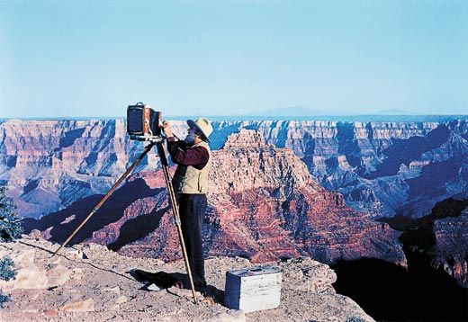
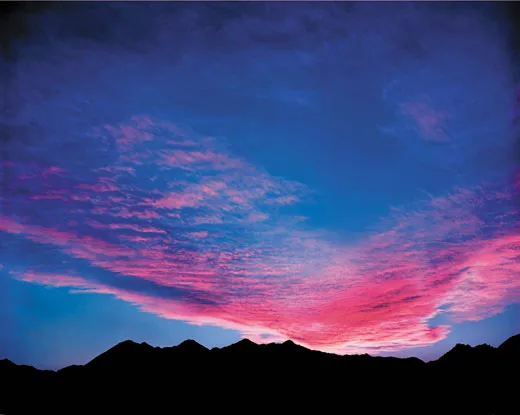
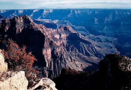
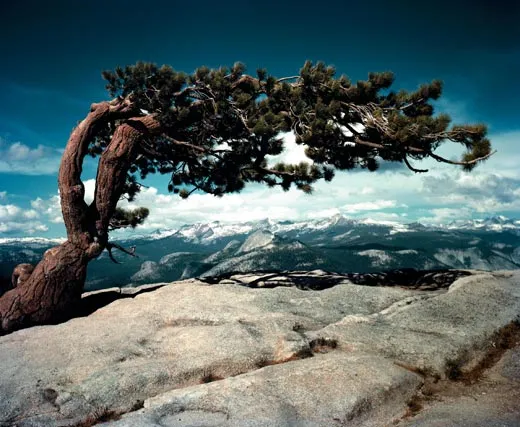
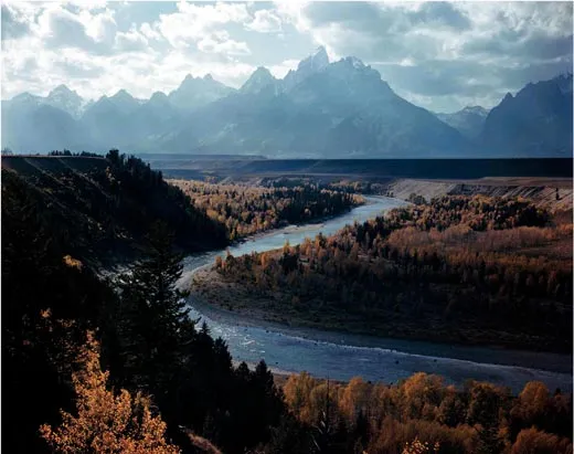
Still, Adams' misgivings did not prevent him from taking hundreds of color transparencies. As he traveled the country on commercial assignments or on Guggenheim Fellowships—a project to celebrate the national parks—he often took pictures in color as well as black and white. A generous selection of these Kodachromes, most created between 1946 and 1948, appears in a new book, Ansel Adams in Color, revised and expanded from the 1993 edition, with laser scans that might have met even his finicky standards.
American motorists of a certain age may have seen some of the images without knowing they were his. The Standard Oil Company (or Esso, a precursor of Exxon) purchased reproduction rights to a number of them to promote driving in America. If you filled up your tank at a Standard Oil gas station in 1947 or 1948, you might have been given an Adams picture—Crater Lake, say, or White Sands—as part of a series the company called "See Your West."
Anyone who walked through Grand Central Terminal in New York City around that time may recall seeing Adams' color work in a more imposing form. His photographs were among those that sparkled in the station's Kodak Coloramas, gigantic transparencies 18 feet high and 60 feet wide that loomed above the commuting throngs in the main concourse. Adams judged these (correctly) to be "aesthetically inconsequential but technically remarkable."
He shot in color because advertisers and corporations liked to present themselves in color, and he liked the money they offered him; by 1935, he had a wife and two children to support. Work in this mode also may have allowed him to keep a sharp psychological distinction between those lucrative jobs and his more personal black-and-white oeuvre, for which he alone was to blame in case of failure.
But almost any technical photographic challenge interested him. He served as a longtime consultant for both Eastman Kodak and Polaroid, and the quest for true and reliable color obsessed both companies for decades. Adams wrote numerous articles for popular magazines on problems with the medium, often touching on philosophical issues. "There is an inevitable conflict between the photometric accuracy of the real color film and the subjective emotional effects of colors in relation to each other," he wrote in a 1949 draft of one article.
The slow speed of early Kodachrome did not allow much beyond portraits, still lifes and landscapes. Stopping action was generally out of the question. To combat the static quality that hobbled photographers who used color during this period, Adams came up with a solution that would become standard: the multimedia slide show. For the journal Photo Notes, he wrote—in 1950!—"possibly one of the most important aspects of the medium would be revealed in the production of 35 mm or 2 1/4 x 2 1/4 slides which would be used in carefully planned projected sequences, using sound track for comment or music."
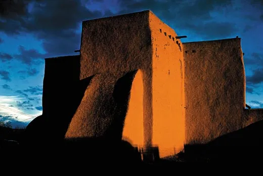
The images from the '40s and '50s in the new edition reveal how his approach to a subject changed (or didn't) according to the film he loaded in his camera. He had photographed the Ranchos de Taos church in New Mexico many times in austere black and white. (Taos Pueblo was the subject of his 1930 book collaboration with writer Mary Austin.) But his 1948 color photograph of the building at sunset rendered the adobe walls and the sky behind as if in throbbing slabs of pastel crayon.
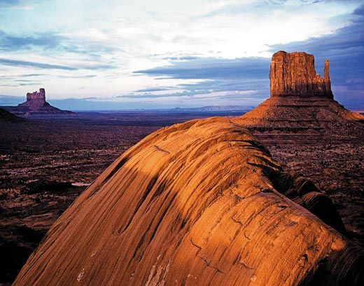
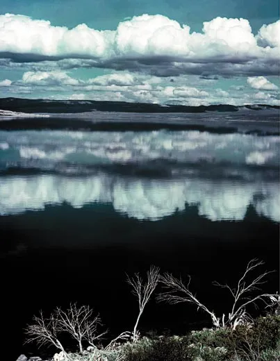
This expressionist approach to color differs markedly from the nearly monochrome view of Mono Lake in California, from 1947, which is similar to many of his studies of clouds mirrored in water. In a class of its own is his view of Utah's Monument Valley circa 1950, in which he captured the warmth of the sun on the dusty sandstone amid long shadows. The photograph is more about transience, atmosphere and time immemorial than bands of color, and it's one of the finest color pictures he ever made.
Adams thought enough of some of his color photographs to exhibit a selection of prints from his transparencies at the Museum of Modern Art in New York City in 1950. The fifth volume in his magisterial series on photographic techniques was to be devoted to color, but he died before getting to it.
Critical acclaim for the color photographers who came of age in the 1970s baffled Adams (and, to be fair, many others). He thought it was outrageous that the Museum of Modern Art gave William Eggleston a solo exhibition in 1976. Eggleston's generation certainly benefited from advances in film sensitivity, but younger photographers also composed in color with an ease unknown to Adams. The subjects they gravitated toward—suburban anomie, roadside trash—were equally foreign to him.
"I can get—for me—a far greater sense of ‘color' through a well-planned and executed black-and-white image than I have ever achieved with color photography," he wrote in 1967. For Adams, who could translate sunlight's blinding spectrum into binary code perhaps more acutely than anyone before or since, there was an "infinite scale of values" in monochrome. Color was mere reality, the lumpy world given for everyone to look at, before artists began the difficult and honorable job of trying to perfect it in shades of gray.
Richard B. Woodward is a New York City-based arts critic.
