Copyright Confection: The Distinctive Topography of the Hershey Bar
After a legal tug-of-war, Hershey’s secured a trademark for the structural design of their classic chocolate bar
/https://tf-cmsv2-smithsonianmag-media.s3.amazonaws.com/filer/1e/dc/1edc7448-12e4-4db4-8fbd-15296d296623/hershey_chocolatev2.jpg)
After many years of apartment living, I finally live in a house where, on October 31, real, live trick-or-treaters will come knocking on my door. Preparing for this thrilling event has so far involved gluing paper grins onto paper skulls, debating whether a kabocha squash can be a jack-o-lantern, and searching Amazon UK for candy options more unique than the kinds that line the aisles of Walgreens. I was aiming for Cadbury or Ritter Sport, but realized toddlers dressed as action figures will probably not appreciate the extra effort (and expense), so a giant bag of Hershey's miniatures is now en route to my house.
In the process of all this internet searching for particular species of candy, I discovered something of interest to design thinkers: The plain, boring, classic Hershey bar that I'd gone to great lengths to avoid buying is perhaps not as generic as it seems—at least not in legal terms. Earlier this year, Hershey Chocolate and Confectionary Corporation won a battle with the U.S. Patent and Trademark Office to legally protect the physical design of their bar. This, I learned, is not an easy thing to do.

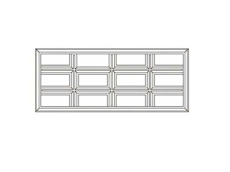
Anyone who has bought a stack of Hershey bars for a fireside smores binge knows that the 12-rectangle grid is great for snapping off just the right size chunk to match up with the perforated platform of a graham cracker. In other words, its scored surface is highly functional. But functionality is explicitly not a qualifying feature when registering a product design for a trademark. The USPTO originally refused the Hershey’s application, citing the little lines that make the bar snappable as being characteristic of many brands of chocolate
In order to appeal, Hershey’s had to go back and prove that its ridges and troughs went beyond utility, and that chocolate consumers had come to associate the design itself as an intrinsic feature of a Hershey bar, even in the absence of the brand name. And they succeeded.
According to a report by the law firm Baker Donelson, the candy maker sought protection for twelve equally-sized recessed rectangular panels arranged in a four panel by three panel format with each panel having its own raised border within a large rectangle, and while the individual design elements alone were insufficient to garner trademark protection on the grounds that each element is merely a functional configuration of the candy bar, the TTAB ruled that the combination of the design features entitled the candy maker to registered trademark protection.
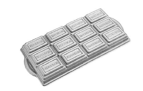
Perhaps their best piece of evidence came inadvertently through cookware retailer Williams-Sonoma, who had started marketing a brownie pan in the shape of a Hershey bar, featuring the word chocolate in each rectangular segment where normally “Hershey” would appear. They did Hershey a solid, demonstrating their faith that consumers would think of the stalwart brand simply by seeing that 12-cell grid.

The next logical question might be: Who cares? Well, for product designers and producers of any consumer good, Hershey’s attainment of a trademark for their candy bar’s physical structure sets an interesting precedent. It has long been difficult for companies to trademark product designs when the notable features are essential to the object’s function. Hershey’s relied on very subtle nuances in their design, as well as more than a century of established brand recognition, to sidestep the argument that segmenting their bars was a utilitarian move. For designers creating a new product inspired by a classic, the case is also a cautionary tale.
So this Halloween, as you pop pieces of candy between costumed visitors, or steal the good stuff from your kid’s plastic pumpkin, think about the design of the confections you gravitate towards, and whether the architecture of your chocolate bar influences how much you enjoy it.
/https://tf-cmsv2-smithsonianmag-media.s3.amazonaws.com/accounts/headshot/sarah-rich-240.jpg)
/https://tf-cmsv2-smithsonianmag-media.s3.amazonaws.com/accounts/headshot/sarah-rich-240.jpg)