Postmodernism’s New Typography
In an act of rebellion against the prevailing Sans serif aesthetic, designers looked to celebrate creativity in their digital fonts
/https://tf-cmsv2-smithsonianmag-media.s3.amazonaws.com/filer/Typography-631.jpg)
Designed by Marian Bantjes (Canadian, b. 1963)
Booklet designed by Rick Valicenti (American, b. 1951) and Gina Garza (American, b. 1979) Matt Flynn
In today’s digital world, most words we read reach us via computer, television or smartphone. Even hardcover books are designed with the help of digital technology. Typographers have meticulously sculpted each individual letter, whether on the page or the computer screen, all with the help of copious mouse clicking.
It wasn’t always this way. Through the early 1960s, before the advent of digital technology, typographers used metal type, often hand drawing on graph paper and using photocopiers or ink transfer to create typefonts. From the end of World War I until the 1960s, “Sans serif” fonts, distinguished by their lack of feet, or “serifs” on the ends of each letter, ruled typography’s proverbial roost. Sans serif fonts had existed as early as William Caslon’s 1816 “English Egyptian” type, a round, simple lettering that faded into obscurity almost as soon as it was invented. In the wake of World War I, typographers connected to the German-based Bauhaus design school found aesthetic value in utilitarianism over artifice and adornment.
“The prevailing philosophy of typography at the time was to show letters in their most pure form,” says Gail Davidson, curator of an installation on digital type currently on display at the Smithsonian’s Cooper-Hewitt National Design Museum in New York City.
Sans serifs epitomized the “form follows function” approach that characterized modernism. Clean, crisp and to the point, they let the information do all the talking. But by the mid-1960s, a small group of typographers, who felt more stifled than liberated by the entrenched modernist ideology, started a new movement in which the designer’s hand figured prominently in each and every letter. “Revolution might be too strong,” says Davidson, “but they certainly reacted against the hard and fast rules of modernism, respecting designers’ creative abilities.”
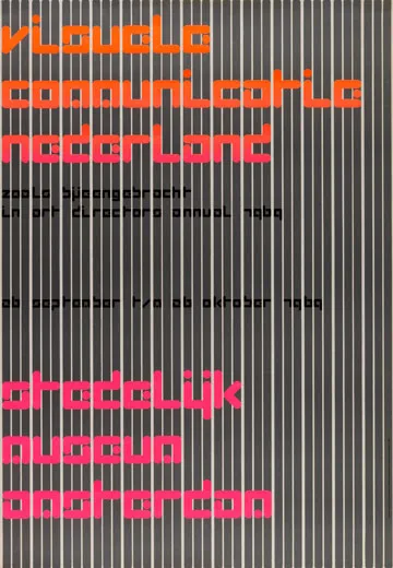
Coinciding with this stylistic break were major advances in digital technology. Dutch designer Wim Crouwel was at the forefront of the movement with his 1969 “Visuele Communicatie Nederland, Stedelijk Museum Amsterdam,” one of five posters featured in the Cooper Hewitt’s installation. At the time, computer imaging, then in its infancy, used a dotted matrix to create images. This raised the question of how computers could represent the sharp edges of certain fonts. Crouwel’s poster makes the issue explicit through lettering comprised of fluorescent pink dots. Each letter has rounded edges; set off against a barcode-like grid (“gridnik” was Crouwel’s reported nickname), the lettering was a startling departure from the modernist code and set a precedent for new typography.
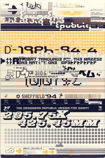
With the emergence of the Apple Macintosh in the mid-1980s, the first computer design software—Fontographer (1986), QuarkXPresss (1986) and Adobe Illustrator (1986-87)—entered the picture. The avant-garde, San Francisco-based Emigre magazine published by Dutch-born Rudy Vanderlans and his wife, Czechoslovakian-born art director Zuzana Licko, was one of the first journals created on Macintosh computers. The Cooper-Hewitt has a 1994 cover of the magazine designed by Ian Anderson for the Designers Republic (or tDR), a firm Davidson calls “deliberately contrarian,” that was primarily interested in breaking with modern type.
The cover features black shadowing on the numbers, as well as a creative use of overlapping and fragmenting numbers and letters. The images and lettering are “loud and blaring, not neat and crisp,” says Davidson. Here, she says, “the onus is on the reader to stretch their visual literacy to understand the designers.” Emigre folded in 2005, but this issue, which was dedicated entirely to tDR, remains the magazine’s bestseller.
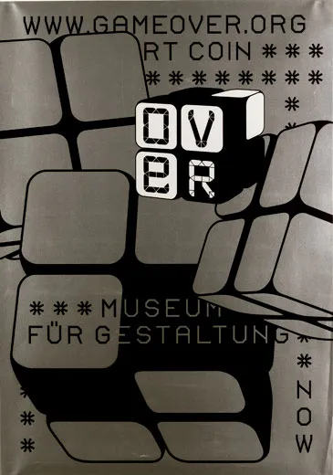
Game Over, a poster created by Swiss designers Cornel Windlin and Gilles Gavillet for an exhibit on computer games, displays two different typefaces made using computer game design software. As if reinterpreting Crouwel’s grid-based experiment of the 1960s, the poster contains the word “OVER” on the face of a die divided into four cells. Each cell contains one letter of the word, forming what looks like a grid out of the word. Windlin completed the entire design on the computer, without so much as a preliminary hand-drawn sketch. The computer not only served him in a methodological sense, but also as a source of direct inspiration.
Other designers use computer software to perfect ornate hand drawings that appear far removed from the digital world. The Cooper-Hewitt has a 2006 booklet published by the Fox River paper company, that is ornamented with finely drawn, intricate black designs that resemble black lace on white paper. Its designer Marian Bantjes is one of a growing group of designers interested in what author Steven Heller calls “new ornamental type.” In this instance, she drew the flowery designs by hand and then used the computer to trace and replicate them in a modular pattern.
“There are times when I think I can take a shortcut, and work directly on the computer, and there’s maybe one or two times when that’s been successful for something very specific,” says Bantjes. “But usually, I find that it somehow controls the way I think, and I can’t articulate how it’s affecting me but I do know it’s affecting me. It causes me to make strange decisions.”
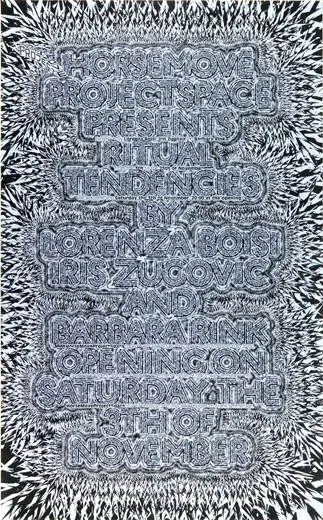
HorseProjectSpace Presents: Ritual Tendencies (2007), the most recent work in the Cooper-Hewitt installation, represents a camp of more “machine oriented” designers. The poster pointedly obscures words in a sharp geometric design that resembles jagged crystal. The words meld into its crags, their meanings eclipsed by the poster’s dynamism.
Davidson believes that no matter what, “Typography conveys meaning. The kinds of letters that you use say something about what you’re trying to project. They can portray hipness, they can portray authority, they can convey playfulness, they can convey power.”
“Of course,” says Davidson, “the early modernists thought that they were being objective in their pairing down of the type so that it looked neutral, but in fact it wasn’t. It was an expression of modernists.” Today’s digital typography, she says, is a response to the fallacy of objective design. At its core, she says, the movement—aided largely by the world of possibilities that digital technology affords—celebrates rather than restricts the designer.
/https://tf-cmsv2-smithsonianmag-media.s3.amazonaws.com/accounts/headshot/jess-righthand-240.jpg)


/https://tf-cmsv2-smithsonianmag-media.s3.amazonaws.com/accounts/headshot/jess-righthand-240.jpg)