How a Psychedelic Concert Poster Rocked the World
C’mon baby light my flier
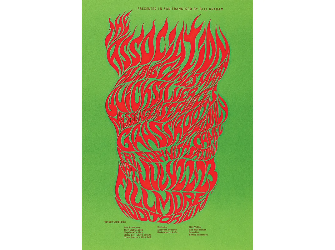
July 16, 1966, the Fillmore Auditorium, San Francisco. Jefferson Airplane and the Grateful Dead have just finished their sets, and as patrons shuffle to the exits they’re handed fliers for another concert, The Association and Quicksilver Messenger Service. The lettering on the 14- by 20-inch poster is a bright orange flame, electrifying, disorienting. Later Bill Graham, the Fillmore’s promoter, will head out on his Lambretta motor scooter to plaster the posters around the city, as has been his practice for the last few months.
More and more, though, he notices them disappearing. His advertisements have become coveted works of art.
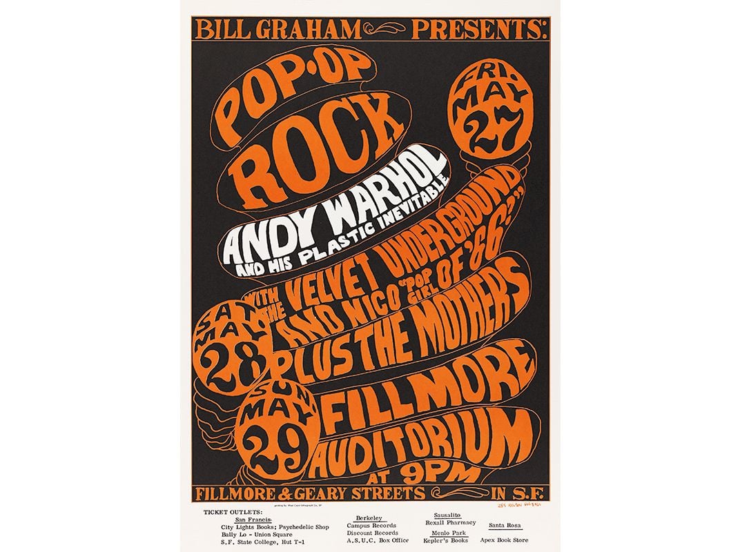
The psychedelic concert poster, with bubbled, flowing lettering and lava lamp colors, was invented by the man behind that now classic “Flames” flier, a local artist named Wes Wilson. Fifty years ago, as San Francisco transformed from a beatnik era of black and white to a hippie decade spiked with color, Wilson’s designs for concerts featuring bands such as Santana, Muddy Waters and even the Beatles became the signature style for America’s fomenting counterculture, as central to our comprehension of that era’s visual landscape as long hair, bell-bottoms and VW buses.
Wilson started working in a San Francisco print shop in 1965. The 28-year-old had little formal training but was inspired by the freedom of Art Nouveau’s sinuous shapes and the block-like lettering of Vienna Secessionist artists like Alfred Roller. “I started to see lettering as a form maker as well as a content of information,” recalls Wilson, who now lives in Missouri’s Western Ozarks. Early in 1966, Wilson made a few posters for Chet Helms, a force behind 1967’s “Summer of Love.” But it was when Wilson hooked up with Graham later that year that his style exploded. “Use all the space and put as much color in there as possible was kind of my feeling,” Wilson says.
It was a radical departure from the functional typography then in wide use, such as the clean, legible Swiss Style familiar on highway signs, which communicates information without passersby having to stop. Concert posters were typically utilitarian, with plain type and maybe a photo of the act. But Wilson’s hit you with the whole freak scene. His wild imagery offered a “slow leak of the information,” says Jennifer Dunlop Fletcher, curator at the San Francisco Museum of Modern Art. “You really have to stop and stare.” The museum will showcase nine of Wilson’s posters in an exhibition opening this month, “Typeface to Interface,” which covers graphic design from 1950 to the present.
Wilson created his posters at top speed. Graham needed to promote shows, and Wilson needed the paycheck. He created 40 for the Fillmore alone in 1966. Once other San Francisco poster artists—Victor Moscoso, Rick Griffin, Stanley “Mouse” Miller and Alton Kelley—began working in a similar vein, a 1967 Time magazine article dubbed the style “Nouveau Frisco,” and called Wilson its foremost practitioner. In 1968, Wilson won a National Endowment for the Arts grant for his contributions to American art.
But as the style he pioneered moved from the streets into museums and department stores, Wilson grew discontented by the commercial side of his work. He left the city for life on a farm, but he kept making art.
And his groovy style lives on. Nate Duval, who designs posters with a bold handcrafted aesthetic for bands like Wilco and the Black Keys, is inspired by the art of Wilson and his peers. “It was so loose and expressive yet had a commercial viability,” Duval says. “If you walked past it and it didn’t catch your eyes or make you want to stop and read it, then it wasn’t for you anyway.”

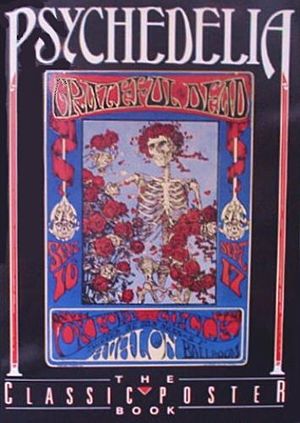
Psychedelia: The Classic Poster Book

