To Redesign a Design Museum Start with the Typeface
The Cooper Hewitt National Design Museum is renovating and rebranding with a tailor-made typeface
/https://tf-cmsv2-smithsonianmag-media.s3.amazonaws.com/filer/54/f7/54f77f8e-ed61-4f81-be41-b252db4ba3e0/cooper-hewit.jpg)
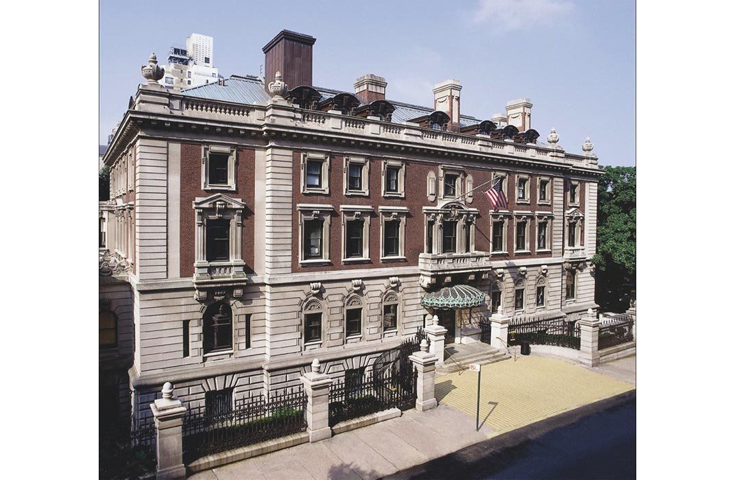
The Cooper Hewitt, Smithsonian Design Museum in New York City is the only museum in the United States devoted exclusively to design. It was founded in 1897 by the Cooper/Hewitt family as part of the Cooper Union for the Advancement of the Science and Art and became a part of the Smithsonian in 1967. The institution has a collection of more than 200,000 items, houses an amazing design library, offers educational programs, and sponsors the National Design Awards. It is the foremost authority on design in the country but was long overdue for a makeover. Later this year, the museum will reopen with a new identity befitting the nation's preeminent repository of good design but their relaunch has already started online with a new website and a tailor-made typeface.

Now going by the shorthand "Cooper Hewitt" (and having eschewed the previous long-winded title of Cooper-Hewitt, National Design Museum, Smithsonian Institution), the museum opens its doors this December after an extensive three-year renovation and restoration of the landmarked turn-of-the-century Fifth Avenue mansion, formerly the residence of Andrew Carnegie, that it has called home since 1976. The renovation preserves the historic character of the building while transforming it into a 21st-century museum with 60 percent more exhibition space, which they’ll need for a new focus on interactive exhibitions. The new exhibition experience is driven by a digital pen that museum patrons can use to collect information, which they can download later at home, thereby transforming museum visitors into museum users. Plus, the data could help curators improve their collecting and exhibition strategies.

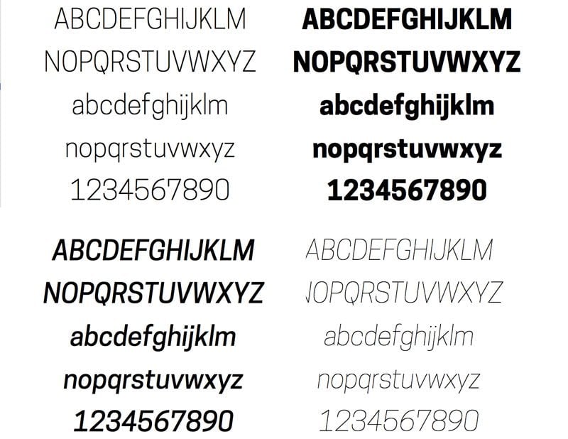
Holding everything together is a new identity, independent of the Smithsonian brand, designed by Pentagram. The firm commissioned Chester Jenkins of the design co-op Village to create an all-purpose, eponymous typeface for the museum. Jenkins’s design is based on a modified version of his typeface "Polaris Condensed" -- an appropriate name for a typeface that is guiding the museum's relaunch -- that has been completely redrawn and expanded to fit the needs of the growing Cooper Hewitt. "We're looking at everything we do from how you enter the museum to how you read about the museum to the identity and the mark," says Cooper Hewitt director Caroline Baumann. "We really wanted to shake things up."
In New York, there’s a strong precedent for the custom museum typefaces. In 1996, the Whitney Museum of American Art museum commissioned their own typeface from Hoefler & Frere-Jones to be "clear for signage, compact for print." Sadly, during their own recent rebranding, Whitney abandoned both their distinctive typeface for a new Helvetica-like lettering and, soon, will also abandon their distinctive building designed by famed Modernist Marcel Breuer for a steel art shed that looks like a Futurist power plant. But I digress.

Known simply as Cooper Hewitt, the new typeface is strong, simple and versatile, making it “clear for signage, compact for print” and optimized for digital media. It's also one of the first objects in the museum's new collection of digital objects, which also includes road sign font Clearview, the 3D printed urn "Tall Green Bloom," and the app Planetary. But the best thing about Cooper Hewitt (the typeface) is that the museum is giving it away for free. The Cooper Hewitt typeface is an open licensed font free for anyone to download, use, or modify on their own and so far, it's been downloaded more than 4,000 times.
Distributing s professionally designed typeface is a bold, and perhaps even contentious move, but one that reinforces the museum's mission to advance the public understanding of design. As Baumann recently said, "We’re all about giving the public access to great design—to our collection online, to our typeface, to our programs—and this was a natural step for us.” The Cooper Hewitt is even working on ways to exhibit how people are using the typeface as part of a larger initiative that will open up the museum with competitions and exhibitions involving young and unknown designers. "We are America's design museum and we want to share our gems and emphasize our vision to educate, inspire, and empower people through design," Baumann told me. "And how better to do that than saying to people, 'take our resources, learn from them, be inspired'....I can't wait to see what people do with the font."
The new and improved Cooper Hewitt doesn't open until December, but their new website is up now and filled with enough amazing content to keep you busy until then.
/https://tf-cmsv2-smithsonianmag-media.s3.amazonaws.com/accounts/headshot/Jimmy-Stamp-240.jpg)
/https://tf-cmsv2-smithsonianmag-media.s3.amazonaws.com/accounts/headshot/Jimmy-Stamp-240.jpg)