How Milton Glaser Came to Design the Iconic Poster of Bob Dylan
The 1966 illustration of the folk-rock icon captured the psychadelic dazzle of the flower-power era
/https://tf-cmsv2-smithsonianmag-media.s3.amazonaws.com/filer/Object-at-Hand-Dylan-poster-631.jpg)
In the art world, posters occupy a middle ground between paintings and advertisements in magazines and on billboards. But when well-known artists, including France’s Henri de Toulouse-Lautrec (1864-1901) and Italy’s Leonetto Cappiello (1875-1942), were commissioned to create promotional posters for everything from Paris’ legendary Moulin Rouge music hall to men’s hats, they trans-formed the poster into a sought-after collectible.
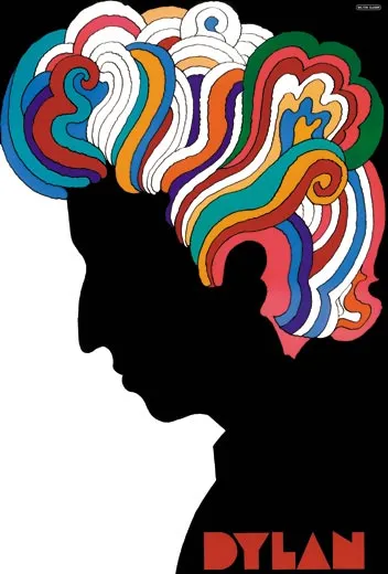
The high renaissance for the form came in the 1920s in Europe, where the fusion of graphic design and illustrative art brightened the streets of Paris, London and Milan. Aside from billboards and movie posters, advertising posters were never quite as important, or as ubiquitous, in the United States. The rise of rock ’n’ roll in the 1960s, however, generated a particular genre of poster art in this country. Many of these flower-power-era artifacts today reside within the collections of the Smithsonian’s Cooper-Hewitt, National Design Museum in New York City. Among the most iconic—“a key item in any poster collection,” according to Gail Davidson, head of the museum’s department of drawings, prints and graphic design—is Milton Glaser’s 1966 image of singer Bob Dylan.
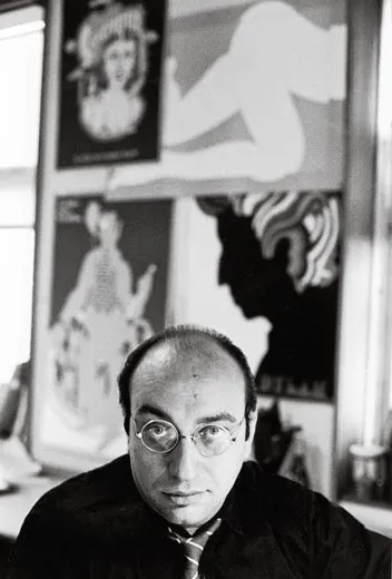
Glaser, who received a National Medal of Arts at a White House ceremony in February 2010, was just beginning his extraordinary career as an artist and graphic designer when he undertook the Dylan project. (A couple of years later, he and editor Clay Felker would found New York magazine.) John Berg, then art director at Columbia Records, asked Glaser to create a poster to be folded and packaged into Dylan’s “Greatest Hits” LP. Glaser, today one of this country’s most prolific poster artists, with more than 400 to his credit, was new to the form. “This was probably my third or fourth poster,” he recalls. It would become one of the most widely circulated of all time; six million or more were distributed with the enormously popular album.
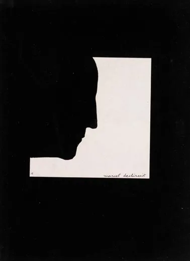
Depicting Dylan with kaleidoscopic hair, the Glaser poster has been described as “psychedelic” and is often associated with rock posters produced in San Francisco at the same time. But Glaser, who had studied in Italy on a Fulbright scholarship in the early 1950s, is a formalist with a broad awareness of artists and art movements, and he took his inspiration for the Dylan profile from a 1957 self-portrait by Marcel Duchamp. Though Glaser used a similar composition, the transformation of Dylan’s curly mane into a tangled rainbow was his own invention.
Glaser says he also tapped into an earlier art movement. “I was interested in Art Nouveau at the time,” he recalls. “That was an influence for the colors and shapes in the picture.” The contrast of vivid colors with the dark silhouetted profile reflects Glaser’s response to the Modernist “Less is more” dictum: “Just enough is more.” For the single word, “Dylan,” Glaser invented a typeface, one that he would use again on a poster for a Mahalia Jackson concert at Lincoln Center.
Despite the millions of distributed copies, the Dylan poster has become a hot collectible that sells for hundreds of dollars. (It has been reissued twice, but originals bear the telltale folds.) Luck played a role in the Cooper-Hewitt’s acquisition, according to Davidson. One of her museum colleagues was teaching a graphic-design course when a student came to class with a poster that she wanted to donate, Davidson recalls. “It was the Dylan poster, in good condition—with folds—and it had been willed to her boyfriend by his father.”
How does Glaser feel today about his most famous piece? “I would have redone the hair,” he says today. “It’s a little clumsy.”
Glaser has yet to share his opinion with his subject. On the day that the artist received his White House honors, another recipient was otherwise engaged: Bob Dylan.
Owen Edwards is a freelance writer and author of the book Elegant Solutions.
/https://tf-cmsv2-smithsonianmag-media.s3.amazonaws.com/accounts/headshot/Owen-Edwards-240.jpg)


/https://tf-cmsv2-smithsonianmag-media.s3.amazonaws.com/accounts/headshot/Owen-Edwards-240.jpg)