The 86-Year-Old Company that Still Designs Your In-Flight Experience
Seattle-based design firm Teague has designed every Boeing aircraft interior since the 1940s, from the post-WWII Stratocruiser to the 2009 Dreamliner
/https://tf-cmsv2-smithsonianmag-media.s3.amazonaws.com/filer/20120522113007strato_470.jpg)
While it’s nice that there’s no longer a social expectation to dress up for air travel, I sometimes sit in the airport watching the passing sea of sweatpants and think fondly of a time—even in my own childhood—when boarding a plane felt like a special occasion. Now it’s all about economy, efficiency, and maximizing dollars per square inch of cabin space. But in the 1940s, when Boeing approached a design firm called Teague to craft the interiors of their new Model 377 long-range airliner, the specs focused on luxury, spaciousness, and comfort.
The Boeing 377, aka the Stratocruiser, was part of an optimistic picture of the post-World War II lifestyle. Its body was modeled on the heavy duty B-29 Bomber, but the interior left utilitarianism behind, taking its cues from cruise ships. The Teague design team, headed by Frank Del Giudice, had 6,600 cubic feet to work with, but only needed to accommodate about 100 passengers in the massive space. This enabled them to include features like four-abreast seating and pull-out sleeping berths, which even today’s international first-class traveller would likely envy.
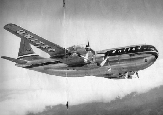
A Boeing Stratocruiser purchased by United Airlines (Boeing Magazine, 1949)
In Boeing Magazine‘s October 1949 issue, an article on the new aircraft declared, “The men behind the Stratocruisers set out to make passengers more than merely comfortable. They set out to coddle them.” Part of this involved extensive research in pursuit of an optimal seat design. And like so many stories of historic American design, this one has a thread that leads back to the Smithsonian. A set of skeletal drawings was supplied to Teague by the Smithsonian Institution (and if I ever find them, I will post them), providing the designers with anatomical data on which they could build, through user testing, toward a flexible chair that would accommodate many body types. The built-in light switch, call button, ashtray and writing table paved the way toward a seat that would meet most of a passenger’s basic needs when, half a century later, FAA regulations would essentially lead to in-row confinement from wheels-up to wheels-down.
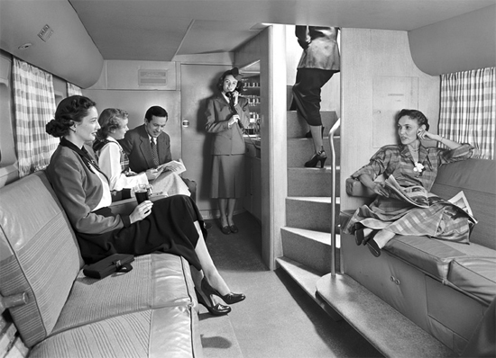
The spacious downstairs lounge of the Stratocruiser (image: Teague)
Of course, those early designers didn’t foresee air travel’s trajectory running away from freedom of movement. The best part of the Stratocruiser’s program was the in-flight lounge, a 14-person hang-out space housed in the belly of the plane, which was accessed via a space-saving spiral staircase. According to Teague’s current Vice President, Ken Dowd, passengers were encouraged to get up from their seats and wander downstairs. ”The early press called it ‘ambling space,’” Dowd explains, adding that the designers still try to achieve some version of this amenity. “Today we call it ‘destination space,’ but we have the same kinds of thoughts now as they did then: Giving passengers a chance to get up for a moment.”
That challenge doesn’t come merely from the pressure to keep passengers in their seats at all times. “An airline cabin is the most expensive real estate in the world,” says Dowd, “Our job is to think of ways to take spaces that aren’t used as much, like inside the galley, and create a destination where the passenger can enjoy a moment before being told to sit back down.”
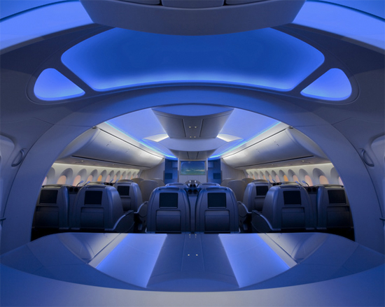
The vaulted interior of the Boeing 787 Dreamliner, illuminated with blue LED lights (image: Teague)
Their job is also to acknowledge that passengers will spend the majority of the flight in their seats, and to make that experience better. In the new Boeing 787 Dreamliner, which was also designed by Teague, strategic use of natural and LED lighting, as well as more efficient design of overhead space, mean travelers have a sense of spaciousness even while buckled in. “I like to say that every seat is a window seat on the Dreamliner,” Dowd gently boasts. Windows on the 787 are 65 percent larger than on a standard airplane, and mounted higher in the fuselage. Whereas normally the top of the window is flush with the seat, Dreamliner windows rise seven inches above it, so that even from the aisle, you can see out. The windows are also shade-free—embedded instead with an electrochromic material that takes the window itself from transparent to opaque.
“Sometimes today you’ll get on a plane and they do everything they can to keep you from realizing it’s an airplane,” Dowd laments, “We wanted to reconnect people to the magic of flight. We took an approach like architects have over time in designing the entrance to cathedrals. The modulation of space is what welcomes you in. You walk down the jetway, through a small door, and you’re immediately welcomed to a vaulted ceiling with LED lights that have a blue-sky effect. Everyone who walks onto our mock-up, their first words are ‘Wow.’ It gives everyone a wow feeling.”
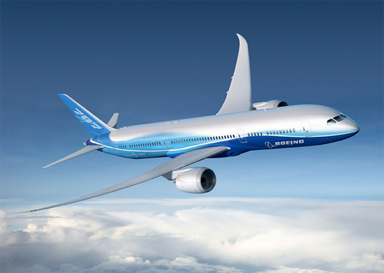
The Boeing 787 Dreamliner in flight (image: Teague)
The designers managed to preserve the soaring overhead line even with the addition of extra-roomy stowage bins. Instead of looming over the heads of seated passengers, they push up and away into the ceiling architecture. “Having enough bin space helps passengers’ anxiety,” Dowd points out. It also helps not to put in details that frustrate passengers, like bin latches that don’t seem to cooperate. “We looked at everything the passenger interfaces with, and made them more effective and human-centered,” he says, “The bin latch will open no matter what you do—you can pull out, push in, whatever you do, it opens. It’s a little engineering marvel that produces another ‘Wow’ moment.”
The integration of smart technology and remote control into the structure of the plane is of course a trick the designers lacked back in 1946. The LED scheme is programmed around the arc of a flight, start-to-finish. At boarding, the lights are luminous blue like a daytime sky. When dinner and drinks are served, the color and brightness shift into a soft, candlelight atmosphere. When it’s time for sleep, passengers experience a “deep blue sky effect,” which Down muses “is so much more restful compared to just having the lights out at night.” And in the morning, rather than shocking sleeping passengers by switching on bright lights, the LEDs come up gradually over a 20-minute period.
Though subtle, the extended light show can have a significant effect of the passenger’s overall sense of wellbeing and enjoyment during the flight. And that is what Teague was after. Their goal in designing the 787, they say, was “to make every flight as memorable as a passenger’s first.”
Amazingly, if your first flight was on a Boeing airliner, even if it occurred well after the high-roller heyday of midcentury air travel, it was an experience designed by Teague. Dowd says the 67-year continuous relationship between Boeing and Teague is one of the oldest business-to-business relationships in U.S. history. If you have a New Yorker subscription, it’s worth reading the 1934 profile of company founder Walter Dorwin Teague, whose early clients included Kodak and Ford, and who the article describes as someone who sought “to make living more attractive” (and who, at his country home in New Hampshire, would “sometimes discreetly nudist.”).
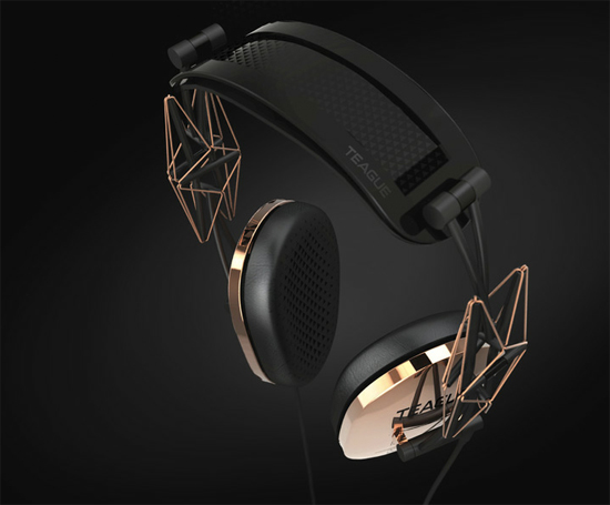
The 20/20 headphones, designed in 2012, inspired by Buckminster Fuller (image: Teague)
Teague’s principles foreshadow many ideas that are key in today’s design conversation, such as the importance of creating heirloom design, and the notion of aesthetic beauty as a natural outcome of a well-designed and functional object. He also presented ideas for a progressive housing typology that would counteract low-density sprawl by placing residents in stand-alone highrises surrounded by vast stretches of productive landscape—a vision that was later articulated by Frank Lloyd Wright. Teague’s own adaptability to cultural and technological change seems to be at the root of his company’s longevity. 52 years after Walter Dorwin Teague’s death, his disciples are hard at work designing the objects of this era—not only airline interiors, but also Xbox consoles and Buckminster Fuller-inspired headphones—under his legendary name.
/https://tf-cmsv2-smithsonianmag-media.s3.amazonaws.com/accounts/headshot/sarah-rich-240.jpg)
/https://tf-cmsv2-smithsonianmag-media.s3.amazonaws.com/accounts/headshot/sarah-rich-240.jpg)