The Architectural History of Pepsi-Cola, Part 1: The ‘Mad Men’ Years
In the 1960s, Pepsi rebranded with a new slogan, a new look, and a cutting edge modernist building
/https://tf-cmsv2-smithsonianmag-media.s3.amazonaws.com/filer/8f/09/8f09749c-cb9e-426a-8ce4-26adccdaeb70/0pepsi-nyc.jpg)
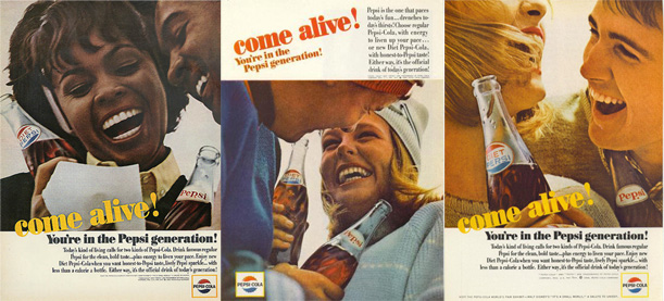
In 1963, Pepsi-Cola launched a new advertising campaign: The Pepsi Generation. Those three simple words represented a drastic rebranding for the company, which had previously marketed itself as a cheaper version of rival Coca-Cola. With the launch of “The Pepsi Generation” campaign, Pepsi claimed to be offering something new, something hip, something for the kids. While Coke continued to trade on nostalgia with traditional imagery of some idyllic yesteryear, Pepsi’s commercials featured snappy jazz numbers and young beautiful people riding motorcycles. “Come Alive! You’re in the Pepsi Generation!” The soda maker’s rebranding also included a simplified logo featuring a modern, sans-serif typeface, the introduction of a diet cola –now famously immortalized in an episode of “Mad Men”– and, a few blocks from the offices of Sterling Cooper, a striking new modern building in New York City – the first of two modern headquarters they would build between 1960 and 1970.

These vintage Pepsi ads circa 1964, featuring the new slogan “Come Alive! You’re in the Pepsi Generation!” contrasted dramatically with Coca-Cola’s staid, Norman Rockwell-esque imagery. (eBay)
Pepsi took a calculated risk with their slogan, their logo, and their architects. And they all paid off. The Pepsi-Cola Corporation World Headquarters in New York was designed by Skidmore Owings and Merrill (SOM) in the International Style, a style of architecture that dates back to 1920s Europe and flourished in America after World War II. The idea of an “international style” was first set forth by historian Henry-Russell Hitchcock and architect Philip Johnson in a famous 1932 exhibition of modern architecture at the Museum of Modern Art in New York and its accompanying book, The International Style, in which the authors identified the modern movement as a global architectural “style” that can be defined by formal and aesthetic characteristics, as pioneered by Walter Gropius, Le Corbusier, Mies van der Rohe and others.
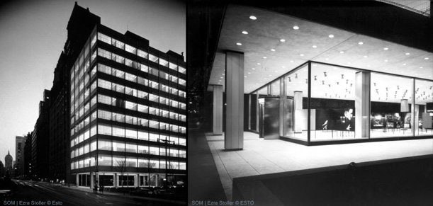
When the Pepsi Headquarters was built in 1960, the 13-story building at the corner of Park Avenue and 59th Street exemplified the International Style in America. Moreover, it pushed the limits of what was technically possible; its nine-feet-high by thirteen-feet-long glass panes were the largest that could be created and only a half-inch thick. To avoid using heavy mullions or frames the glass was cushioned by neoprene glazing strips, allowing an almost completely flush exterior surface. Structural columns were set back from the glass and mechanical systems were installed at the south side of each floor, making it possible to see deep within the building, thereby enhancing the effect of an impossibly thin facade. As originally built, the Pepsi Headquarters felt almost ethereal. This effect was only increased by the heavy stone and brick structures that surrounded the modest glass and aluminum building. The design won several awards, was named “Building of the Year” by the Municipal Arts Society, and widely praised by critics. Hitchcock called it “the ultimate in refinement of proportion and elegance of materials.”

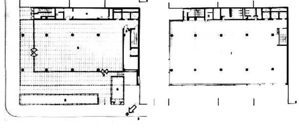
Ground floor and second floor plans for the Pepsi building. Note the free plan and gathering of mechanical elements at the top of the drawing, allowing for an uninterrupted office space. (docomomo)
The design is typically attributed to Pritzker Prize-winning SOM architect Gordon Bunshaft, but credit for the building, and many other SOM/Bunshaft designs, must also be attributed to SOM senior designer Natalie de Blois. De Blois, who passed away in July, was, as her New York Times obituary described her, a woman “in architecture’s ‘Mad Men’ era.” A single mother with four kids, de Blois faced bias daily and her contributions often went uncredited in what was then very much a boy’s club. In the case of the Pepsi building, de Blois told an interviewer in 2004 that it was a true team effort in which she designed the floating massing of the building while Bunshaft “came up with the structural concept so that there were no columns on the exterior walls. It was a smooth box.” Nathaniel Owings, the “O” in SOM, described the critical role she played in the firm:
“Her mind and hands worked marvels in design—and only she and God would ever know just how many great solutions, with the imprimatur of one of the male heroes of SOM, owed much more to her than was attributed by either SOM or the client.”
In recent years, de Blois has started to earn some of the recognition she so well deserves, and though her name may not yet be well known, she designed –or at the very least co-designed– some of the greatest buildings SOM ever produced. Her good taste and design sensibility played a large part in establishing the cool “Mad Men” aesthetic that defined their office designs in the 1960s.

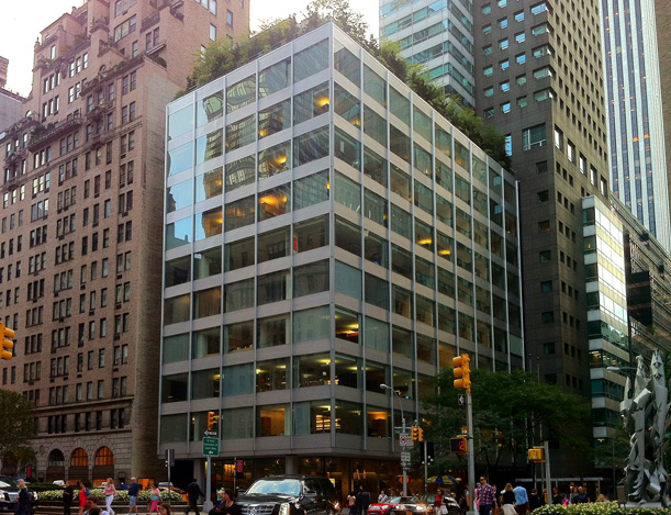
The Pepsi-Cola World Headquarters at 500 Park Ave. as it stands today. Visible in the back is the 40-story addition by James Polshek & Parters. (Courtesy of author)
Today, the building still stands as one of New York City’s modern masterpieces. It is, however, a little worse for wear. Its metal panels are rusted and stained; its windows no longer reveal views deep into the heart of the building. Pepsi left their Park Avenue address in 1967 and, a few tenants and nearly 20 years later, the building was renovated by James Stewart Polshek & Partners (now Ennead Architects), who changed the grid lighting so pervasive in 1960s offices and further subdivided the large open interior spaces of the building. Some of the ineffable magic of the facade is gone; it no longer seems to drape over floor plates like a curtain. But the renovation, along with a 40-story addition to the West, also designed by Polshek, saved the building from the risk of demolition by making it a viable investment for new owners. The massive addition is designed in a complementary style that borrows its materials from SOM’s structure and is respectfully set back so as to not interfere with the design of the original building. Is it an ideal solution? No. But as celebrated architecture critic Ada Louise Huxtable wrote when the design as first revealed, “Saving buildings of quality, either from outright destruction or design sabotage, can only be done in the immortal tradition of tradeoffs that characterizes development in New York. The proposal for 500 Park is about as good an answer as we can hope to see.” The building is still alive for future Pepsi generations.
In Part 2, we’ll look at Pepsi’s move from their big city HQ to the shadier pastures of the suburbs.
/https://tf-cmsv2-smithsonianmag-media.s3.amazonaws.com/accounts/headshot/Jimmy-Stamp-240.jpg)

/https://tf-cmsv2-smithsonianmag-media.s3.amazonaws.com/accounts/headshot/Jimmy-Stamp-240.jpg)