The Architectural History of Pepsi-Cola, Part 2: Edward Durell Stone and the Corporate Campus
Employee morale rose but architecture critics were repulsed upon the opening of the company’s new campus in Purchase, New York
/https://tf-cmsv2-smithsonianmag-media.s3.amazonaws.com/filer/20130916081031pepsi-purchase-470.jpg)
Sometime in the early 1970s, huge American companies like IBM, General Foods and Union Carbide fled the confines of the city for the greener pastures of the suburbs. The new corporate campuses built during this time were sprawling modernist complexes, designed for efficiency by some of the country’s top architects. In 1970, as the first shots were being fired in the cola wars, PepsiCo joined this corporate diaspora, relocating from their modest and much-adored 13-story building in Manhattan to a 450,000-sq-ft complex on a 168-acre former polo field in Purchase, New York. To design their new home, Pepsi recruited “modernism’s populist architect” Edward Durell Stone.
Stone’s name isn’t well known today, but he was once one of the most famous architects in the world. When he started his career in the 1930s, Ed Stone was a promising young designer and bon vivant who, it was said, “could draw anything except a sober breath.” He first made a name for himself in the 1940s, working on the designs for Rockefeller Center and Radio City Music Hall, which led to the commission for the new Museum of Modern Art building (1939) – Stone’s first foray into International Style modernism. Stone continued to work in the modernist idiom throughout the 1940s while also serving as chief critic at the Yale School of Architecture and, during World War II, a major in the United States Army Air Forces. Some years before the war, he befriended Frank Lloyd Wright, who encouraged the up-and-coming architect to question the precepts of the International Style, and imbued him with an appreciation for ornament and vernacular architecture. Wright’s influence would manifest dramatically in the early 1950s when Stone was commissioned to design the American Embassy in New Delhi.
The embassy’s modern design drew equal parts inspiration from Classical temples, European modernism, and local traditions. Its most notable–and most controversial– feature was a patterned concrete screen that minimized heat and glare while still allowing plenty of light into the building. The embassy was met with wide acclaim and honored by the American Institute of Architects as an expression of “serenity and power in government in terms appropriate for the country in which it is guest.” Although the building was an enormous professional and popular success, it proved to be quite divisive among the architectural community. While commissions were pouring into his office, staunch modernists and architecture critics focused on the patterned screen, calling it distracting and decorative – a stigma that would follow Stone throughout the rest of his career. But Stone had developed a fondness for decorative details and clients were clamoring for the his ornamental, romantic modernism. With the success of the embassy and a new PR-savvy wife who helped sober him up, Stone was quickly propelled from relative obscurity to the cover of Time magazine in 1958. He was in many ways a proto-starchitect
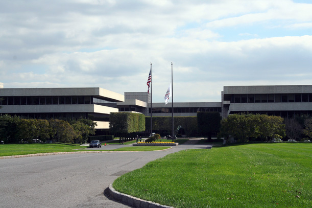
A view from the approach to Pepsi’s Purchase, New York Headquarters (image: “WhisperToMe” via wikimedia commons)
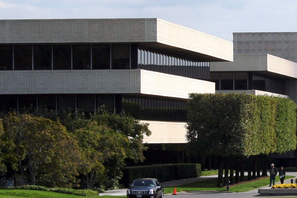
However, when he got the Pepsi commission in the late 1960s, Stone’s star was fading. By the mid-1960s, he had finally moved away from the concrete grillwork that had defined his personal style for so long, but the buildings behind the screens just weren’t as exciting. However, Stone never completely abandoned his love for decorative detailing, as evidenced by his design for the Pepsi Headquarters. The Purchase, New York complex, which is still the home of PepsiCo, consists of seven nearly identical inverted white ziggurat-like structures linked at their corners and organized around a cruciform central garden. It was supposedly designed to be expanded as the company grew, in a manner similar to, though less successful than, his friend Eero Saarinen’s design for IBM’s Rochester facility. Last year plans were announced that the facility was expanding for the first time since its construction, although it’s not certain if Pepsi will follow Stone’s original vision.

A closer look at Stone’s design for the PepsiCo Headquarters. Note the patterned concrete block. (image: “WhisperToMe” via wikimedia commons)
The new headquarters met with mixed reviews. Architectural Record described it as a “skillful blending” of architecture and nature combining elements of both the urban and the rural. Pepsi reported that after moving into the building, employee morale went up and work habits had improved. However, many critics still had a hard time accepting Stone’s work. Paul Goldberger, during his tenure as The New York Times architecture critic, called it “a world of utter blandness” that “is free of major vulgarities but also free of any excitement.” Much of the rancor towards his architecture can probably be attributed Goldberger’s precursor at The Times, the venerable Ada Louise Huxtable, whose dislike of Stone’s work merited two paragraphs in her obituary.
The landscaping, on the other hand, has been widely lauded. Initially designed by Stone’s son, Edward Stone Jr., to complement his father’s structure, the PepsiCo property is a verdant, luxurious sculpture garden filled with work by the likes of Brancusi, Alexander Calder, and Claes Oldenburg. And best of all, it’s open to the public.
Edward Durell Stone retired from practice in 1974 and fell into relative obscurity – a surprising reversal of fortune for a man whose face once adorned the cover of Time. Though his name is in the history books for his early work on Rockefeller Center and MOMA, his later projects are rarely discussed. Perhaps because they’re not easy to discuss; Stone’s work defies categorization. Some people have called Stone a proto-Postmodernist; some considered him a man ahead of his time while others thought he was struggling to keep up. In either case, his design for Pepsi’s HQ wasn’t attuned to the zeitgeist like their Manhattan offices. Stone may have been many things, but was certainly not a man of the Pepsi Generation – whatever that may be.
The final part in this short series will look at Pepsi’s radical pavilion at the 1970 Osaka World Expo.
/https://tf-cmsv2-smithsonianmag-media.s3.amazonaws.com/accounts/headshot/Jimmy-Stamp-240.jpg)


/https://tf-cmsv2-smithsonianmag-media.s3.amazonaws.com/accounts/headshot/Jimmy-Stamp-240.jpg)