The Golden Arches of McModernism
A brief history of the McDonald’s Golden Arches and the influence of Modernist ideals
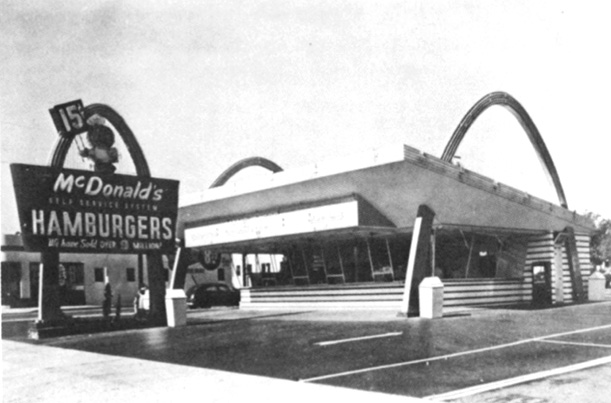
The second McDonald’s ever built and the oldest still standing, in Downey, CA. (image: Alan Hess via Journal of the Society of Architectural Historians)
When the ancient Romans marched through arches, it was a celebration of victory, an end to long-fought battles and distant travels. Today, when we march through arches, it is a celebration of globalization, efficiency and Shamrock Shakes. And it is decidedly less triumphant – unless of course, you happen to be a franchise owner.
McDonald’s recently opened up location number 34,492 – its first in Vietnam, the 116th country to serve up the franchise’s famous French fries. In honor of the occasion, The Guardian took a broad look at McDonald’s McInfluence around the world. More interesting to me though, is Nicola Twilley’s closer look at a typical McDonald’s location on the excellent blog Edible Geography. Twilley notes that there are more than 50 different factors that McDonald’s judge when they determine the precise locations to expand their empire:
“These included predictable benchmarks, such as property tax levels and the age, race, and income levels of the local population, as well as more fine-grained details such as speed limits and the direction of traffic flow (e.g. “going home side versus going to work side”). Meanwhile, complex algorithms govern the optimal placement of a McDonald’s in relation to its competition, Burger King.”
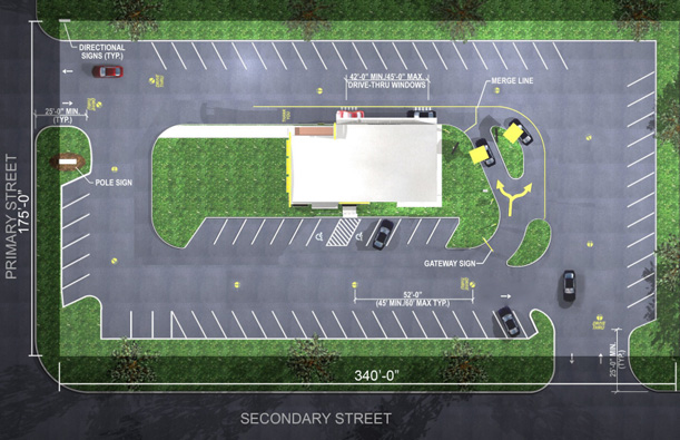
McDonald’s even provides potential franchisees with a site plan of an ideal location. It’s an all-too familiar design, though one that looks much more depressing when seen from above. The fast food store becomes an oasis in a sea of cars. A model of efficiency for an automotive culture.

An oasis of French fries in a sea of parking spaces. Also known as the ideal site plan for a McDonald’s franchise. (image: McDonald’s USA Real Estate)
With so much thought now going into the success of each new location opened by most recognizable fast-food franchise in the world, it’s no surprise that the same type of rigor has been applied to McDonald’s global maneuvers. In 1996, James Cantalupo, then President of McDonald’s International, told The New York Times columnist Thomas Friedman, “We focus our development on the more well-developed economies — those that are growing and those that are large — and the risks involved in being adventuresome…are probably getting too great.” So basically, McDonald’s sticks to the busy intersections of the world.
The statement came in response to Friedman’s “Golden Arches Theory of Conflict Prevention,” which states that “no two countries that both have a McDonald’s have ever fought a war against one another.” Far from the triumphal arches of ancient Rome, any city with the modern arches of McDonalds is much less likely to go to war – at least not with one another. Originally conceived in 1996, Friedman’s tongue-in-cheek (or teeth-in-patty) theory didn’t quite hold up, but it still suggests that most countries with a McDonald’s have stable economies, a strong middle class, and just too much to lose to go to war. Friedman isn’t alone in looking to McDonald’s as a shorthand metric of global politics and economic issues. Before his theory, there was the “Big Mac Index” of currency exchange rates.
Of course, McDonald’s wasn’t always a global power. Before its arches stood for the triumph of globalization, they stood for the triumph of a hamburger stand and the impact of the automobile on American culture and architecture. In a 1986 article for the Journal of the Society of Architectural Historians, architect Alan Hess explains the origins of McDonald’s famous arches.

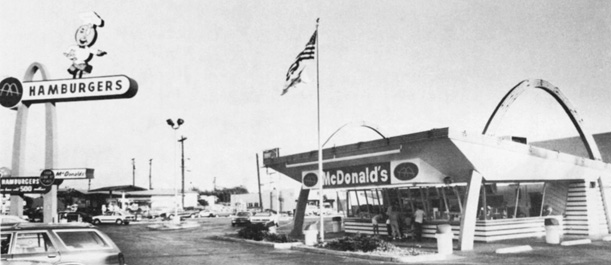
The fourth McDonald’s franchise, in Alhambra, CA. Photo taken 1954. (image: collection of Charles Fish, via Journal of the Society of Architectural Historians)
In the early 1950s, brothers Richard and Maurice McDonald hired architect Stanley Clark Meston to design a drive-in hamburger stand that carried on the traditions of roadside architecture established in the 1920s and 1930s. They had some experience with previous restaurants and a very clear idea of how they wanted their new venture to work – at least on the inside. Meston described the design as “logically dictated by clear program and commercial necessities” and compared it to designing a factory. Though he didn’t necessarily consider himself a modernist, Meston’s pragmatic, functionalist approach reveals, at the very least, a sympathy with some of the tenets of Modernism. Function before form. But not, it would appear, at the expense of form.
And anyway, the exterior had its own function to fulfill. In an age before ubiquitous mass media advertisements, the building was the advertisement. To ensure the restaurant stood out from the crowd, Meston decided to make the entire building a sign specifically designed to attract customers from the road. Now, many architects have speculated that McDonald’s iconic Golden arches have their origin in Eero Saarinen’s 1948 design for the St. Louis Gateway Arch or Swiss architect Le Corbusier’s unbuilt 1931 design for the Palace of the Soviets. But they tend to read little too much into things. The answer is much simpler.
The building was a sign, but it wasn’t really signifying anything – other than, “Hey! Look over here!” According to Hess, the initial idea for the golden arches –and they were called “golden arches” from the very beginning– came from “a sketch of two half circle arches drawn by Richard McDonald.” It just seemed to him like a memorable form that could be easily identified form a passing car. The longer a driver could see it from behind a windshield, the more likely he or she would be to stop. Oddly enough, the idea to link the arches, thereby forming the letter ‘M’, didn’t come about until five years later. McDonald had no background in design or architecture, no knowledge of Eero Saarinen, Le Corbusier, or the triumphal arches of ancient Rome. He just thought it looked good. Weston turned that sketch into an icon.
Technology has long conditioned urban form and continues to do so today. But this was perhaps never quite so clear as it was with roadside attractions and restaurants like McDonald’s. Speeding across the country in cars changed our understanding of the landscape and a new architecture arose in response. But technology changed this roadside architecture in another way too. In Notre-Dame de Paris (also known as The Hunchback of Notre Dame), Victor Hugo wrote a line oft-repeated by architecture scholars: “This will kill that. The book will kill the edifice.” Buildings once transmitted ideas across centuries. Hugo was describing how the printed word and mass media would become the dominant historical and cultural record, obviating what was previously a primary function of architecture: communication. Well, to make his argument more germane to this article, TV killed the Golden Arches.
As television advertising became the primary means of marketing, there was less and less of a need for buildings to serve that function. In 1968 McDonalds completely broke from their automotive-inspired building type when they introduced their first mansard roof structure that, until recent years, was ubiquitous on the main streets and highways of America. No longer part of the building, the arches have become a separate sign, functioning purely as a corporate logo and graphic identity. The roadside attractions of Stanley Meston are quaint novelties and tourist traps. Though it was ultimately entrepreneur Ray Kroc’s business savvy that transformed McDonald’s into the brand it is today, it seems that the early success of the restaurant resulted from detailed, pragmatic, perhaps even Modernist thinking went into the design of the very first McDonald’s location. Though the scale has dramatically changed, in some ways it’s the same type of thinking that went in their 34,492nd.
Moreover, the notion of the global franchise itself something of a Modernist concept. This type of identical seriality evolved from mechanical reproduction – a concept close to the heart of early architectural modernists who thought that industry and planning could cure all society’s woes. Architecture might not be the answer to global poverty that early modernists like Le Corbusier hoped for, but it can help assure consumers they’ll be getting a consistent product, whether they’re purchasing it in Vermont or in Vietnam.
/https://tf-cmsv2-smithsonianmag-media.s3.amazonaws.com/accounts/headshot/Jimmy-Stamp-240.jpg)

/https://tf-cmsv2-smithsonianmag-media.s3.amazonaws.com/accounts/headshot/Jimmy-Stamp-240.jpg)