The History of the Olympic Pictograms: How Designers Hurdled the Language Barrier
Infographic design first appeared at the Olympics in 1948, when the games were last in London
Pictograms for the 1964 Tokyo Olympic, designed by Katsumi Masaru (image: Virtual Olympic Games Museum)
Of all the instances in which graphic communication is necessary to transcend language barriers, the Olympic Games are, if not the most important, probably the most visible. We take the little icons of swimmers and sprinters as a given aspect of Olympic design, but the pictograms were a mid-20th Century invention—first employed, in fact, the last time London hosted the games, in 1948 (some pictographic gestures were made at the 1936 Berlin games, though their mark on international memory has been permitted to fade because of their association with Third Reich ideology).
The 1948 London pictograms were not a system of communication so much as a series of illustrations depicting each of the competitive sports, as well as the arts competition, which existed from 1912 to 1952 and included architecture, literature, music, painting and sculpture. In 1964, the Tokyo games took pictogram design to the next level by creating a complete system of typography, colors and symbols that would be applied across Olympic communications platforms.
In a paper on the history of Olympic design and national history, Jilly Traganou, an associate professor at The New School, writes:
Since Japan had not adopted the principles of the International Traffic Signs, introduced at the United Nations Geneva conference in 1949 and accepted by most European countries, the Olympics were regarded by graphic designers as an opportunity to establish a more unified and internationally legible symbolic language across the country. It was along these lines, searching for universally understood visual languages, that pictograms (ekotoba, in Japanese, a word used prior to the design of pictograms) were for the first time designed for the Olympic Games, embodying at the same time Baron deCoubertinʼs aspirations of universalism…A major task of the Japanese design team of the 1960s was to de-traditionalize Japanese visual languages by subscribing to the abstract, non-iconic principles of the modern movement, found also to be more appropriate for expressing the new corporate identities of postwar Japan.
The Japanese pictogram system was conceived by a team of designers led by Katsumi Masaru and inspired in part by design language development that was taking place in Vienna, masterminded by Otto Neurath and Gerd Arntz. Neurath and Arntz are known for the creation of isotype, an early (and still completely current) infographic form.
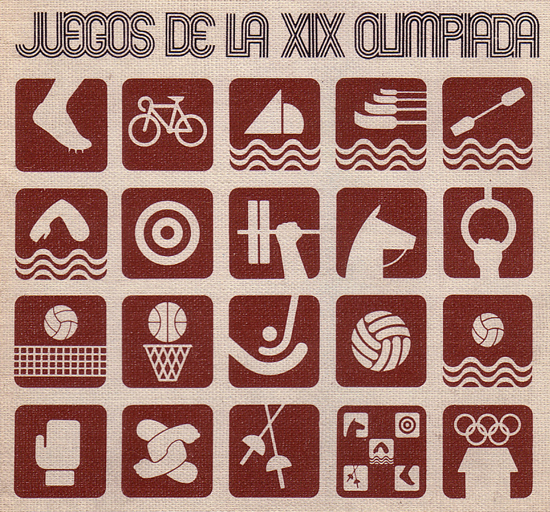
Pictograms for the 1968 Mexico Olympics, designed by Lance Wyman (image: Virtual Olympic Games Museum)
The simplicity and standardization of the isotype language came more fully into the Olympic pictogram arena with the 1972 Munich Olympics, but in between came the 1968 Mexico games, where, as design critic Steven Heller put it, graphic language met traditional Mexican folk art forms and 60s op-art psychadelia. The pictograms for the ’68 games were designed by Lance Wyman, an American graphic designer who also created the Washington, D.C. metro map, which is still in use today, as well as designs for various branches of the Smithsonian Institution.
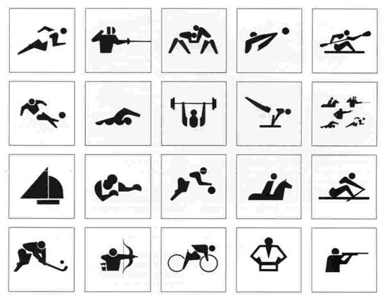
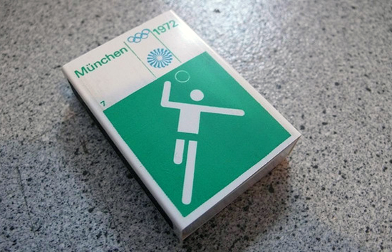
In 1972, a German designer named Oli Aicher refined Olympic pictograms into the concise, clean system that most people think of today as the symbols of the games. Portuguese design professor Carlos Rosa wrote in his book, Pictografia Olímpica:
drew an extensive series of pictograms on a modular grid divided by horizontal, vertical and diagonal lines. A very good example of German cold geometry that emerged as a complete standardised visual language due to all of his drawings being designed under strict mathematical control. Aicher’s pictograms were an unavoidable milestone in the design of pictographic systems.
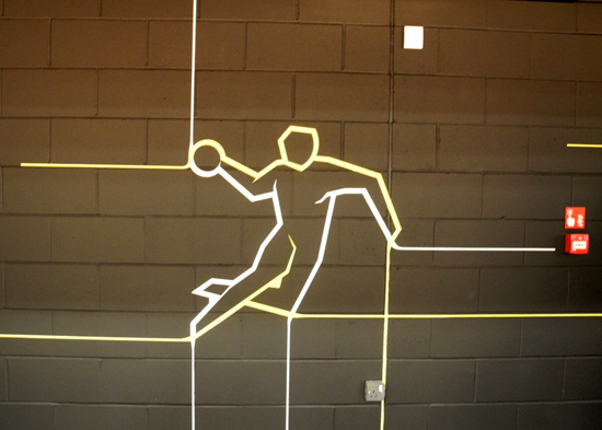
Slightly modified versions (and in some cases exact replicas) of the Aicher designs were used at subsequent Olympics as the standard of universal visual language, though in the early 1990s, some designers began moving away from the simplified standard, adding embellishments that referenced the culture of the city where the games were taking place. The Sydney games played up the boomerang, the Beijing images were vaguely calligraphic, and this year, as the games return to the place where pictograms first came into common Olympic use, the London 2012 visual language takes two approaches: a set of simple silhouettes for utilitarian communication purposes, and a more “dynamic” alternate version for use in decorative applications.
Designed by a firm with the appropriately universal name SomeOne, the images move away from isotype and back toward illustration, conveying both motion and emotion through color and a sense of hand-sketching. Carlos Rosa wonders in his essay, “If pictograms have abstract characteristics, will orientation be compromised for many visitors?”
Does the utility of visual communication get lost when we reinsert the obvious complexity of human interpretation? He suggests that mobile gadgets and digital technology may obviate the need for explicit pictographic guidance, in which case artful expression and cultural flavor can come back into the mix. Between now and 2016, apps and GPS will keep getting better at telling us where we are and where to go, which means the designers who’ve most likely already been tapped to design the Rio de Janeiro Olympic language may have more creative license than their predecessors of the past 60 years.
/https://tf-cmsv2-smithsonianmag-media.s3.amazonaws.com/accounts/headshot/sarah-rich-240.jpg)
/https://tf-cmsv2-smithsonianmag-media.s3.amazonaws.com/accounts/headshot/sarah-rich-240.jpg)