The Secret to National Geographic’s Maps Is an 80-Year-Old Font
With a little ingenuity, a 1930s cartographer left his mark on the society
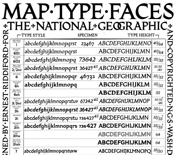
A collection of typefaces designed by National Geographic Society cartographer Charles E. Riddiford (image: National Geographic)
With the onset of consumer technology like desktop printing and portable mapping devices, a general interest has developed in two previously niche design fields – cartography and typography. The National Geographic Society has been in the business of both since the days when there were still frontiers to be discovered and explorers had little more than a tall ship and a star to steer her by. In the age of Google maps and GPS, old-school cartography is becoming something of a lost art. It’s easy to take maps for granted but they represent the labor of many surveyors, cartographers and designers. There amount of data represented in both geophysical and political amps is staggering. It’s no easy task to cram the names of all those cities, states, rivers, mountains, parks, highways and airports on maps. When so many different names are written in such a small space, a good typeface can make all the difference. Juan Valdés, Director of Editorial and Research for National Geographic Maps, recently revealed the history of the typefaces used on every NatGeo map dating back to the 1930s.
Before the ’30s, the maps of the National Geographic Society were true works of art. They were painstakingly hand-lettered; the unpredictable nature of movable type was unacceptable to the National Geographic Society, whose exacting standards left little latitude for imprecision and illegibility.
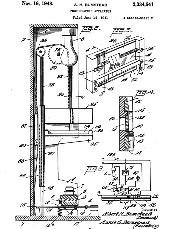
A former surveyor for the U.S. Geological Survey and the Society’s first Chief Cartographer, Albert H. Bumstead, worked to find an alternate solution to create a mechanical type that wouldn’t break down or blur together when it was enlarged or reduced. Bumstead, something of a tinkerer best known for inventing the sun compass used during Admiral Byrd’s 1928 Antarctic expedition, put his skills to use on the typography problem and devised a new photographic apparatus to create a more flexible, more legible map type.

U.S. Patent 2,334,541 for a “photographic apparatus” to be “employed in phototypography”. Issued November 16, 1943. Invented by Albert H. Bumstead (deceased), submitted by Annie S. Bumstead (executrix).
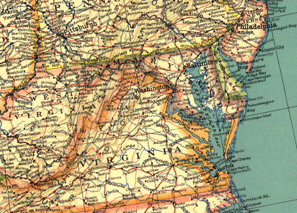
After a bit of refining, his “phototypography” process was first used in a United States map included as a supplement to the May 1933 issue of National Geographic.

Detail of a map of the United States from the May 1933 issue of National Geographic (image: maps.com)
Soon after the successful implementation of Bumstead’s device, another society cartographer, Charles E. Riddiford, was asked to develop new typefaces with improved “photomechanical reproductive qualities”. Riddiford took his role quite seriously and wrote with a philosophical zeal about the importance of design and typography in mapmaking in the pages of the journal The Professional Geographer:
“Fine map-making is an art; it is also a science, and the one should compliment the other on equal terms. It is one thing to make an accurate and useful map, and quite another to make it presentable, attractive, pleasing to the eye…The factual content of a map is generally taken for granted; it is the visual appearance, particularly on the first impression, to which lettering contributes so much, that sometimes determines whether a map is prized or discredited. This leads me to believe that the impact of line and form on our minds in everything we see has a greater influence on us than the more tangible facts of everyday life.”

A more contemporary National Geographic map of the United States using Riddiford’s typefaces (image: National Geographic)
Riddiford’s dedication to his craft paid off. His designs (top image) were an instant success. In fact, they so beautifully accentuated the maps’ features and were so clearly legible that National Geographic never saw the need to change them. Even when they digitized their amazing collection of maps, the typefaces held up. So no matter how complex our mapping technology becomes, some vestiges of an early cartographic tradition will continue.
/https://tf-cmsv2-smithsonianmag-media.s3.amazonaws.com/accounts/headshot/Jimmy-Stamp-240.jpg)

/https://tf-cmsv2-smithsonianmag-media.s3.amazonaws.com/accounts/headshot/Jimmy-Stamp-240.jpg)