The Unbuilt High-rise Designs of Rem Koolhaas and OMA
The radical, unbuilt high-rises designed by Rem Koolhaas are witty, subversive, and surprisingly simple
![]()
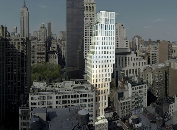
A rendering of 23 East 22nd Street (image © OMA)
The Dutch architect Rem Koolhaas is both celebrated and maligned for his buildings and writings about architecture. While he considers himself to be a public intellectual, his polemics often cause people to think of him, and by extension, his architecture, as cynical. Koolhaas and his firm, the Office for Metropolitan Architecture (OMA), based in Amsterdam Rotterdam, are perhaps best known for the spectacular and controversial CCTV Headquarters in Beijing and their dramatic plans for cities in the Middle East and Asia, but some of Koolhaas’s best high-rise designs, and often his most subversive, are much simpler and have largely remained unbuilt.
In the first years of the 21st century, developers and architects were racing to change the skylines across America. Of course, that changed in 2008 following the collapse of the housing market and the beginning of the recession. Koolhaas shelved a building at 23 East 22nd St. It is described as a “luxury residential tower in a culture of congestion.” That brief description perfectly both appeals to a high-end clientele and refers to his book Delirious New York , in which he describes Manhattan with the seemingly pejorative phrase “a culture of congestion” even though he also praised the city for the wealth of interactions. Koolhaas’ design presents an understandable, somewhat satirical –but not cynical– take on the building and zoning codes that have shaped the New York skyline. The city’s mandated setbacks are interpreted quite literally as large sections of the building are set back to create a series of stacked cantilevers that shifts the entire building to the side. The result is a structure that playfully peeks around its neighbors but also, from a practical perspective, affords more light and outdoor space for some of the units.
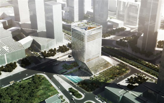
rendering, Baosteel Building (image © OMA)
OMA has recently reinterpreted the basic schematic of a leaning or stepped building for its planned Baosteel Building in Guangdong, China . From one angle, it appears to be a standard, if slightly tapered, commercial tower. The facade’s repetitive grid is pure midtown Manhattan. But from the side, the twist is revealed. Or rather, the lean. Nearly half of the Baosteel Building is built at an incline that dramatically pushes the upper part of the tower over the adjacent park and toward the nearby Pearl River.
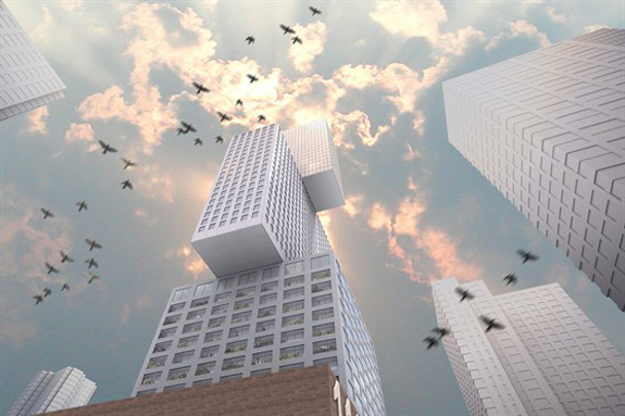
rendering, 111 First Street (image © OMA)
A true twist on the skyscraper can be seen in Koolhaas’s design for 111 First Street in Jersey City. Proposed in 2006 but still in design development, 111 is another somewhat satirical skyscraper based on a simple architectural gesture: a literal twist at the center of an ostensibly typical high-rise building. The center third of the 52-story mixed-use building is rotated 90 degrees, introducing a radical new silhouette to the Jersey City skyline. The design, like almost all of OMA’s subversive skyscrapers, is rationalized as a practical solution: “The stacking maintains the independence of each block, optimizes views from the site and creates a dynamic relationship between the building and its surroundings: Spectacle from Convention.” Spectacle from Convention. The very essence of Koolhaas’s work.
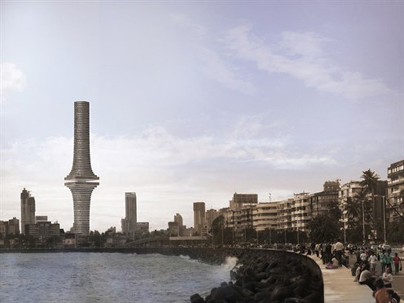
rendering, India Tower (image © OMA)
India Tower , an unbuilt competition project from 2008, also disrupts the center of the familiar residential tower silhouette—this time with a wide “sky-lobby”. It creates a striking effect in which the upper half of the apartment tower and hotel appears to hover above the lower half. For Koolhaas and OMA, the aerial public space elevates the vibrancy of Mumbai’s local culture from the street into the sky, defining the tower as “an innovative and convincing symbol of the subcontinent.”
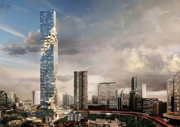
rendering, MahaNahkhon (image © OMA)
The MahaNakhon tower in Bangkok, designed by OMA partner Ole Sheeren, introduces a new disruption. Here, the repetitive high-rise appears to be eaten away, as if it was attacked by some sort of architectural predator or modernist virus. The resulting pixelated spiral appears to reveal the interior of the tower, dissolving the building mass as it reaches the ground — subverting the typical tower/podium arrangement — to better integrate the tower into the smaller scale of the surrounding buildings. MahaNakhon, which is translated as “great metropolis”, broke ground in June 2011 and is expected to be completed in 2014, at which time the 310-meter-high mixed-use building will be the city’s tallest.
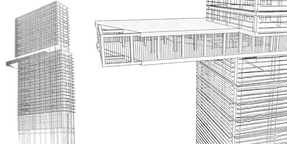
drawing, Zac Danton office tower (image © OMA)
Koolhaas’s most elegant subversion of a commercial skyscraper may also be one of his oldest. The Zac Danton office tower is a component of his proposed 1991 redesign of the La Defense business district in Paris. Here, Koolhaas’s purposeful banality is taken to its extreme. The Zac Danton office tower is a classic modernist glass high-rise, Miesian in its apparent simplicity. But half way up the tower, the structure is split into two separate units— a division that would become a popular trope in OMA’s work. Between these two nearly identical elements a single floor slides out and Koolhaas’s sense of irony is on full display. This is a younger, brasher Koolhaas who doesn’t describe his buildings with market-friendly real estate jargon. Instead, the cantilevered volume is emblazoned with a scrolling marquee presenting anti-corporate situationist messages: “sous la pave, la plage” (under the pavement, the beach) and “ne jamais travailler” (never work). The building’s signage undermines both its form and function.
Compared to the rest of Koolhaas’s oeuvre, these buildings are subtle. They’re witty and architecturally striking without being abrasive. Koolhaas has a genuine affection for the classic commercial high-rise. He sees it as a product of our cultural and political environment. Though these buildings may appear complex —indeed, they are incredible feats of engineering—their core idea is often quite simple: a basic formal manipulation of a common building type. Koolhaas’s ideas can be broken down into simple, architectural moves: shift tower, twist tower, step tower and so on. But simplicity is hard. The illustrate an expert’s familiarity with commercial building types and the history of the city. To break the rules, as it is said, you first have to know them. And Koolhaas knows them well. Whether or not they are built, his buildings represent a search for newer modes of living and. They may sometimes appear arch or ironic, OMA’s high-rise designs illustrate a respect for and deep understanding of the cities in which he builds. At his very best, Koolhaas designs buildings that are a reflection of contemporary culture— even when that reflection is in a funhouse mirror.
/https://tf-cmsv2-smithsonianmag-media.s3.amazonaws.com/accounts/headshot/Jimmy-Stamp-240.jpg)
/https://tf-cmsv2-smithsonianmag-media.s3.amazonaws.com/accounts/headshot/Jimmy-Stamp-240.jpg)