Designing for Seniors and Soldiers, Toward a “Silver” Architecture
Going green is good, but could architects be doing more for two segments of our population?
/https://tf-cmsv2-smithsonianmag-media.s3.amazonaws.com/filer/33/bf/33bf6c13-0627-451d-9ccb-c6cd77cb6e0c/graves-wounded-warrior-house.jpg)
In a recent opinion piece in The New York Times, geriatrician Louise Aronson advocated for a new type of building, one designed with an aging population in mind, which, she suggests, might be dubbed “silver” architecture. The idea came to her after taking her father to a top-notch, “green” medical center that was surprisingly unaccommodating for older patients. Sure, sustainability is important, but a building needs to do more than perform efficiently and attract millennials. Aronson notes:
Such approaches once may have made sense from a business perspective, but current demographic realities are creating financial and practical reasons to build more homes, businesses, health care facilities and public buildings that are well suited to older people’s needs.
The Americans With Disabilities Act’s guidelines help, but they do not ensure access or safety for this unique and rapidly growing population. Many buildings are A.D.A.-compliant and still difficult to navigate for older adults who have one or more physical, sensory or cognitive challenges, and especially for the frail elderly who have many.
To meet the challenges of an aging population, she proposes the development of LEED-like standards and awards for a “silver” architecture. Such an architecture would be well-lit, quiet, accessible and safe. It would be spacious enough to accommodate walkers and wheelchairs and provide room for a caregiver. These aren’t new ideas, but they aren’t as widely adapted as they could be, especially considering that over 50 million Americans are over the age of 65 - and that number is growing quickly. “Some might say that buildings can’t cater to every group with special needs,” says Aronson. “But silver architecture and design aren’t about indulging a special interest group. They’re about maximizing quality of life and independence for a life stage most of us will reach.” She makes a good point.
It being Veterans Day, this article got me thinking about architect Michael Graves, who recently designed a pair of houses for returning soldiers that follow through on many of Aronson’s suggested parameters for silver design. First though, a brief digression. The idea of a “silver” architecture actually has some precedent in architectural history, although the term was used in a very different way. In the 1970s, some West Coast architects formed a loosely affiliated group known as the “Silvers” in response to the growing prominence of two East Coast groups, the “Whites” and the “Grays.” These color-coded collectives functioned almost like architectural political parties, each with their own platform: the Whites advocated a Modernist-based formal approach to architecture, the Grays argued for a historical approach, and the Silvers preferred a more pragmatic and polished design. Many of the Whites, Grays, and Silvers, went on to become some of the best known and most prolific architects of our time, although today, "white," "gray," and "silver" best describe their hair colors more than their ideological differences. While these architects have built many hospitals and healthcare projects, they focus more on high-end commercial and cultural designs. However, one of the White architects, Michael Graves, who went on to become more of Gray in the 1980s and 1990s, recently began practicing what might be termed a “Silver” architecture as described by Aronson in The New York Times.

Graves has been in the news recently for his affiliation with a controversial new architecture school and for eloquently defending his Portland Building (1982), a canonical work of Postmodern architecture that is in danger of being demolished. The brightly-colored Portland building exaggerates traditional architectural forms and symbols to almost cartoonish effect - a style that attracted Disney, for whom Graves designed many offices, hotels, and resorts in the late 1980s. Over the next decade, Michael Graves & Associates completed many projects while continuing to express a playful attitude and appreciation of historic forms. But the architect is probably most widely known for his collaboration with Target, which began in 2000 when the big box retailer commissioned the Michael Graves Design Group to design a new line of consumer products that included everything from egg timers to chess sets. Then in 2003, Graves’s career took another unexpected turn when an unidentified infection left him paralyzed from the waist down. While in recovery, he became determined to use his talents as a designer, and his new understanding as a patient, to improve healthcare design and the quality of life for people with disabilities or impaired physical mobility.

The Michael Graves Design Group has worked with Stryker Medical to design a new transport chair, the Prime TC, that’s more ergonomic, more versatile, more maneuverable, and more intuitive than common wheelchairs. Graves-Stryker partnership has also produced a line of hospital room furniture that easier to use, easier to learn, and, like the Prime TC, easier on the eyes than existing models. But their largest project is the Wounded Warrior Home.
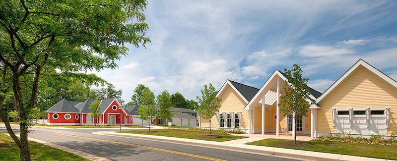
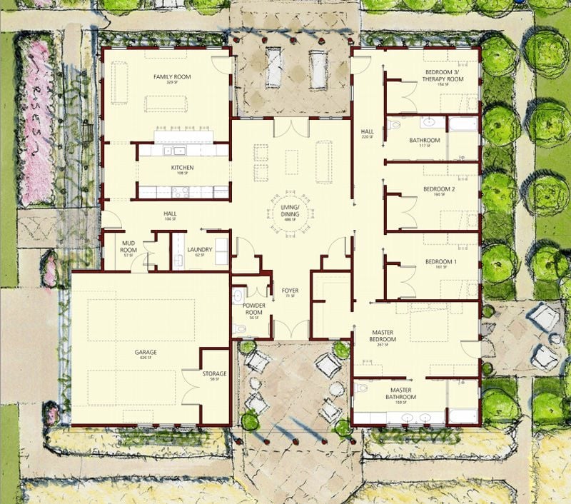
In 2010, Michael Graves & Associates were commissioned by Clark Realty Capital (CRC) to create two prototype single-family homes designed specifically for wounded soldiers who continue to serve and live at Fort Belvoir army base in Virginia. The real estate company, which develops all the housing on the fort, previously tried renovating existing houses to make them more accessible, the resulting modifications were expensive and ineffectual. When they decided to start from scratch, they reached out to Graves, who was personally involved in the process from the very beginning, showing up at every meeting and sketching every design himself.

There’s not much about these designs that screams “assisted living” or “ADA Compliant.” They’re just nice houses, with white picket fences and colorful siding (Graves’s Postmodernist background showing through). The spacious, well appointed homes, and the furniture in them, are designed to mitigate a wide range of issues beyond wheelchair clearances. The design had to address a variety of injuries: limb amputation, hearing loss, brain injury, spinal cord injury, post-traumatic stress disorder, vision loss, and burns. Automatic doors, low appliances, and high-ceiling hallways are some of the more immediate ways these houses help wounded soldiers, but there are other, more subtle means of making them feel at home. Huge windows and doors that provide views throughout the house and its surrounding can help alleviate some of the symptoms felt by soldiers with PTSD, while smaller, darker places are also available to provide a sense of comfort and security Two homes have been built, 19 more are planned, and the team hopes Fort Belvoir will serve as model to inspire a continuing dialogue on how we can improve lives for wounded soldiers and other people living with disabilities.
While the Wounded Warrior Homes aren’t designed specifically for “silvers,” they address physical, sensory, and cognitive challenges and possess many of the qualities of what Aronson describes as a “silver” building in her New York Times article. In 2013 Michael Graves was appointed to the Federal Architectural and Transportation Barriers Compliance Board, which addresses nation-wide accessibility issues. As a member of the board, Graves hopes to “contribute on a grand scale” and though his work isn’t dedicated exclusively to these assisted living projects, it’s heartening to see an architect of his caliber and reputation taken on work and responsibilities that could improve the lives of millions of people.
/https://tf-cmsv2-smithsonianmag-media.s3.amazonaws.com/accounts/headshot/Jimmy-Stamp-240.jpg)
/https://tf-cmsv2-smithsonianmag-media.s3.amazonaws.com/accounts/headshot/Jimmy-Stamp-240.jpg)