When F. Scott Fitzgerald Judged Gatsby By Its Cover
A surprising examination of the original book jacket art to The Great Gatsby
![]()

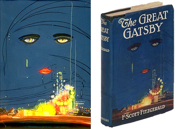
left: Francis Cugat’s original gouache painting for The Great Gatsby. right: a first edition of the book (image: USC)
It’s one of the most recognizable book covers in the history of American literature: two sad female eyes and bright red lips adrift in the deep blue of a night sky, hovering ominously above a skyline that glows like a carnival. Evocative of sorrow and excess, this haunting image has become so inextricably linked to The Great Gatsby that it still adorns the cover of F. Scott Fitzgerald’s masterpiece 88 years after its debut. This iconic work of art was created by Spanish artist Francis Cugat.
Little is known about Cugat –also known as Francisco Coradal-Cougat– and the Gatsby cover, for which he was paid the princely sum of $100, was the only one he ever designed. In a 1991 essay discussing the connections between the book and its cover, publishing scion Charles Scribner III, who revived the cover after a 40 year absence for his classic edition of the book in 1979, charted the development of the work from its original conception to the final gouache painting of the detached gaze. Scribner notes that its origin is somewhat unusual in that the cover art was designed before the manuscript was finished, resulting in a sort of collaboration between the artist and writer that may have yielded one of the more prominent literary symbols in American literature.
In a letter to editor Max Perkins, Fitzgerald, whose manuscript was late, requested that the art be held for him. “For Christ’s sake don’t give anyone that jacket you’re saving for me,” Fitzgerald wrote, “I’ve written it into the book.” It’s not clear exactly what Fitzgerald meant by this, but it is generally believed that that Cugat’s haunting image was realized in the form of the recurring billboard for oculist Dr. T.J. Eckleburg that watches over one of the climactic moments of Fitzgerald’s work:
“The eyes of Doctor T. J. Eckleburg are blue and gigantic — their irises are one yard high. They look out of no face, but, instead, from a pair of enormous yellow spectacles which pass over a nonexistent nose. Evidently some wild wag of an oculist set them there to fatten his practice in the borough of Queens, and then sank down himself into eternal blindness, or forgot them and moved away. But his eyes, dimmed a little by many paintless days, under sun and rain, brood on over the solemn dumping ground.”
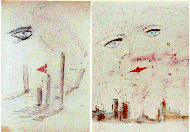
Of course, there are several obvious differences between the final cover art and the bespectacled billboard, but if this is the connection, then the floating, faceless eyes of Doctor T.J. Eckleburg serve as testament to the talent of each artist, as well as to the value of such collaborations. But the familiar cover art may not, in fact, have been what captured Fitzgerald’s imagination. Rather, it’s possible that he saw a much different, early cover sketch by Cugat, several of which were only discovered in 1990:
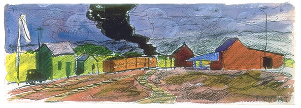
Because the manuscript was not complete, it’s likely that Cugat based his design on a conversation with Perkins about Fitzgerald’s working text, then titled Among the Ash Heaps and Millionaires, and a description of one of the books settings – a “valley of ashes” where “About half way between West Egg and New York the motor road hastily joins the railroad and runs beside it for a quarter of a mile, so as to shrink away from a certain desolate area of land.” In one of these early design proposals, the valley of ashes is presided over by several small faceless eyes and lips floating like clouds. It seems likely that this early draft inspired Fitzgerald to create his own eyes above the desolate landscape in the form of the Eckleburg billboard. As Cugat’s design developed, he focused more on those floating eyes that seem to have enthralled Fitzgerald. The landscape became more abstract and the country road way was abandoned in favor of a cityscape that recalls the glowing lights of Times Square and Coney Island.
Although it seems likely that the billboard really is the manifestation of Cugat’s eyes, without any definitive proof it remains something of an open question. Scribner cites another theory for “those who still find the derivation troublesome” – that the cover image was actually integrated into the text as Nick Carraway’s vision of Daisy as the “girl whose disembodied face floated along the dark cornices and blinding signs….”
With a big Hollywood movie now in theaters, some recent printings of the book have abandoned the classic cover in favor of one that ties in more closely with the film. So high school students working their way through the summer reading list this year will be hard pressed to find a copy without Leondardo DiCaprio standing front and center among the movie’s beautiful cast and art deco ornamentation. While the new cover is controversial among readers and retailers, Scribner himself enjoys it. In a recent letter to The New York Times, he wrote, ”I confess to liking the Leonardo DiCaprio cover, too (the new movie tie-in). I would not be ashamed to be seen reading it on the subway, but then I’m a Gemini.”
Although there have been many covers since its first publication in 1925, today, none are more suited to The Great Gatsby than the celestial eyes of Francis Cugat, so perfectly do the image and text seem align. Perhaps its appropriate that the true meaning of the celestial eyes remain somewhat mysterious. After all, if I remember my own summer reading of The Great Gatsby, the eyes of Doctor T.J. Eckleburg ultimately serve as a reminder that signs are devoid of any meaning save that which we give them.
/https://tf-cmsv2-smithsonianmag-media.s3.amazonaws.com/accounts/headshot/Jimmy-Stamp-240.jpg)


/https://tf-cmsv2-smithsonianmag-media.s3.amazonaws.com/accounts/headshot/Jimmy-Stamp-240.jpg)