When PepsiCola Allowed a Team of Artists to Wreak Creative Havoc
In 1970, the soft drink company commissioned artists, musicians, and engineers to design an interactive pavilion that could disappear in a puff of smoke
/https://tf-cmsv2-smithsonianmag-media.s3.amazonaws.com/filer/20130926094036pepsi-pavilion-470.jpg)
While Pepsico’s finger may have slipped off the pulse of youth culture when they hired Edward Durell Stone to build their corporate campus, they found it again–briefly–when commissioning designers for their pavilion at Expo ‘70 in Osaka, Japan.
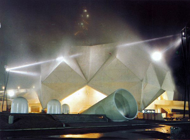
Still focusing their marketing on the kids they called the Pepsi Generation, the soda maker initially planned for the pavilion to be a simple bandshell that would host the winner of a global battle-of-the-bands style competition. After all, the kids love rock & roll, right? Japanese architect Tadashi Doi of Takenaka Komuten Co., a general contractor that traces its history back more than 400 years, was commissioned by Pepsi Japan to design the basic structure. Doi’s design for a slightly distorted 120-foot diameter faceted geodesic dome was a radical departure from the rather conservative Modernist headquarters Pepsi moved into that same year. But the dome’s architecture would be the least interesting thing about it.
The battle-of-the-bands idea was quickly scrapped after some internal disagreements among upper-level Pepsi brass. In lieu of a standard rock concert, it was decided that the pavilion would house a truly avant-garde work of contemporary art. Pepsi commissioned a group of artists, musicians and engineers who collaborated together under the name Experiments in Art and Technology (E.A.T) to design and program their pavilion. There were a lot of wheelings, dealings, arguments, misunderstandings and fundamental philosophical disagreements surrounding E.A.T.’s collaboration with Pepsi, but let’s just focus on the design of the installation, because it’s pretty great.
E.A.T. weren’t particularly fond of the space they were given, but instead of ignoring it or opposing the faceted dome structure, they created a series of highly site-specific, integrated installations that dissolved the boundaries between art, technology and space, using the dome’s form against itself to create an immersive multimedia experience they referred to as “a living responsive environment.”

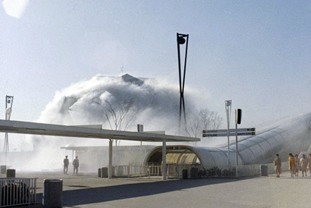
The Pepsi Pavilion engulfed in a cloud of its own making (image: Fujiko Nakaya via Research Library, The Getty Research Institute)
The Pepsi pavilion was a true collaborative effort in which E.A.T. synthesized multiple artistic interventions into a single unified whole. Two of the most prominent programs worked in tandem to literally conceal the architectural design. Most visibly (or invisibly as the case may be), a system of pipes and fog-emitted nozzles, designed by artist Fujiko Nakaya and physicist Thomas Lee, cloaked the dome in an artificial cloud whose shape would change in response to local weather conditions. At times, the cloud was six-feet thick, extending the effect of the Pavilion beyond the boundaries of the dome and prompting complaints from nearby vendors who couldn’t proffer their wares in the haze. Similar ideas and themes would be explored much later by architects Diller Scofidio Renfro, whose, scaffolding-like Blur Building(2002) used spraying misters to create what the architects called “immaterial architecture,” a phrase that echoes E.A.T. member Robert Rauschenberg’s description of the Pepsi project as an “invisible environment.”
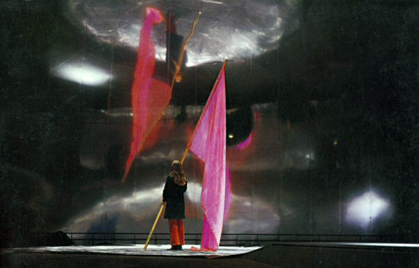
If the outside of the building was a cloud, than the inside was its silver lining. The main interior space of the dome was dominated by an enormous mirrored Mylar surface held in place by vacuum pressure. In photographs, the inverted reflections created by the mirror almost look like holograms floating in space. As Marcelyn Gow, of the research and design collaborative servo writes, the combination of the fog and the mirror “would actively work to dematerialize the architecture of the pavilion itself. They would simultaneously augment and obscure the structure.” E.A.T. hated the architecture. So, like the strange and wonderful techno-artist-magicians they were, they made it disappear.
Additional programming in the building included electronically modified recordings of natural sounds that corresponded with various floor surfaces – bird tweets might be heard while walking across astroturf, for example. Other exterior elements, visible in the above photographs, included a laser beam space-frame and interactive, sculptural “floats” that move outside the pavilion and respond to movement. Truly keeping with the spirit of the 1960s, the pavilion was a case study in collaboration and participatory design. The interior changed in response to environmental conditions and the number of visitors, who were give some semblance of control over their environment through the interactive components. It’s hard to say more about what it was like to experience the pavilion because, it really was an experience; it was a visceral union of light, sound, and space. In other words, you had to be there, man.
The pavilion was an early example of a productive interaction between arts and industry, something that is so common today we barely even take note of it – see BMW’s collaboration with the Guggenheim, for example. The first lines of the press statement released jointly by E.A.T. and Pepsi-Cola is a paean to the union of the arts and and corporate culture: “E.A.T. is interested in Pepsi-Cola, not art. Our organization tried to interest, seduce and involve industry into participating in the process of making art.” This was a provocative statement to say the least and caused quite a commotion in the art world, many of whom saw little difference between global corporations like Pepsi and the military industrial complex. It came as no surprise then, that the relationship proved untenable and the program was unfortunately short-lived. Pepsi and E.A.T. came to some insurmountable disagreements and the cola giant canceled E.A.T.’s interactive, immersive, and incredibly expensive program with a modified version of their original idea for a music venue- something that Pepsi thought was more accessible for the average visitor.

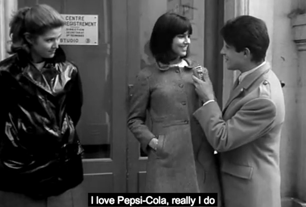
Still from Masculin Feminin
The conflict between Pepsi’s desire to capture both the revolutionary spirit of avant-garde while also appealing to a broader, popular audience, reminds me of a scene from Masculin Féminin (1966), Jean-Luc Godard’s 1964 film/essay about a wannabe revolutionary in love with a wannabe pop star, and the dialectics of youth culture in the 1960s. The pop star, Madeleine, is asked by a reporter if she considers herself to be part of the “Pepsi Generation.” Her enthusiastic reply –”Oui! J’adore le Pepsi-Cola!”– is briefly interrupted by a gunshot, which goes completely unacknowledged. Madeleine so perfectly captures the charm and beauty of the youth with whom Pepsi, since the early ’60s, has tried to associate their brand. And yet, for a brief moment in 1970, Pepsi played both roles –revolutionary and pop star– but ultimately, like Madeleine, they ultimately chose to remain willingly oblivious to the burgeoning revolution, abandoning the barricades for pop culture adoration.
/https://tf-cmsv2-smithsonianmag-media.s3.amazonaws.com/accounts/headshot/Jimmy-Stamp-240.jpg)


/https://tf-cmsv2-smithsonianmag-media.s3.amazonaws.com/accounts/headshot/Jimmy-Stamp-240.jpg)