Why Colors You See in an Art Museum Can’t Be Replicated Today
A look into the history of the pigments used in spectacular art
/https://tf-cmsv2-smithsonianmag-media.s3.amazonaws.com/filer/8f/83/8f8391e6-acba-4d57-ab9d-ea338746fd64/chartreswindowedit.jpg)
When I was 8 and on holiday in France with my parents, we went to Chartres Cathedral, just south of Paris. My father took me by the hand as we both stared at the blue glass casting reflections all over the limestone in the great medieval church.
“That blue was made 800 years ago,” he said. “And we can’t make it like that any more.”
From that moment on I was fascinated—obsessed you could say—by colors. Not just by what effect they have on the eye (though for me any encounter with a new piece of art is almost always about the colors first), but also by their history and, of course, how they were and are made. For, as I learned, colors are amazing and complex things. Even the purest and brightest natural colors like madder-root orange are actually blends of many colors when viewed under the microscope: yellow, red, even blue and white. Chemical colors (so much less delightful!) often are just one.
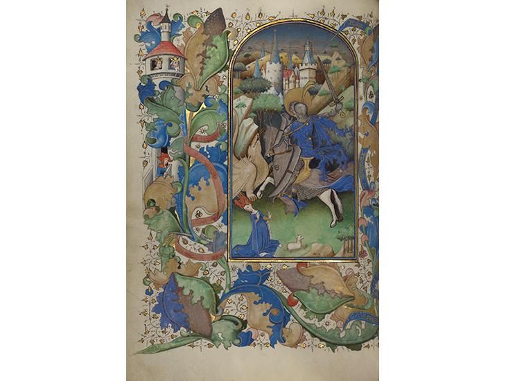
I recently spent five weeks at the Getty Museum, walking the galleries with a large magnifying glass in hand and talking to experts about the different paints and processes. The Brilliant History of Color in Art, the book I just wrote with the Museum, follows paints and dyes and pigments through time, from the manganese black used in the prehistoric cave paintings at Lascaux in France to the tiny dots of light, pixels, that create color on our computer screens.
My quest for color has landed me in all sorts of adventures. I traveled to eastern Iran for the two weeks in November when the landscape is purple with saffron crocuses harvested for their scented
red stigmas. I went twice to Afghanistan during wartime, the second time reaching the remote mountains where for 6,000 years people have mined the lapis lazuli stone that gives the astonishing purplish blue of Titian’s skies and the Virgin Mary’s robes.

Over the years I’ve seen my share of medieval stained glass windows in churches, cathedrals, and museums. I’ve even found and picked up tiny colored shards of glass on the ground outside churches in my native England. These shards had been lying in the dirt since the dark days of what we rather kindly call the Reformation of the 1530s, when some of the country’s most beautiful sacred art objects were smashed in obedience to King Henry VIII.
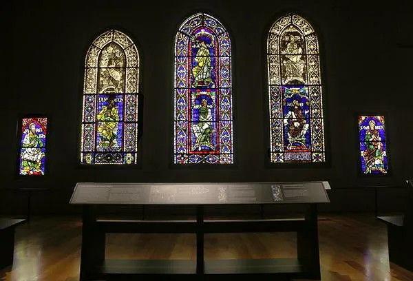
But I’d never done more than touch a fragment of stained glass until a few weeks ago, when I visited the Stained Glass Studio at Canterbury Cathedral in Kent in southern England. Conservators at the Cathedral had taken down this pane featuring the Biblical figure of Methuselah in his 12th-century glory, along with 42 other depictions of Christ’s ancestors as part of extensive cathedral renovations. This work became necessary when the glass in the southeast transept window started to fall out after weathering 800 years of wind and rain. Five of these over-life-sized glass figures were in a glorious exhibition at the Getty Center in 2013.

I used to think “stained glass” got its name because it’s so colorful. But I learned during the early years of my research that, instead, it is because some colored glass panes are overpainted with a metallic stain to depict faces, fabric folds, and other details, and then baked in a kiln. The staining can be damaged by the slightest touch.
Not all colored glass is truly stained, however. “Do you want to touch one of the unpainted pieces?” asked Leonie Seliger, head of the stained glass conservation department, pointing to panes in which the color comes from the glass itself, not from the painstaking, and vulnerable, surface stain.
I tentatively reached out my fingers to a piece of glass––a blue one, of course. I closed my eyes. The surface was like a smooth wave. Imagine touching a distant landscape of rolling hills and tracing your finger across the horizon. At a distance the glass looked flat, but it was far from it.
She showed me the replacement handblown glass she had prepared for restoration, organized in stacks by color. The sheets were flat.
“We’ve been desperately trying to find someone who can handblow glass unevenly,” she said. “But they’re all too good. We haven’t found anyone yet.”
Yet it is this uneven surface, and the impurities that were mixed with the coloring elements—cobalt for blue, manganese for purple, gold for pure red—that make the shimmers that have captivated me for years, going back to that day at Chartres.
The stories of colors burst with improbable details. Vivid red comes from cochineal, extracted from South American bugs whose brilliant red pigment was once so valuable that people danced in the streets when they arrived twice a year into the port of Seville. Lead white—now banned for toxicity in the U.S.—was derived from lead corroded through contact with acid and manure. Prussian blue was created by accident when an alchemist tried to make red. And all the “coaltar” colors with
which most of our clothes are dyed today were discovered by a teenager who made a mistake in his chemistry homework.
There is a common thread in the whole history of color in art, as I saw in those cathedral windows that first started me on this lifelong journey: the vital role played by imperfection, accident, and vulnerability in the striving for perfection. The windows of Chartres were made 800 years ago by itinerant craftsmen who traveled from cathedral to cathedral, living close to forests to have ample supplies of wood, and who no doubt told stories as they made their bumpy glass, full of dust motes and bits of leaves—imperfections that make it all the more glorious.
Victoria Finlay is the author of The Brilliant History of Color in Art, published by Getty Iris in November 2014. She lives in England and is still obsessed by colors (and colours). She wrote this for Zocalo Public Square.

The Brilliant History of Color in Art