A New Way to Illuminate Inequality Around the World
Want to know where the poor live? Look at where the light isn’t
/https://tf-cmsv2-smithsonianmag-media.s3.amazonaws.com/filer/March-Phenomenon-Dark-Truths-631.gif)
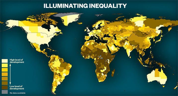
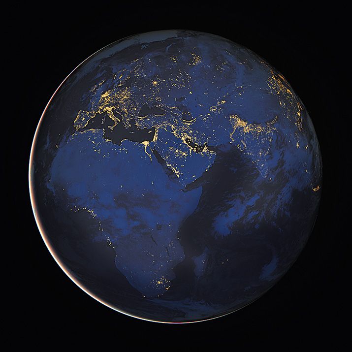
Satellite photos of Earth’s artificial lights at night form a luminescent landscape. But researcher Chris Elvidge of NOAA and colleagues from the University of Colorado and the University of Denver realized that they could also illuminate something much darker: the magnitude of human poverty. By comparing the amount of light in a particular area and its known population, they realized that they could infer the percentage of people who are able to afford electricity and the level of government spending on infrastructure development. This allowed them to extrapolate levels of human development—a measure of well-being that includes such factors as income, life expectancy and literacy.
Their Night Light Development Index (NLDI) uses a composite of cloudless night images taken by Air Force satellites. They found that the NLDI (below) measured human development with uncanny accuracy. The results closely correlated with conventional indices and in some cases even surpassed them. “The NLDI helps us get at the spatial patterns that you can’t see with traditional economic indices,” Elvidge says. “For instance, most nations report their GDP at the country or province level, but the NLDI can reveal subregional patterns, down to the one-kilometer scale.” The index also provides information on some countries, mostly in Northern Africa and the Middle East, for which reliable economic data are simply unavailable.
/https://tf-cmsv2-smithsonianmag-media.s3.amazonaws.com/accounts/headshot/joseph-stromberg-240.jpg)


/https://tf-cmsv2-smithsonianmag-media.s3.amazonaws.com/accounts/headshot/joseph-stromberg-240.jpg)