Could This New Tactile Font Help People Who Lose Their Sight Late In Life?
ELIA Frames may serve some blind readers better than braille, but the new system has its skeptics
/https://tf-cmsv2-smithsonianmag-media.s3.amazonaws.com/filer/e3/b7/e3b76d44-fc93-4d04-9532-41d2ffe8eda7/033018_elia_hands_74.jpg)
Elia Vallone once filled her days with mystery novels, newspapers and New York Times crossword puzzles. But at age 74, her vision began to fail.
Vallone had macular degeneration—a breakdown of the rod- and cone-shaped cells in the eye that convert light into electrical signals for the brain. In the worst of cases, as Vallone had, this means near total vision loss. "I couldn't stand the idea of her being shut down because she could no longer read," her daughter Elia Chepaitis told People magazine in 1988.
Vallone attempted to learn braille, to no avail. And she isn't alone. Though reliable statistics are not available for the number of braille readers (an oft-cited, but outdated figure is less than 10 percent of legally blind Americans), people who lose sight and are already out of school are thought to be less likely to learn braille than those who start young.
Because of this, Andrew Chepaitis, Vallone's grandson, wants to flip the braille script. The former equity research analyst founded the company ELIA Life Technology, which aims to create a tactile alphabet that echoes the Roman characters, tailored to people who lose their sight later in life.
The company makes the bold claim that their new system is "the world's most intuitive tactile reading system." But the upstart is stirring controversy in the braille community, with many questioning if an alternative is necessary at all.
***
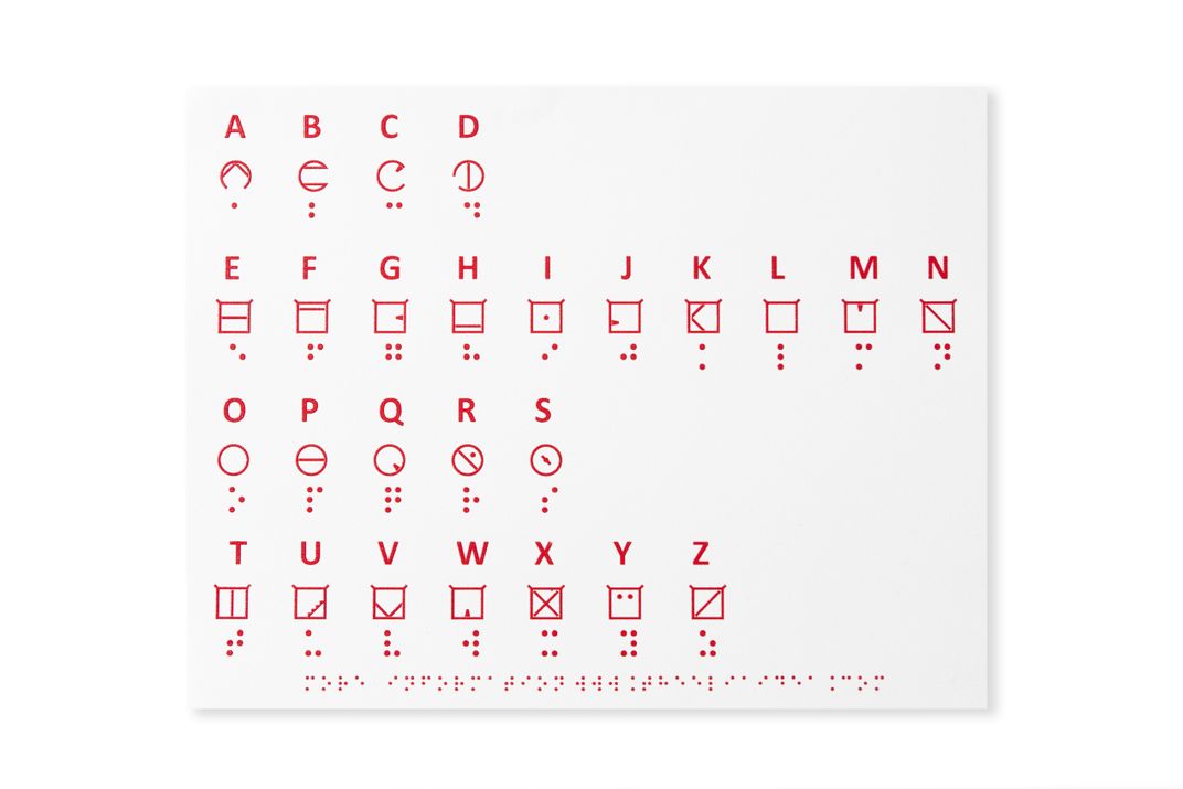
"Reading tactilely is a bit like reading through frosted glass, so it kind of blurs together," says Chepaitis. To tackle this issue, the ELIA system—or "font" as the company calls it—houses each character in a frame to guide readers from letter to letter.
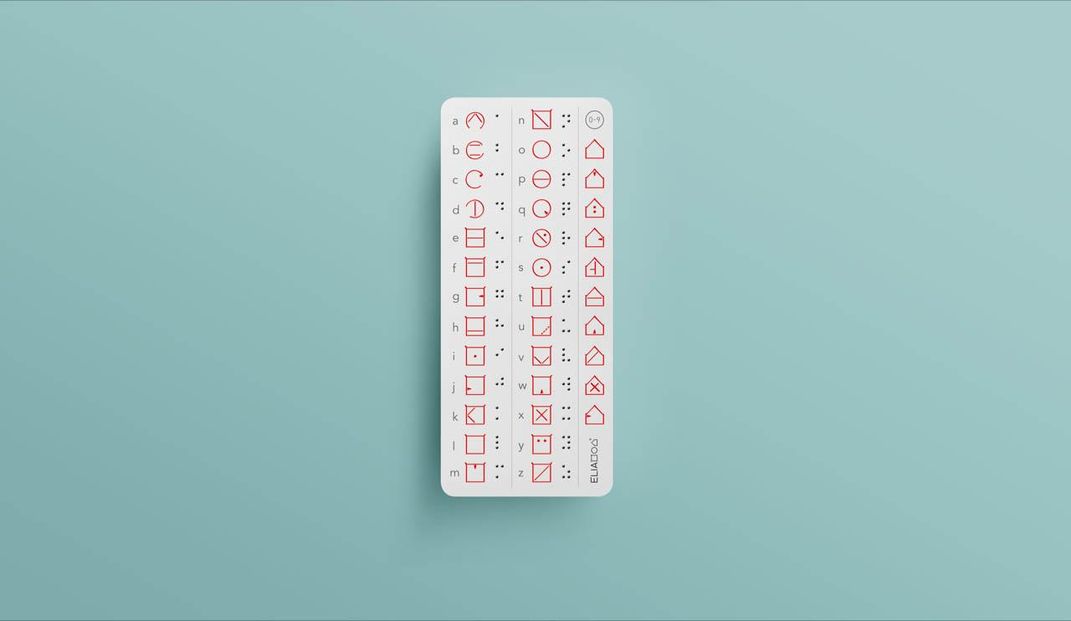
There's the circular frames that bracket the symbols for A-D and O-S, then there's the square frames of letters E-N and T-Z. Numbers all have house-shaped frames. The frame shapes not only loosely mimic the Roman alphabet (for example: O, P, and S are all pretty curvy, whereas X, Y, Z are all boxy), but they also help distinguish different segments of the alphabet.
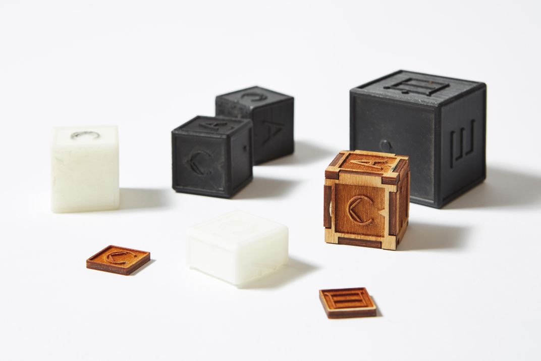
The final product is a series of raised pictographs that, with the exception of a few select letters, look (and feel) like blocky, stylized versions of the Roman alphabet. Unlike braille, these tactile letters can be scaled to any size the user requires. The team just launched a Kickstarter campaign and plans to release a specialized HP Inkjet printer this fall that can create all manner of raised imagery.

Andrew's mother Elia Chepaitis originally designed the font in 1987 while working on a degree in human factors engineering and design. But Elia abandoned the project after earning her degree and becoming a professor of information systems at Fairfield University.
"So it just kind of sat there," says Andrew Chepaitis, who helped his mother in the early stages of development. But, he adds, "I always thought it was worthwhile."
Since founding his company in 2000, Chepaitis and his team have put the font through a battery of tests. In total, they've analyzed 175,000 responses from 350 participants, including blindfolded sighted participants and visually impaired or legally blind participants of a wide range of ages.
The latest ELIA font bears the fingerprints of these years of testing. Though the design remains similar to the one his mother created, there have been slight tweaks. For example, tiny ears sit atop the upper corners of each square frame. Though the participants can't actually feel these little ticks, it makes the square's corners feel extra sharp, preventing confusion of square and circular letters at small font sizes.
Chepaitis envisions the system can be used for everything from home labels to books. When asked about the feasibility of printing the font, he acknowledges paper documents would be quite large thanks to ELIA's oversized letters and, at the moment, expensive. But he isn't deterred.
"Braille started with one book," he says. "So we'll start with one."
***
Overall, responses to ELIA are mixed. Many experts draw comparisons between ELIA and other Roman character-based systems, like Moon type, which was invented by William Moon in 1845. Moon is slow to read and challenging to reproduce. And because of this, it never really took off.
"It is a very interesting concept, and it's neat that they're trying to come up with something that could be usable," says Ike Presley, National Project Manager for the American Foundation for the Blind. But he has concerns about how ELIA cites some inaccurate statistics about braille literacy.
According to ELIA, it takes 10 months to learn braille and 5 to 11 years to achieve a 23 WPM reading speed. But ten months is merely the length of a braille course at the Hadley School for the Blind, according to Chepaitis. ("We don't know what it takes," he says in conversation.) And the 5- to 11-year figure comes from the book Reading By Touch, which was written more than 20 years ago, notes Rebecca Sheffield, senior policy researcher at the American Foundation for the Blind.
ELIA also includes the striking statistic that less than 1 percent of the 8.4 million people in the U.S. with visual impairments can read braille. But this figure is calculated using results from two different surveys conducted more than a decade apart. "We do not believe there is a comprehensive study that exists that would give a good handle on the number of people who are blind who read braille," says Sheffield.
That's not to say learning braille is a breeze.
Thomas Reid lost his sight in 2002 at age 35 due to cancer. After spotting ELIA on Twitter, Reid, the host of the podcast “Reid My Mind Radio” and “2 Blind Mics,” reached out to Chepaitis to learn more about the font and potentially highlight it on his show.
Though Reid has learned braille, he emphasizes he's still a slow reader. And it took "months and months," he says. When asked about the most difficult part of learning braille, he responds with a rhetorical question: "You ever see how small those bumps are?"

"If you've been reading print all your life and now you have to take in information tactilely, it's different," he says. "It takes a lot of brain power." Studying braille, he says, required intense concentration to think through each letter—and the effort often left him mentally exhausted.
"I didn't find that with ELIA," he says. Within an hour he learned the alphabet and was relatively comfortable identifying individual letters.
ELIA's tests suggest that others have a similar experience. After 60 hours of focused training, with no additional at-home practice, focus group participants achieved an average reading speed of 2.8 words per minute at 0.7 cm font size and up to nearly seven WPM with a 1.1 cm font size. The range was wide, with some participants able to process up to 25 WPM after training.
The company also tested braille readers’ learning speed in a similar situation. After the 60 hours of training, participants read standard braille (roughly 0.7 cm) at just under one WPM. With a 1.1 cm braille, participants read at 3.1 WPM, an average comparable to the small ELIA font.
To put that into context, sighted English readers process an average of 200 to 250 words per minute. Braille reading speeds widely vary from the mid-20s words per minute up to 200 words per minute for exceptionally fast readers.
But Presley worries that ELIA's max reading speeds won't line up. Since its invention by Louis Braille in 1824, braille has been optimized over the years, he says. Dot depth, size and distance are now all standardized for the fastest and accurate reading.
"You want to be able to perceive all six dots at one time under your finger without having to move [it]," says Presley. ("Jumbo braille" is slightly larger, but less common than the standard size.) But that's not the case with ELIA frames, which require a little tactile exploration.
Responding to the critique, Chepaitis argues that all readers—sighted and tactile—start one letter at a time. "No reader on the planet ever just jumped to reading words," he says.

Perhaps, in the end, speed reading isn't really the goal for ELIA. "Where I see it can make a big difference is labeling," says Reid, who largely relies on screen readers for work. He qualifies this statement, however, by expressing strong support for braille—a system that has provided hundreds of thousands of dedicated users independence at both home and work.
Many concerns about ELIA seem to stem from the idea that it would compete with or replace braille, drawing away some of the already limited resources and funding. And Chepaitis is sympathetic to the concern.
When asked about the worry, he's clear that it is not his intent. People with visual disabilities at birth "learn braille as their first font, their only font," he says. "And changing it would be disruptive." But he hopes that ELIA will be an alternative for those who did not learn braille at such an opportune age.
"At the core, [our hope is that] down the road, people will be able to choose whatever font they want," he says, likening the decision to selecting Helvetica versus Times New Roman.
As Reid notes, for now, ELIA remains fairly inaccessible without a printer, and it's unclear how affordable such devices will be. Nancy D. Miller, CEO of VISIONS services for the blind and visually impaired, agrees that the biggest challenge for the font will be attracting a large enough market to bring the cost of printing down.
"I wouldn't prevent anybody from coming up with alternative ways of being as independent as possible," says Miller. "And even if a small group finds it helpful, what's wrong with that? I just don't think it's ever going to be marketed to scale."
For Reid, the lengthy process of learning to read braille was a constant reminder of his situation. "You're adjusting to blindness. Everything is new and you're dealing with all of that at the same time," he says.
"There's a lot of emotional stuff that's going on. It's a lot of mental strength you have to put yourself through," he adds.
But for people like Reid, perhaps ELIA—whose curves and corners hold a certain comfort in their familiarity—can help lift just a sliver of that burden.
ELIA is currently on view in "The Senses: Design Beyond Vision," an exhibition at the Cooper Hewitt, Smithsonian Design Museum in New York City through October 28, 2018.
/https://tf-cmsv2-smithsonianmag-media.s3.amazonaws.com/accounts/headshot/Wei-Haas_Maya_Headshot-v2.png)
/https://tf-cmsv2-smithsonianmag-media.s3.amazonaws.com/accounts/headshot/Wei-Haas_Maya_Headshot-v2.png)