The World According to Twitter, in Maps
A new geographic analysis of millions of tweets provides a remarkably broad view of humanity, by language, location and other factors
![]()
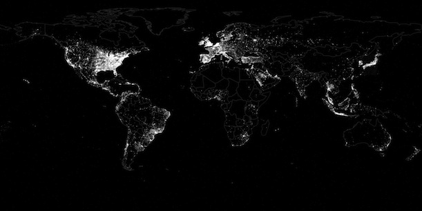
Tweets from around the world, plotted by location as part of a new study. Click to enlarge. Image via First Monday/Leetaru et. al.
It’s hard to appreciate just how quickly and thoroughly Twitter has taken over the world. Just seven years ago, in 2006, it was an idea sketched out on a pad of paper. Now, the service is used by an estimated 554 million users—a number that amounts to nearly 8 percent of the all humans on the planet—and an estimated 170 billion tweets have been sent, with that number climbing by roughly 58 million every single day.
All these tweets provide an invaluable source of news, entertainment, conversation and connection between people. But for scientists, they’re also valuable as something rather different: raw data.
Because Twitter features an open API (which allows for tweets to be downloaded as raw, analyzable data) and many tweets are geotagged, researchers can use billions of these tweets and analyze them by location to learn more about the geography of humans across the planet. Last fall, as part of the Global Twitter Heartbeat, a University of Illinois team analyzed the language and location of over a billion tweets from across the U.S. to create sophisticated maps of things like positive and negative emotions expressed during Hurricane Sandy, or support for Barack Obama or Mitt Romney during the Presidential election.
As Joshua Keating noted on Foreign Policy‘s War of Ideas blog, members of the same group, led by Kalev Leetaru, have recently gone one step further. As published in a new study earlier this week in the online journal First Monday, they analyzed the locations and languages of 46,672,798 tweets posted between October 23 and November 30 of last year to create a stunning portrait of human activity around the planet, shown at the top of the post. They made use of the Twitter decahose, a data stream that captures a random 10 percent of all tweets worldwide at any given time (which totaled 1,535,929,521 for the time period), and simply focused on the tweets with associated geographic data.
As the researchers note, the geographic density of tweets in many regions—especially in the Western world, where computers, mobile devices, and Twitter are all used at peak levels—closely matches rates of electrification and lighting use. As a result, the maps of tweets (such as the detail view of the continental U.S., below) end up looking a lot like satellite images of artificial light at night.
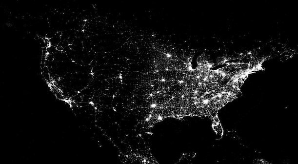
Click to enlarge. Image via First Monday/Leetaru et. al.
As a test to see how well tweets matched artificial light use, they created the composite map below, in which tweets are shown as red dots and nighttime lighting is shown as blue. Areas where they correspond in frequency (and effectively cancel each other out) are shown as white, and areas where one outweighs the other remain red or blue. Many areas end up looking pretty white, with some key exceptions: Iran and China, where Twitter is banned, are noticeably blue, while many countries with relatively low electrification rates (but where Twitter is still popular) appear as red.
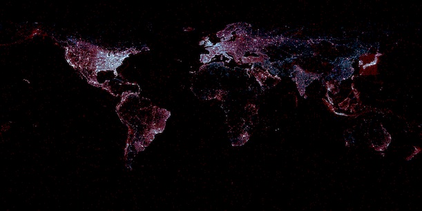
Click to enlarge. Image via First Monday/Leetaru et. al.
The project got even more interesting when the researchers used an automated system to break down tweets by language. The most common language in Twitter is English, which is represented in 38.25 percent of all Tweets. After that came Japanese (11.84 percent), Spanish (11.37 percent), Indonesian (8.84 percent), Norwegian (7.74 percent) and Portugese (5.58 percent).
The team constructed a map of all tweets written in the 26 most popular languages, with each represented by a different color, below:
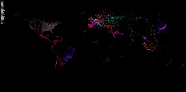
Click to enlarge. Image via First Monday/Leetaru et. al.
While most countries’ tweets are dominated by their official languages, many are revealed to include tweets in a variety of other languages. Look closely enough, and you’ll see a rainbow of colors subtly popping out from the grey dots (English tweets) that blanket the U.S.:
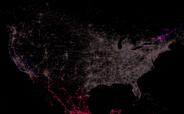
Click to enlarge. Image via First Monday/Leetaru et. al.
Among other analyses, the research team even looked at the geography of retweeting and referencing—the average distance between a user and someone he or she retweets, as well as the average distance between that user and someone he or she simply references in a tweet. On average, the distance for a retweet was 1,115 miles and 1,118 for a reference. But, counterintuitively, there was a positive relationship between the number of times a given user retweeted or referenced another user and their distance: Pairs of users with just a handful of interactions, on the whole, were more likely to be closer together (500-600 miles apart) than those with dozens of retweets and references between them.
This indicates that users who live far apart are more likely to use Twitter to interact on a regular basis. One explanation might be that the entities with the most followers—and thus the most references and retweets—are often celebrities, organizations or corporations, users that people are familiar with but don’t actually have a personal relationship with. A global map of retweets between users is below:
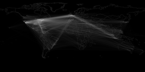
Click to enlarge. Image via First Monday/Leetaru et. al.
The paper went into even more detail on other data associated with tweets: the ratio between mainstream news coverage and number of tweets in a country (Europe and the U.S. get disproportionate media coverage, while Latin America and Indonesia are overlooked), the places Twitter has added the most users recently (the Middle East and Spain) and the places where users have, on average, the most followers (South America and the West Coast).
There are a few caveats to all this data. For one, though the tweets analyzed number in the tens of millions, they are still just 0.3 percent of all tweets sent, so they might not adequately represent all Twitter patterns, especially if users who enable geotagging behave differently than others. Additionally, in the fast-changing world of Twitter, some trends might have already changed significantly since last fall. But as Twitter continues to grow and as more data become available, it stands to reason that this sort of analysis will only become more popular for demographers, computer scientists and other researchers.
/https://tf-cmsv2-smithsonianmag-media.s3.amazonaws.com/accounts/headshot/joseph-stromberg-240.jpg)
/https://tf-cmsv2-smithsonianmag-media.s3.amazonaws.com/accounts/headshot/joseph-stromberg-240.jpg)