Worst NASA Posters Ever
/https://tf-cmsv2-smithsonianmag-media.s3.amazonaws.com/filer/20110520102332NW-2009-11-08-JSCexp22SFAposterSmall.jpg)
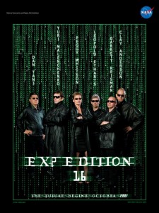
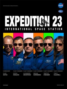
NASA is usually a master of the art of self promotion, which is why I'm a bit perplexed by this page of downloadable posters promoting NASA manned space missions. The most innocuous ones are simply boring, with proud astronauts grouped in front of a space shuttle or some stars. (No one looks good in an orange space suit, but that's the uniform.) What I'm talking about, though, are the posters where NASA is trying to be "creative." Who thought that giving everyone bright blue hair was a good idea? Or referencing Rat Pack promotional posters from the 1960s? Or dressing up the team as characters from The Matrix:
Or Star Trek:
Or Reservoir Dogs (at least it didn't cost much; all they had to buy for this photo shoot were a few pairs of sunglasses):
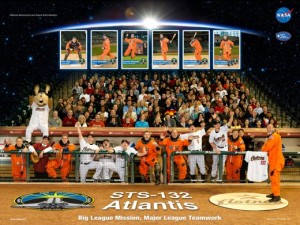
Most perplexing to me, though, is this poster for the upcoming May mission to the International Space Station:
Why baseball?
Who wants these posters? I can't see little kids who dream of being astronauts wanting to hang these up on their bedroom walls. And if I was in one of these missions, I would be more than a little embarrassed by some of them. So why is NASA spending time and money on this? Or am I just not getting the joke?
/https://tf-cmsv2-smithsonianmag-media.s3.amazonaws.com/accounts/headshot/Sarah-Zielinski-240.jpg)


/https://tf-cmsv2-smithsonianmag-media.s3.amazonaws.com/accounts/headshot/Sarah-Zielinski-240.jpg)