The Arc of History is Long, But it Bends Toward Asian Economic Dominance
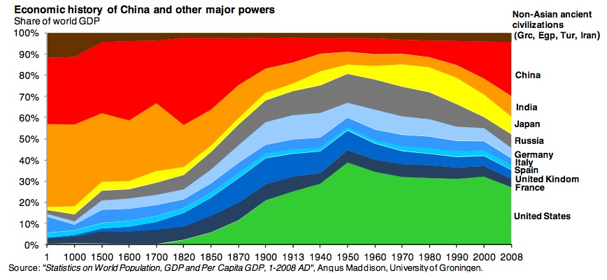
Derek Thompson from The Atlantic manages to present 2,000 years of economic history in 5 paragraphs plus a colorful little graph by Michael Cembalest, an analyst at JP Morgan.
In Year 1, India and China were home to one-third and one-quarter of the world’s population, respectively. It’s hardly surprising, then, that they also commanded one-third and one-quarter of the world’s economy, respectively.
Until the Industrial Revolution, Thomson explains, income growth was based on simple numbers: if lots of people died, incomes went up. If lots of people were born, incomes went down, which in turn led to more deaths and repeated the cycle. As a result, populations closely approximated a country’s GDP, he writes.
But then came the game-changer, the Industrial Revolution.
Today, the U.S. accounts for 5% of the world population and 21% of its GDP. Asia (minus Japan) accounts for 60% of the world’s population and 30% of its GDP.
So, one way to read the graph, very broadly speaking, is that everything to the left of 1800 is an approximation of population distribution around the world and everything to the right of 1800 is a demonstration of productivity divergences around the world — the mastering of means of manufacturing, production and supply chains by steam, electricity, and ultimately software that concentrated, first in the West, and then spread to Japan, Russia, China, India, Brazil, and beyond.
The post quickly accumulated over 100 comments, and some readers questioned the validity of the graph. RayTheFourth wrote:
The bigger question is how you compare economies across time using metrics devised in the 20th century with 20th century mathematical tools. Data isn’t standardized across history because at different places and at different times varying sets of data may, or may not, be gathered While estimations can be made based off of these data sets, pairing them with the more precise modern data creates a distorted view of what we actually know.
While I would love to be able to accurately compare modern economic apples to historical ones, all we can do with the data at hand is to compare modern economic apples to what we assume are oranges, which we then try to turn into apples.
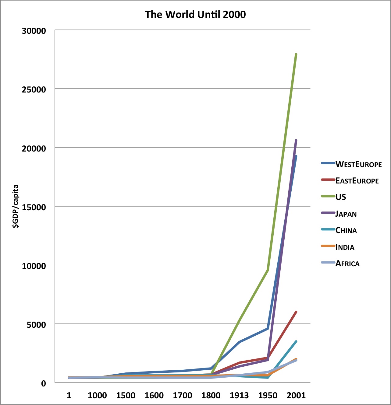
In response, Thompson fired back with a second post the next day, complete with graphs of GDP per capita plotted against the same timeline.
This data visualization still points to Asia’s propensity to dominate economically. Thompson summarizes:
The industrial revolution didn’t happen everywhere at the same time, but it did have the same effect everywhere: massively rising GDP/person.
The Japanese and Chinese stories are the most dramatic. Japan, which was behind Eastern Europe before World War I, nearly caught the United States by the end of the 20th century. China, which fell behind Africa in the middle of the 20th century, is now perhaps the most massive success story in industrialization history.
More from Smithsonian.com: Great Depression Had Little Effect on Death Rates, Men of China’s Qing Dynasty Chose Trophy Wives to Flaunt Their Wealth
/https://tf-cmsv2-smithsonianmag-media.s3.amazonaws.com/accounts/headshot/Rachel-Nuwer-240.jpg)


/https://tf-cmsv2-smithsonianmag-media.s3.amazonaws.com/accounts/headshot/Rachel-Nuwer-240.jpg)