This Map, With a Dot for Every American, Shows the Country’s Racial Divisions
With one dot for every person, color-coded by race, this map shows the distribution of Americans
/https://tf-cmsv2-smithsonianmag-media.s3.amazonaws.com/filer/2013082012302308_20_2013_population-America.jpg)
This is a map of every single American living in the United States—one dot for each person—broken down by the block they live on and their self-reported racial identity. The map was built using the 2010 census data by Dustin Cable for the Weldon Cooper Center for Public Service at the University of Virginia. The map itself is huge and provides a fun (if sort of slow) way to really get a sense of the population distribution of Americans, both in terms of population density but also in community structure.
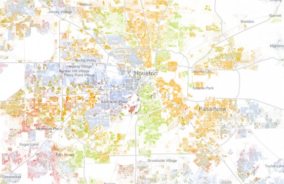
Let’s look at one city. Tony Perrottet recently visited Houston, America’s most racially equitable city, for Smithsonian. Of any city in the country, this one has the most even proportions of four main racial groups: white, black, Asian and Hispanic. The map shows, though, that while Houston as whole has a fair mix of people with different backgrounds, within the city, those groups doesn’t blend so smoothly:
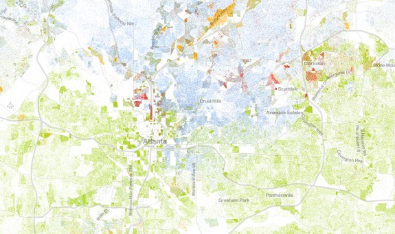
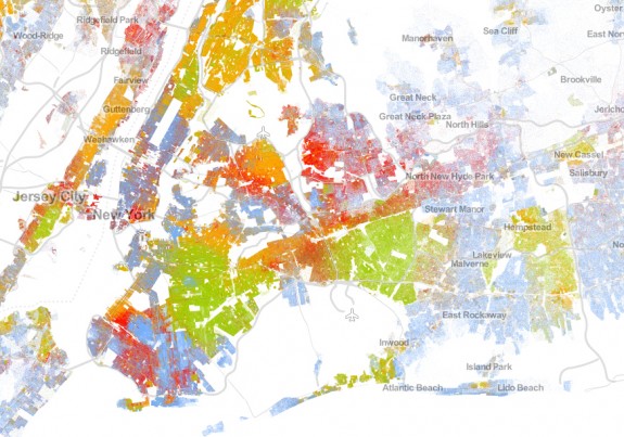
The same is true for cities like New York, with its pockets of racial groups, or Atlanta, with its stark divides.

Unlike the patchy milieu of Houston or New York, Atlanta’s population is much more segregated geographically. Photo: Dustin Cable
More from Smithsonian.com:
/https://tf-cmsv2-smithsonianmag-media.s3.amazonaws.com/accounts/headshot/smartnews-colin-schultz-240.jpg)


/https://tf-cmsv2-smithsonianmag-media.s3.amazonaws.com/accounts/headshot/smartnews-colin-schultz-240.jpg)