Transit Users Trust Distorted Subway Maps Way Too Much
Subway map design might have a lot bigger impact on the way you travel than you might think

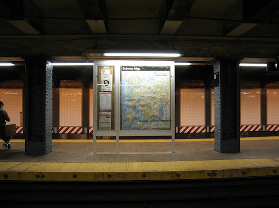
New York City’s famous subway map. Image: wka
Look at the London subway map, and you might think you’re getting a good sense of the city’s layout. You’d be mostly wrong. The London map depicts the city center about four times larger than it actually is. The same thing happens if you look at New York City’s subway map—Manhattan is definitely not that big, and Central Park is definitely not that wide.
Our maps are distorted for a reason. The New York City map most people know today was thirty heated years in the making. The map is full of oddities and mistakes, as the The New York Times writes:
On the West Side of Manhattan, beginning near Lincoln Center and extending toward the campus of Columbia University, Broadway is seemingly misplaced. It is west of Amsterdam Avenue at West 66th Street when it should be east. It drifts toward West End Avenue near 72nd Street, where it should intersect with Amsterdam. It overtakes West End Avenue north of the avenue’s actual endpoint near West 107th Street, creating several blocks of fictitious Upper West Side real estate.
Confronted with their errors, some designers who worked on the map betrayed more than a little embarrassment. But not everyone involved believes that these things matter. “This is not a street map,” Adam Lisberg, the chief spokesman for the Metropolitan Transit Authority told the Times. “This is a subway map.”
Different cities allow for different amounts of…let’s call it creativity in their map designs. Jessica Gross, at The Atlantic, writes:
According to Zhan Guo, an assistant professor of urban planning and transportation policy at NYU Wagner, certain cities allow for more flight of fancy than others. San Francisco and New York have a lot of geographic markers, so passengers will only accept so much map distortion. New York’s grid system further discourages excessive futzing. In Chicago, the line is elevated, which leaves even less leeway. But in a place like London, with twisty streets, few geographical markers other than the Thames, and an underground system, you can pull a lot more over on people.
But the real question is, does any of it matter? As the MTA’s Leisberg says, these are subway maps, not street maps. They can’t really change our behavior that much, right? Wrong.
The Atlantic again:
In an extensive study of the London Tube, published last year, Guo found that passengers tend to take routes that look shorter, even if they’re actually longer. This is no small difference: the map depiction is about two times more influential than lived experience. Passengers who knew the system well were less likely to be duped than first-time riders, but even they still regularly fell under the Tube map’s spell.
Even the most seasoned New Yorker can fall victim to the map’s magic. People will transfer at Times Square but avoid a 14th street L transfer, where the map shows a dot and a line, indicating an underground passage. These subway users don’t account for the hundreds of people and several flights of stairs that make Times Square transfers terrible, because on the map the station is just one dot.
Designing these maps to change people’s behavior can alter congestion and traffic flow, too. In Washington, D.C., researchers have produced three distinct Metro maps and are using them to compare rider behavior. Chances are that these three maps will nudge people to create distinctly different routes.
For visitors, this might make a big difference. But the stubborn commuters among us won’t stray from our standard route no matter what the map says.
More at Smithsonian.com:
/https://tf-cmsv2-smithsonianmag-media.s3.amazonaws.com/accounts/headshot/Rose-Eveleth-240.jpg)
/https://tf-cmsv2-smithsonianmag-media.s3.amazonaws.com/accounts/headshot/Rose-Eveleth-240.jpg)