Welcome to Beefspace, Where the Battle for Fast Food Dominance Rages On
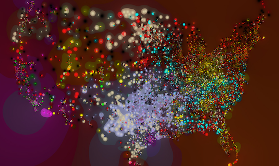
This is a beautiful, and detailed map of the most influential fast food chains at each point

Image: Stephen Von Worley
You and I live in meatspace, but this map is of a different kind of meaty world. It’s a beautiful, detailed representation of the most influential fast food chains at each point.
This is an update of an earlier map of the eight largest U.S. burger chains. The mapmaker, artist and scientist Stephen Von Worley, explains the changes:
The colors now represent the three most influential chains at each point, weighted by cumulative force at a 4:2:1 ratio, where black is McDonald’s, red Burger King, yellow Wendy’s, magenta Jack In The Box, periwinkle Sonic, cream Dairy Queen, green Carl’s Jr., and cyan Hardee’s. Together, you can think of these tweaks as elegantly exposing the subtle contours of market dominance, then splattering them with the individual restaurant locations.
You can zoom in and around the map to find your home town, your school or your vacation spot. The data comes from AggData.com, a database of business locations across the United States. Who dominates your beefspace? Are you in a Sonic belt, or a Jack in the Box island?
More from Smithsonian.com:
/https://tf-cmsv2-smithsonianmag-media.s3.amazonaws.com/accounts/headshot/Rose-Eveleth-240.jpg)
/https://tf-cmsv2-smithsonianmag-media.s3.amazonaws.com/accounts/headshot/Rose-Eveleth-240.jpg)