The Art and Design Behind Pixar’s Animation
A new exhibition at the Cooper Hewitt in New York City draws on the rich backstory of what it takes to give computer-animated life to pen and ink sketches
New York City has a new destination for animation aficionados: the Process Lab of the Cooper Hewitt, Smithsonian Design Museum.
The lab, housed in Andrew Carnegie’s grand old office suite, is the museum’s interactive space where visitors of all ages can participate in the design process, visually, digitally and manually.
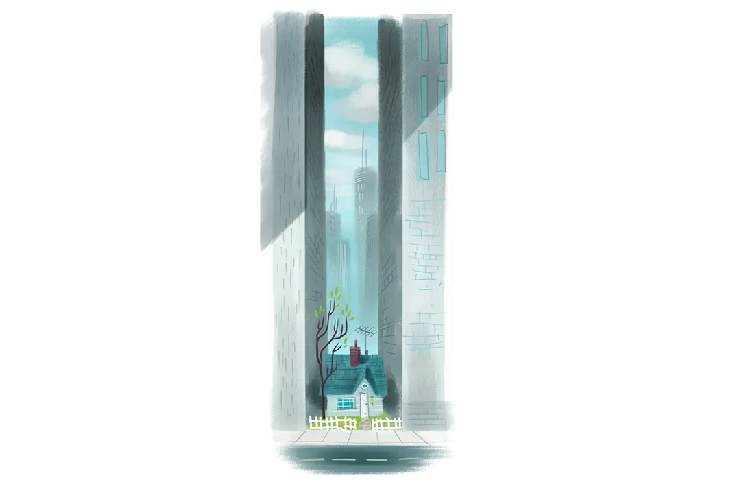
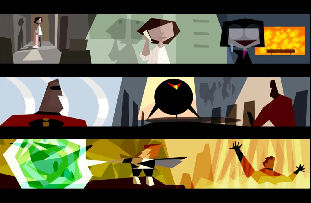
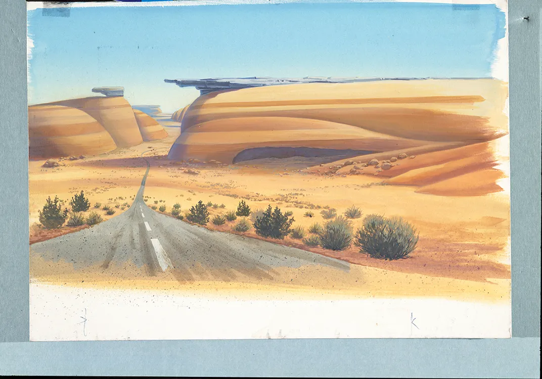
The lab just opened “Pixar: the Design of Story,” (on view through August 7, 2016) a show that examines the chemistry of an animated picture. It tracks the arduous five-year process required to make a full-length film at Pixar Animation Studios, from initial idea through development of stories, characters, mood, music, color scripts and settings.
The walls are mounted with rarely seen original hand-drawn pencil and ink “concept” sketches—most Pixar directors started out as animators—architectural drawings, paintings, clay sculptures and digitally created images of such popular Pixar characters as Sadness from Inside Out, cowboy Woody from Toy Story and the redheaded archer Merida from Brave.
“Our films are not about stories but about storytelling,” says Elyse Klaidman, the longtime director of Pixar University (the in-house school for employees) and the Archives at Pixar Animation Studios in California. “It starts with wanting to tell a story. We strive to create appealing characters in a believable world. Who are the characters? How do they change? What do they learn?”
“Our directors come up with ideas they share with [CEO] John Lasseter and our Brain Trust, a team of directors that decides what story is the one that resonates,” Klaidman explains. “These are people who have this passion to tell stories that make us feel wonderful, stories that have deep meaning to them. The stories come from life.”
Consider Inside Out, the 2015 Pixar film that depicts the inside of an 11-year-old girl’s brain, as it is alternatively dominated by conflicting emotions.
“It’s about what happens to the brain of a little girl as she transitions to middle school,” Klaidman says.
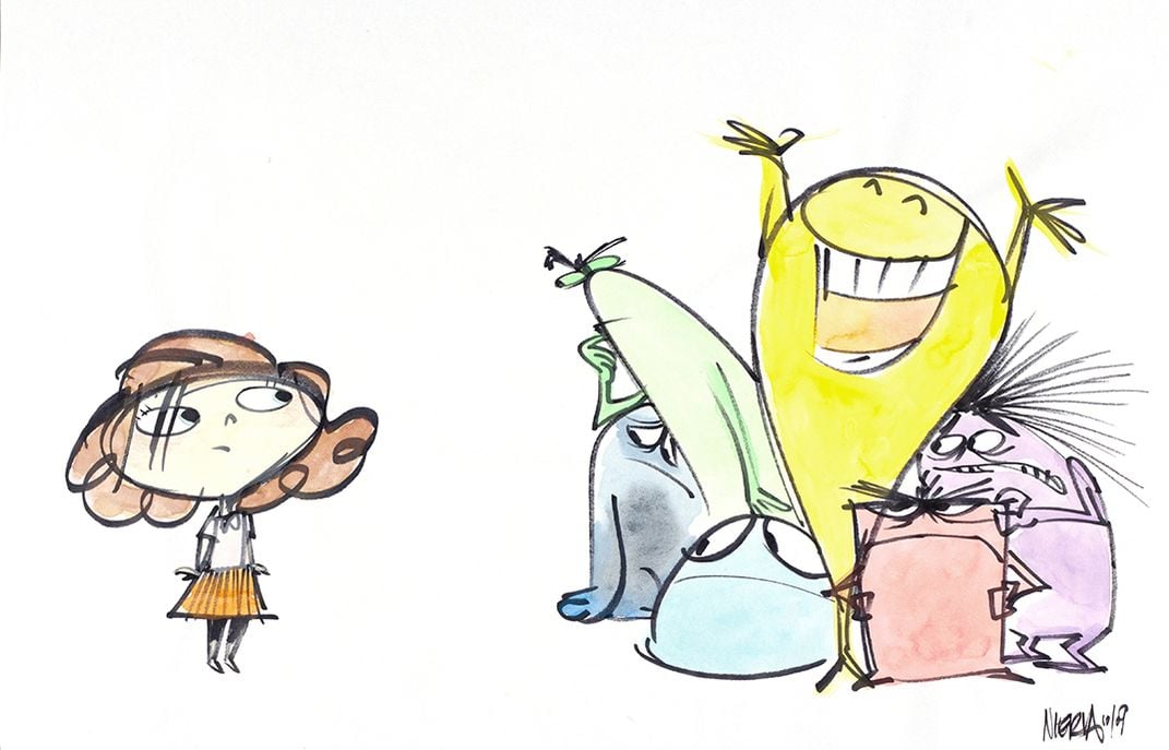
In fact, the story for Inside Out came from Pixar director Pete Docter, who was struck by the emotional changes he saw his daughter experiencing as she went from carefree little girl to withdrawn preteen. He decided to make a film that would show the girl’s “outside” life at school and home while illustrating the turmoil inside her brain, especially her emotions: Joy, Sadness, Disgust, Fear and Anger.
Each is given its own color and personality.
So Joy is a sparky yellow “it” girl. Sadness is a shy blue bookworm. Disgust is a green snarky, mean girl. Fear is a purple goofball. Anger is a squat trapezoidal hunk. In Inside Out, emotions are full-blown characters.
“Design is at the heart and center of everything we do,” Klaidman says.
In the Cooper Hewitt's lab we see the Pixar process of research and collaboration in drawings of Toy Story's Woody as first conceived, as he evolves, even as a sculpted clay head. We see how Pixar’s computer programmers “map” the way the long red curls on Merida’s head swing as she prepares to shoot an arrow.
We see Cars compete and The Incredibles in action.
Then there is the lab’s interactive part: On an 84-inch touch-screen table, one can access 650 examples of Pixar artwork and compare each one to works in the museum’s collection. (For example, looking at the décor of a modern house in a Pixar film, you could drag an image of an Eames chair to it, to learn all about the chair.)
“Our intent in the lab was to create a participatory space that is very much the intersection of education and digital,” says curator Cara McCarty. “The underlying goal is to encourage and inspire our public to start thinking about design and the world around them. Design is all about connections.”
Why Pixar?
“We look at the design processes of different industries, and this time it’s film. Pixar came to mind because the films are so highly designed,” says McCarty.
To further that idea, Pixar and the Cooper Hewitt have produced a children’s “work book” to accompany the exhibition. Designing with Pixar: 45 Activities to Create Your Own Characters, Worlds, and Stories (Chronicle Books) has pages encouraging children to draw their own stories, expanding on various Pixar themes.
A different room in the lab serves as a theater to show Luxo Jr.—a groundbreaking short film directed by John Lasseter in 1986. It was the first three-dimensional computer-animated film and the first to receive an Academy Award nomination. It is a short story about a desk lamp (Dad) and his rambunctious son, a mini desk lamp, on a play date that has its ups and downs. (The mini is crestfallen as he bounces on a ball and squashes it, but he recovers when he finds an even bigger ball. Dad merely shakes his head, knowing what’s coming next.)
The film was so important to Pixar’s foundation that the lamp became the studio’s logo.
Lassater, who had been fired from Disney’s animation studio, created it to showcase computer technology and prove it could tell stories with universally appealing characters.
“At that time, most traditional artists were afraid of the computer,” Edwin Catmull, the president of Pixar, is quoted in the wall text. “They did not realize that the computer was merely a different tool in the artist’s kit but instead perceived it as a type of automation that might endanger their jobs…The release of ‘Luxo Jr.’…reinforced this opinion turnaround within the professional community.”
And how.
Seeing the film, the original lamp sketches, the storyboards, even Lassater’s list of lamp-bouncing “actions” on a yellow legal pad lets visitors fully understand Pixar’s design processes—without losing any of the magic.
"Pixar: The Design of Story" is on view through August 7, 2016 at the Cooper Hewitt, Smithsonian Design Museum in New York City.
/https://tf-cmsv2-smithsonianmag-media.s3.amazonaws.com/accounts/headshot/wendy_new-1.jpeg)


/https://tf-cmsv2-smithsonianmag-media.s3.amazonaws.com/filer/55/81/55818f17-5889-4e97-89f9-c68d4dd83a23/pixardigitalpaintingweb.jpg)


/https://tf-cmsv2-smithsonianmag-media.s3.amazonaws.com/accounts/headshot/wendy_new-1.jpeg)