The Cooper Hewitt, Smithsonian Design Museum Makes Its Grand Re-Opening in New York City
The old and the new crash into each other beautifully in the former Carnegie mansion
/https://tf-cmsv2-smithsonianmag-media.s3.amazonaws.com/filer/5d/cc/5dcc80a4-9e7c-49a9-b9a5-6e9a41e8b613/carnegie_mansion_north_facadeweb.jpg)
In a Georgian mansion on New York’s Upper East Side, a lamp made of shattered ceramic crockery abstracted into a frozen explosion hangs over an gilded porcelain jewel cabinet, artfully adorned with images of birds and flowers and ancient gods. In the next room, an iPod shares space with a typewriter, and a Russian lithograph in a custom case designed by one of New York’s top architecture firms. Despite spanning centuries and styles these groupings of disparate objects coalesce with surprising grace, provoking visitors to really think about just what design is. These are only two of many such moments realized by the thoughtful curators and designers behind the newly reopened, revamped and reinvigorated Cooper Hewitt, Smithsonian Design Museum.
America’s only museum devoted to historic and contemporary design was established in 1897 by Sarah and Eleanor Hewitt, granddaughters of industrialist Peter Cooper, as part of the Cooper Union for the Advancement of the Science and Art. Their aim was to create a “practical working laboratory” where visitors could learn about the “arts of decoration.” They succeeded. In 1967,the museum became a part of the Smithsonian, and in 1976, it moved into the landmark Fifth Avenue mansion built for steel magnate Andrew Carnegie (1835-1919). Three years ago, the museum closed for a massive renovation and, when it reopens to the public on December 12, it will reaffirm the Hewitt Sisters’ legacy with 60 percent more exhibition space, along with a new focus on cutting edge technology and public engagement that aims to transform museum-goers into museum-users.
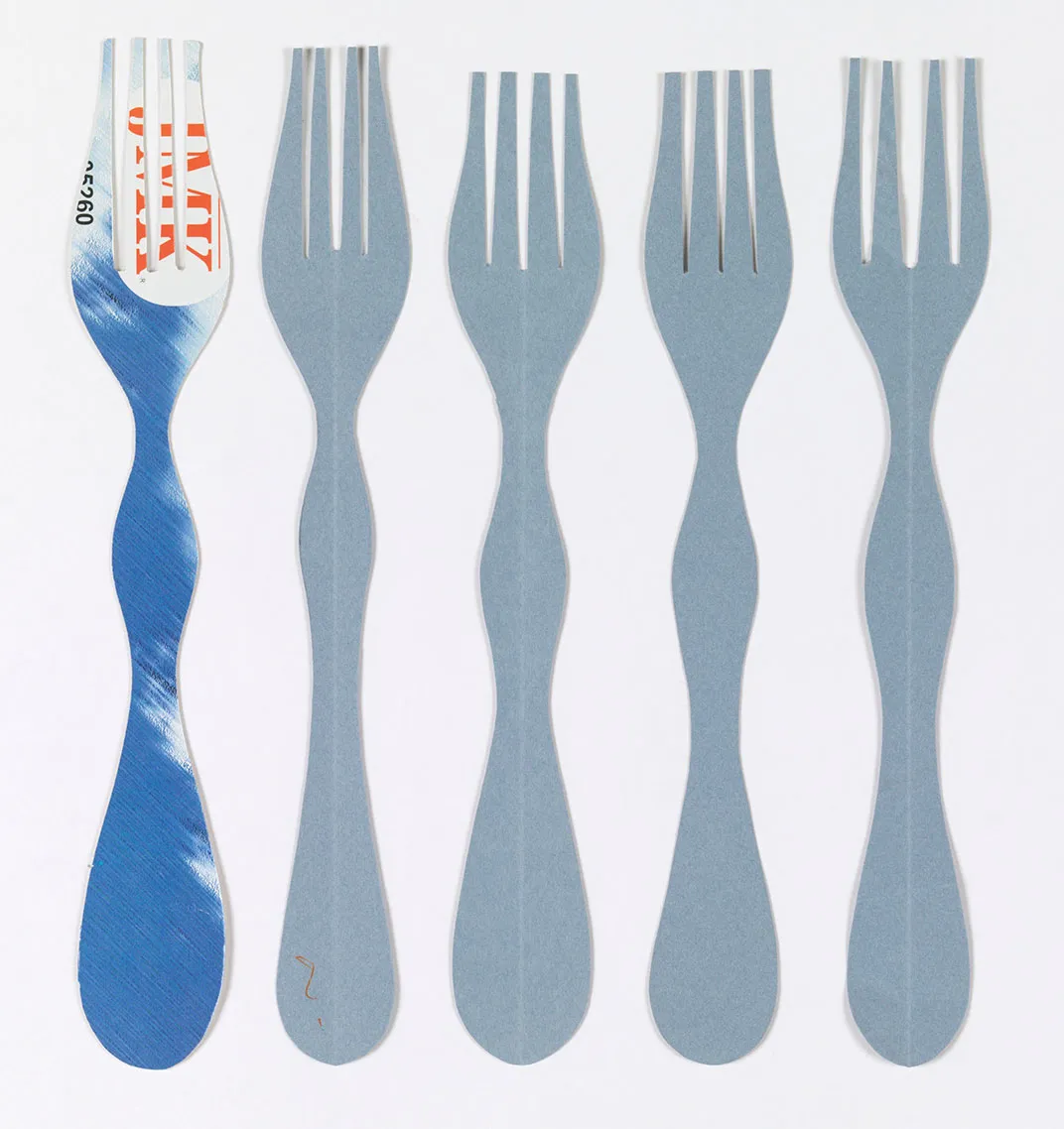
The new Cooper Hewitt opens with a series of exhibitions that embody the museum's mission to "inspire and empower people through design." The abovementioned items are part of Making Design, which brings together nearly 400 objects drawn from the museum's vast collection, carefully selected and arranged by its curators to provide an overview of five basic design elements: line, form, texture, pattern, and color.
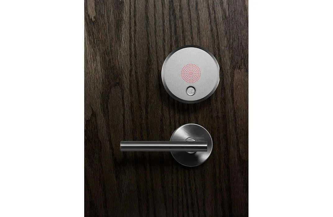
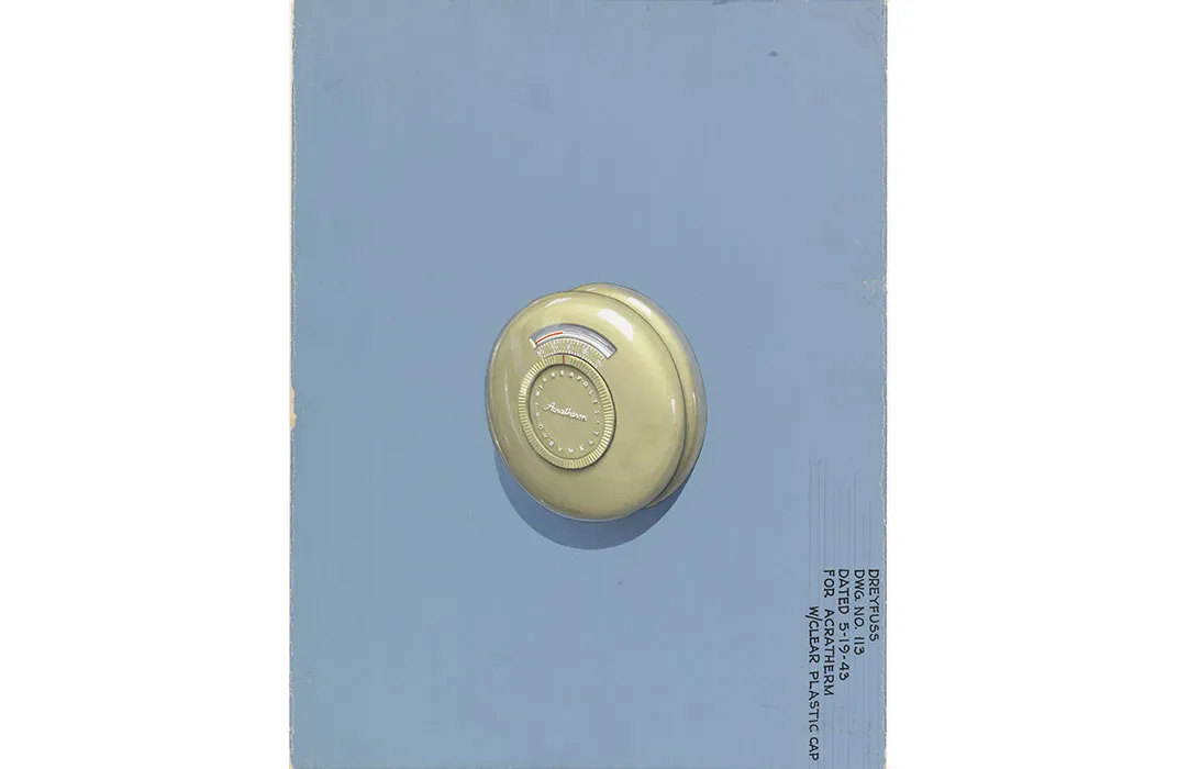
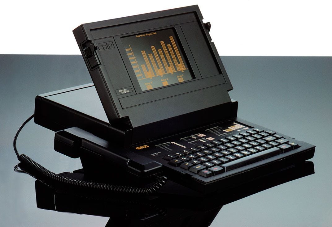
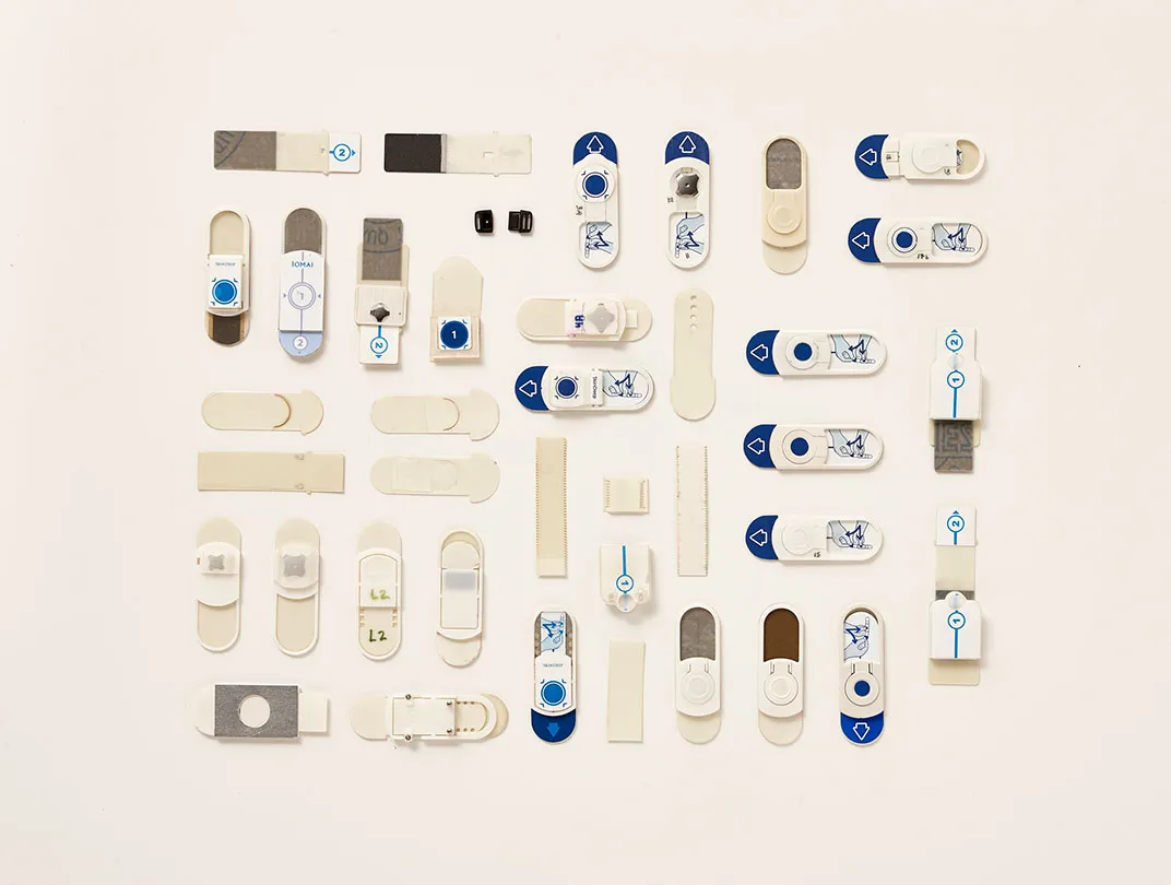
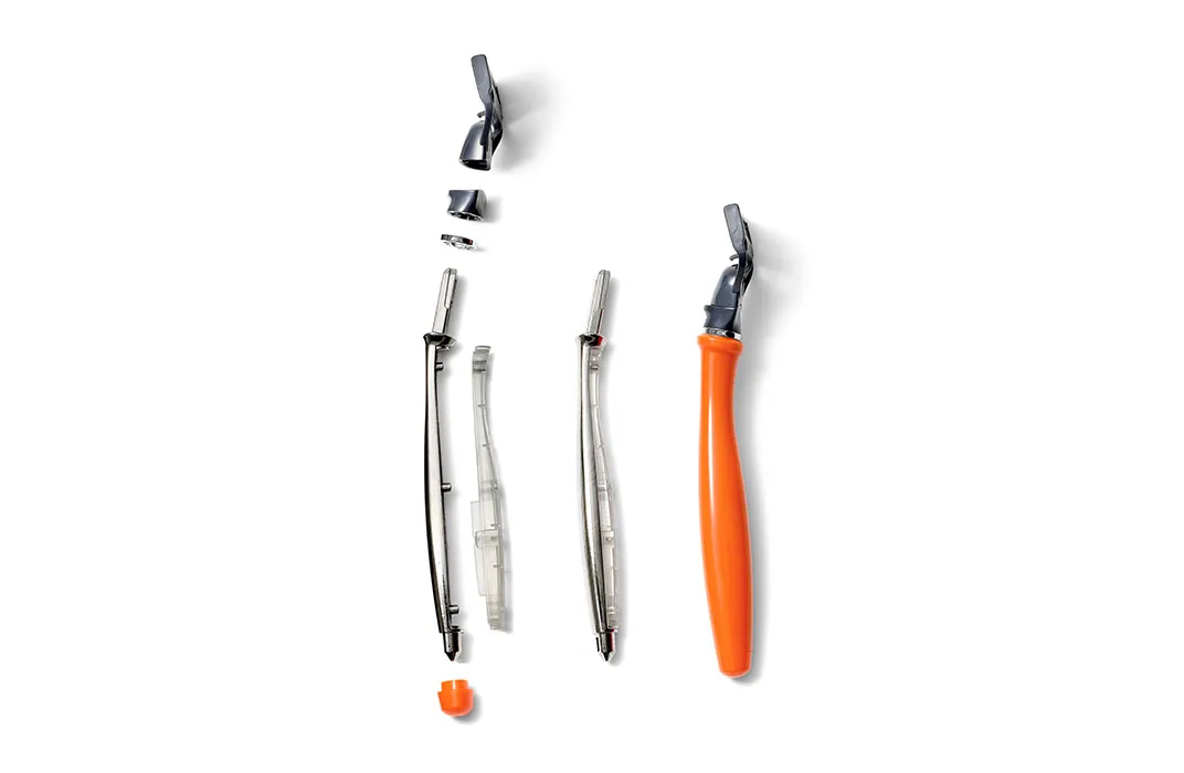
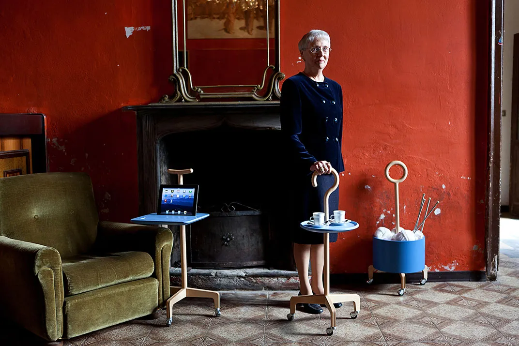
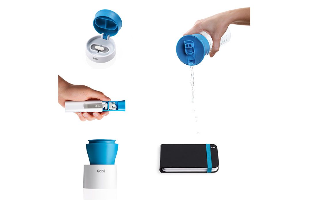
Inspired by the work of industrial designer Henry Dreyfuss (1904-1972), but encompassing today's hackers and disruptors, the Beautiful Users exhibit, along with Cooper Hewitt's hands-on Process Lab, shows how designers develop their work around the human body and human behavior, with process sketches, models and prototypes. This collection of 120 objects illustrates the concept of "user-centered design." and shows off the new modular cases designed by Diller Scofidio + Renfro.
The brand new 6,000 square foot third floor gallery is dedicated to Tools: Extending Our Reach, a breathtaking exhibition that spans 1.85 million—million!—years of human ingenuity— from the first tool, the hand axe, to the one of the most recent, the dynamic shape display (MIT Media Lab, 2013). In between are drawings, patent applications and objects—some unusually common and some just unusual—culled from the entire family of Smithsonian museums. “When the museum was talking about the opening show, it was important to make it from the Smithsonian,” says curatorial director Cara McCarty, adding. “A lot of people don't realize that Cooper Hewitt is part of the Smithsonian. So we wanted to use this as an opportunity to go into their treasures. [Other Smithsonian curators] don't always talk about this as design, but we do. We look at all this as design....and there are so many wonderful stories here."
To help visitors create their own stories, Cooper Hewitt created its own tools. Throughout the museum, a series of new interactive features enhance the experience of every exhibition. Foremost among them is The Pen, which won’t be available to visitors until early 2015. An alternative to passive audio guides, The Pen is a digital stylus given to every visitor to help them interact with the objects on display. Here's how it works: every wall label includes a small cross symbol and an identical symbol is on the top of The Pen—when the two are pressed together, The Pen vibrates to signal the interaction, and the object is saved to your personal online collection, which is keyed to either your ticket or a unique user profile.
Made specifically for the Cooper Hewitt by a team of designers and fabricators,.It also interacts with the new digital touchscreen tables found throughout the museum, though a finger works just as well. A continuous stream of circular images scrolls down the screen, each image depicting a detail of a different object from the collection. It's beautiful and hypnotic and fun to guess what kind of object will be revealed as you drag a circle to the center of the screen as it expands into a full high-resolution image.
When an image is selected, the table works as a virtual gallery wall, displaying catalog information and historical data, with the added digital benefit of category and color tags. Looking at an 18th century red Chinese vase and want to see other vases? Or other red objects? Just click the appropriate tag. Like the wall texts, you can also touch The Pen to the table to save the vase to your collection for later reference. The tables offer other interactive experiences as well. You can explore the museum’s offerings by randomly drawing lines or shapes on the surface and letting the computer bring up an object that corresponds to your scribbling. Feeling inspired? Use the tables software to create your buildings, lamps, chairs, or hats. Strangely, the streamlined modern tables don't seem too out of place in even the most ornate spaces because everywhere you look there is a pleasing blend of the old with the new.
Nowhere is this clearer than the Immersion Room, where you can experience, in virtual situ, every wallcovering in the Cooper Hewitt’s collection. Just bring up one of the wallpapers on the interactive table, push a button, and—voila!—digital projections transform the walls of the room with patterns that can be adjusted or customized. Or, if you’re feeling especially creative, you can create your own.
All this technology, supported and complemented by the Cooper Hewitt's new website and digital collections, affords a deeper understanding and appreciation of the more than 200,000 objects in the museum's collection. But the greatest object in the collection is the building, and it is best understood and appreciated simply by visiting.
A small room off the main 2nd floor gallery that once housed the former Carnegie Family Library has been stunningly restored as part of the renovation. In homage to designer and painter Lockwood de Forest (1845-1932), who created the remarkably rich room covered in intricately carved teak Indian paneling and ornate stencil work, the room shows off his work alongside that of painter Frederic Church, his teacher and mentor.
At the end of the hall, where the Carnegies once slept, The Hewitt Sisters Collect tells the story of Sarah and Eleanor and the early days of the museum now known as Cooper Hewitt. Inspired by Paris's Musée des Arts Décoratifs and London's Victoria & Albert Museum, the sisters sought to elevate the status of the decorative arts in America, and traveled across Europe collecting examples of exceptional artistic or technical merit to bring back for exhibition. From block prints to birdcages, the collection was eclectic from the start, embracing almost everything as design and establishing a method for a museum that today exhibits a 3D-printed prosthetic limb next to Abraham Lincoln's pocket watch.
Maira Kalman Selects continues Cooper Hewitt's series of guest-curated exhibitions. Artist and author Maira Kalman fills Carnegie's former drawing room with objects selected from the museum's vast collection alongside her own personal pieces. The objects themselves are fascinating, though sometimes curious--a pair of trousers worn by conductor Arturo Toscanini, for example—and the exhibit is very personal, making it both delightfully idiosyncratic and somewhat impenetrable. But this serves as a reminder that we interpret everything in context of our personal experiences. And in a design museum like Cooper Hewitt, visitors have a lot more direct personal experience with the everyday objects and tools on display than they do with most of the art hanging a block away at the Guggenheim. "Design is so much about connection and references,” says McCarty. “No one makes something in complete isolation but is somehow influenced by the culture around them and the materials they have access too.”
When Andrew Carnegie built his mansion on the corner of Fifth Avenue and 91st Street, he famously told his architects he wanted the “most modest, plainest, and most roomy house in New York.” Although today we might not find a four-story, 64-room mansion “modest,” by the standards of the Gilded Age’s millionaires Carnegie’s brick, stone and steel home was downright humble. It’s also humble by the standards of today’s mega-museums. But that modesty, tinged as it is with the occasional flamboyant ornamentation, works for a museum like the Cooper Hewitt. The intimacy of the domestic interior reifies our personal connections to the objects on display—we know these things, we’ve seen most of them around our house—while the high coffered ceilings, spacious wood-paneled rooms, and general formality of the spaces give these objects an import that forces us to pay a little more attention, to think about them a little more. The exhibition designers and curators take great advantage of their renewed spaces and bring out the best in the building while allowing the building to draw out new aspects of the objects on display. The broken ceramic lamp and jewel cabinet would just wouldn't have the same effect of they were installed in a white box gallery.
This dynamic, complementary relationship between object and space and old and new is a result of the brilliant collaborative efforts of the "dream team" brought together by the Cooper Hewitt, who transformed the mansion itself into an exhibition showcase of the work of talented designers. "Rather than just having two design teams, we wanted to have a sampling of American design firms represented here," says the museum’s director Caroline Baumann. Three architecture firms were involved with the project. Gluckman Mayner Architects’ primary role was to design the new spaces—the modern white galleries brought alive by the exhibitions, the cafe, the classroom and lab spaces—and plan new circulation, including the naturally lit public stairwell that links the four floors of galleries. Beyer Blinder Belle Architects & Planners have been involved since the Cooper Hewitt started planning this renovation in 2006. They oversaw the revitalization of the original structure and the seamless integration of modern building systems, making sure the entire building is safe, efficient and accessible. The fact that their work is largely invisible is a testament to their success. Diller Scofidio + Renfro designed the gift shop, admissions desk, 90th street entrance canopy, and modular exhibition casework, which was engineered and manufactured by Goppion. Landscape Architects Hood Design revitalized the museum’s massive garden. Thinc designed the Tools exhibition. Pentagram and Village are responsible for the museum’s new graphic identity as well as the clear and colorful signage throughout the building, written in Cooper Hewitt’s custom, open-sourced typeface. And don’t forget everyone involved with the interactive media, website and digital collections.
Every design project is a complex undertaking requiring collaboration and coordination between multiple parties—owners, architects, engineers, contractors, subcontractors, consultants, the list goes on. But rarely do so many high profile designers with strong ideas and unique voices perform together as a pitch perfect choir rather than devolve into a disharmonic shouting match. The fact that the museum feels like a cohesive, singular experience is a testament to both the skill of the conductor, Cooper Hewitt, and the strength of the original composition—the Carnegie Mansion. The renovated Cooper Hewitt building does what I think all good architecture should do: to engage the public while expressing both the traditions of the discipline and current technological possibilities.
With its new exhibitions, new galleries, and new technologies, this is a museum that will keep you coming back. And that's the idea, the mission that dates back to 1897: to create a "practical working laboratory," a museum that you'll use.
/https://tf-cmsv2-smithsonianmag-media.s3.amazonaws.com/accounts/headshot/Jimmy-Stamp-240.jpg)




/https://tf-cmsv2-smithsonianmag-media.s3.amazonaws.com/filer/d1/e2/d1e2ebe3-1365-4a8a-9949-e5b21827b35f/the-measure-of-manweb.jpg)
/https://tf-cmsv2-smithsonianmag-media.s3.amazonaws.com/accounts/headshot/Jimmy-Stamp-240.jpg)