Hirshhorn’s Redesigned Lobby Sheds New Light on a Classic Washington D.C. Building
The Japanese photographer Hiroshi Sugimoto, known for his pensive images, is taking on the role of architect and designer
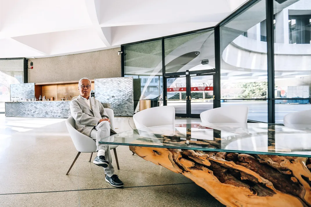
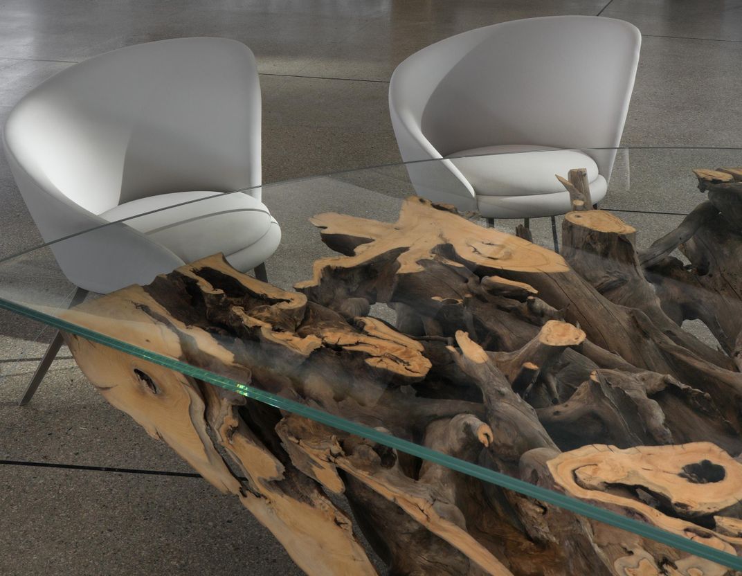
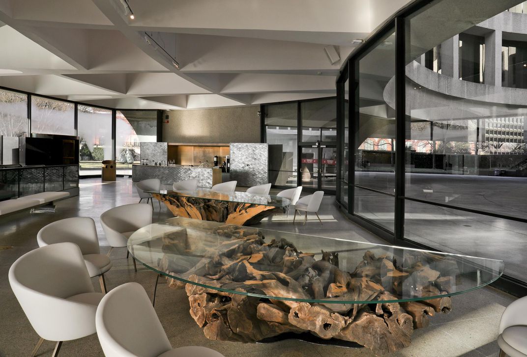
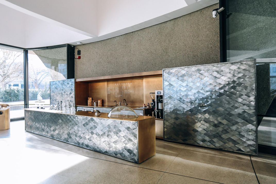
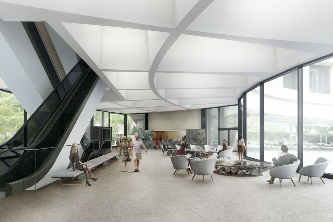
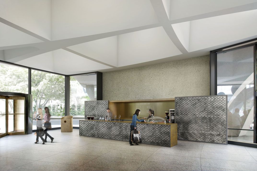
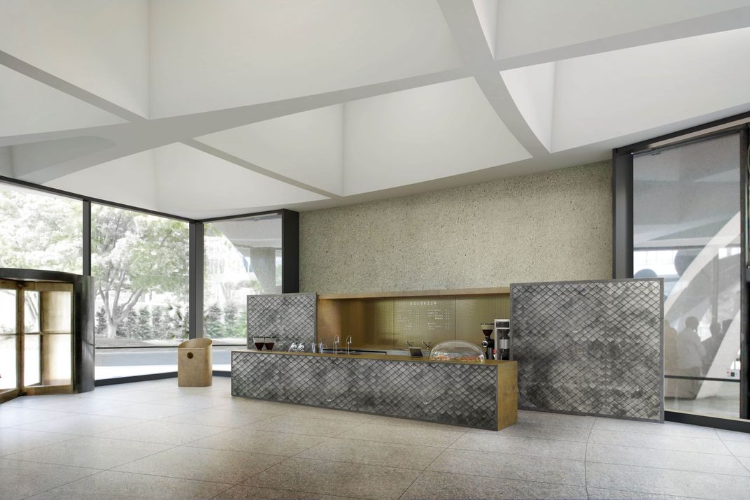
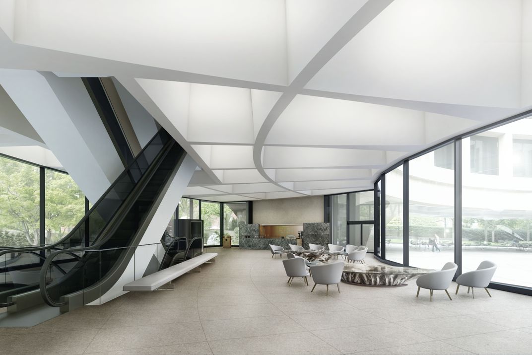
Japanese photographer and architect Hiroshi Sugimoto is rethinking the Hirshhorn Museum and Sculpture Garden. The redesign of the museum’s lobby by the renowned artist and his Tokyo-based architecture firm, New Materials Research Laboratory, will open to the public on February 23. At the entrance visitors will encounter artistic furnishings crafted from the branches of a 700-year-old tree, brighter windows and a brushed brass coffee bar, where Washington D.C.’s much-loved Dolcezza Gelato and Coffee will set up shop.
Says Melissa Chiu, the Hirshhorn’s director, the museum’s goal was to “make contemporary art much more accessible than it has been before.”
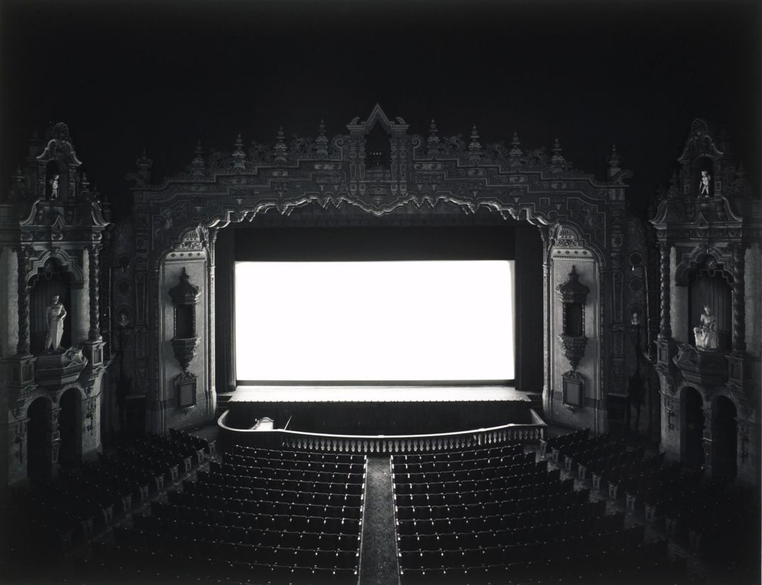
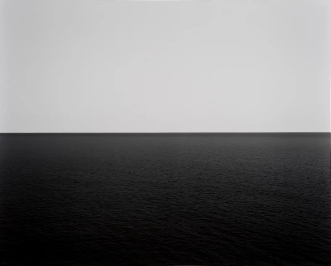
Commissioning a photographer to design and furnish a lobby seems somewhat odd. Sugimoto is well known for his black-and-white photography: pensive, carefully-composed pieces often bordering on abstraction. He rose to fame for photo series like Diorama, Theaters and Seascapes, haunting portrayals of museum displays, ocean horizons and empty movie theaters that strike an air of quietude, if not reverence.
But the artist’s admirers might be surprised to learn that Sugimoto has lately added works in architecture and design to his award-laden résumé. Recent projects include restaurants, private residences, and mostly notably, the artist’s Odawara Art Foundation—an arts and culture complex set on a 10-acre tract of land one-hour southwest of Tokyo.
That Sugimoto has taken on so many architectural challenges was an added bonus for museum curators. The Hirshhorn and the artist go way back: In 2006, the museum was the first to present a career survey of Sugimoto, and still has some of his seascapes on display today.
Alfred Zollinger, director of the Parsons School of Design’s Master of Fine Arts in Interior Design program, sees Sugimoto and his work as a fitting choice. “What’s really amazing about [the lobby],” he said, “is the daylight coming in and the coffered ceiling, the colors, the polish, the reflection in the terrazzo floor, has all the makings of a Sugimoto photograph, as one could imagine it.”
Preserving these elements was a central objective of the 18-month project. The Hirshhorn, one of the city’s dozen or so examples of the modern brutalist era, was designed by Gordon Bunshaft of the Skidmore, Owings & Merrill firm and unveiled in 1972. Its striking cylindrical shape was famously derided at the time by art critic Ada Louise Huxtable. But today the doughnut (as Huxtable called it) is so iconic that a National Register of Historic Places nomination is underway—a great achievement for so young a building.
Chiu says that while the structure does have a brutalist sense of gravity to it, Bunschaft’s original intention was to create a space that felt light, hence the building’s elevation and windows onto the National Mall and the sculpture garden. In keeping with this intent, Sugimoto’s design of the lobby evokes a sense of comfort and openness. The design calls for the removal of a dark film from the windows to bring in more light. The effect is to remind visitors of the Hirshhorn’s connection to the sculpture garden, the larger Smithsonian Institution campus and the National Mall.
The circle and its occurrence in both the man-made and natural worlds is a prominent theme of the new design. The tables are crafted from the roots of a 700-year-old Japanese nutmeg tree, which spread to form a wide circle. Spiral chairs pay homage to both the museum and the helicoid shape of DNA. “Placing a circle that nature made inside this man-made one gives us the opportunity to compare and contrast natural circles with notional ones,” says Sugimoto in his artist’s statement.
Sugimoto creates a measured tension between the museum’s traditional 70s-era contemporary style and its future. Brushed metal fixings on everything from the coffee bar to the sliding glass doors update the look with a modern edge. This conversation between past and present is reflective of his previous work, which Sugimoto describes as illustrations of “time exposed.”
Sugimoto’s own past is incorporated with a relic material reminiscent of his childhood neighborhood in Tokyo. Scale-like metal siding is used in the design of the coffee bar. The fire-retardant material dates to the 1920s and was a prominent feature in the homes Sugimoto grew up around during the 1950s.
Zollinger says the lobby mirrors Sugimoto’s illustrious photography work—they share a sense of “stillness” and “quiet presence,” adding that “he slows down the time and reduces the distractions.”
But Markus Berger, a graduate program director at the Rhode Island School of Design’s Department of Interior Architecture, disagrees. He sees Sugimoto’s creation as too “quiet.”
“The power that Hiroshi Sugimoto’s photos have, I’m missing that power,” he says. “It’s too scaled back, too light, too simple.”
“It’s very nice beautiful designed pieces inside there,” Berger says, “but there’s no proper narrative conversation [with] the existing building, which has a very different tone.”
Zollinger understands Sugimoto’s contribution as a tribute to the building’s open, modernist space. “His approach is one of preserving the museum and heightening the experience of what’s already there,” says Zollinger. “In a place like the Hirshhorn, which has such a history, the building is so strong, to try to compete with that would be counterproductive.”
Chiu argues that the museum has achieved the central message it hoped to send through Sugimoto’s redesign. “It really signals to visitors that the Hirshhorn is an open, transparent, space that through art, is able to create a sense of wonder,” she said.
/https://tf-cmsv2-smithsonianmag-media.s3.amazonaws.com/accounts/headshot/spengler_headshot.png)

/https://tf-cmsv2-smithsonianmag-media.s3.amazonaws.com/accounts/headshot/spengler_headshot.png)