How Curators Found a Ghostly Image Lurking Beneath Layers of Lacquer
Work in the conservation lab revealed there was more to this Ming Dynasty tray than meets the eye
/https://tf-cmsv2-smithsonianmag-media.s3.amazonaws.com/filer/13/ac/13ac4f11-df62-405e-a95d-8f3f8959cebc/f198617web.jpg)
The ancient, square Chinese tray is one of the fine examples of lacquered artistry at the Freer Gallery of Art and Arthur M. Sackler Gallery, the Smithsonian’s museums of Asian Art. Its dark black lacquered center, surrounded with an elegant bamboo basketry design edged with mother of pearl inlay, seems almost modern.
Still, something didn’t seem quite right about the sleek object, dating to the Ming dynasty (1368-1644) and donated in 1986 from the estate of an influential design editor. “Once I started looking at it,” says curator of Chinese art Jan Stuart, “I felt it was very unusual that something of the 17th century in China would have this kind of undecorated center.”
That kind of undecorated monochrome lacquer was popular in China in the 12th century and 13th century, Stuart says, “but we didn’t really see it in the aesthetic sensibility of the 17th century so much. So I began to think maybe there should be more to it.” At one point early in the 1990s, she says, “we saw that one of the cracks in the lacquer was possibly revealing something glittering underneath.”
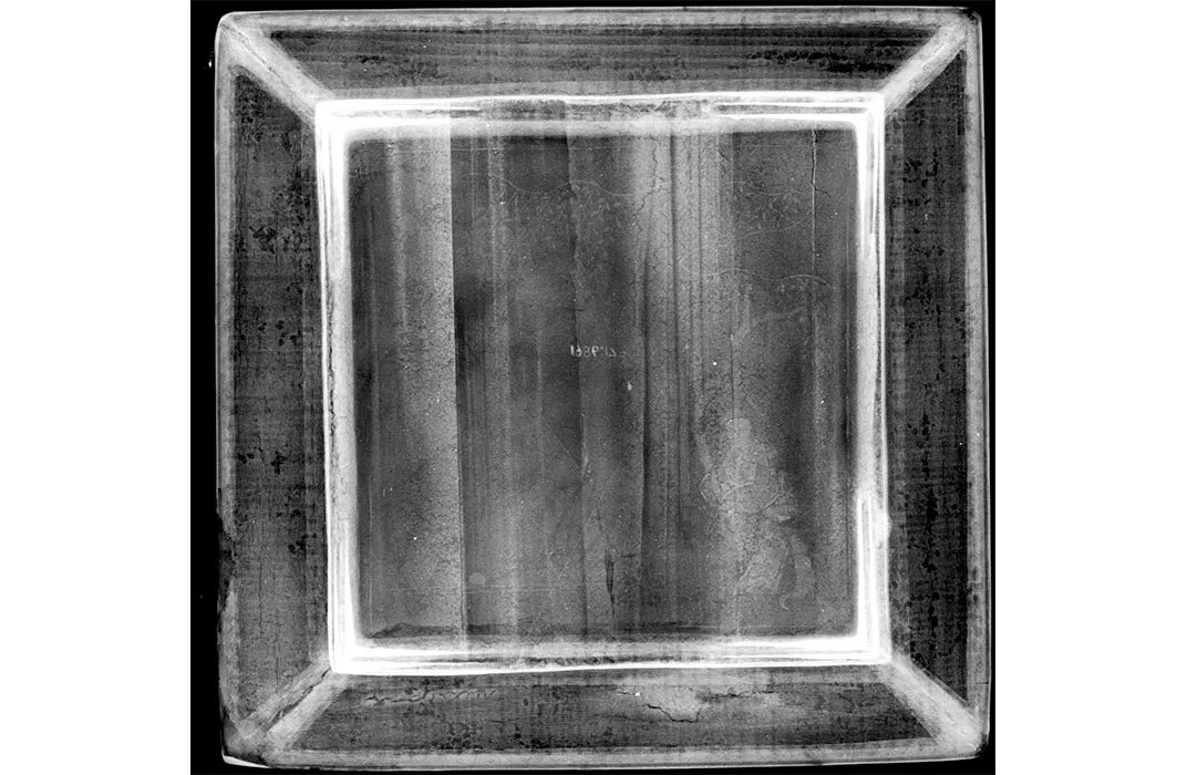
Lacquer, the thick, shiny finish of decorative items, derived from the sap of a tree in the poison sumac family, is prized for its extraordinary hardness, so it wasn’t easy to peek behind its many layers. That’s when an x-ray was ordered in the museum’s labs. And something indeed was there.
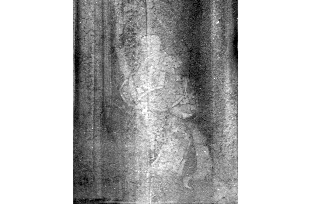
“At first they couldn’t say whether it was a metal or mother of pearl inlay underneath,” Stuart says. But as they have studied it, they have beome more convinced of the mother of pearl material, and more surprisingly, the design it was used for: a ghostly figure in an ancient landscape.
“They’re not crystal clear,” Stuart says of the x-rays, “but they seem quite likely to me to have a person sitting under a willow tree.” With the tree and person in one corner of the square, the artwork almost seems unfinished. But Stuart says such an arrangement is “a typical Chinese design, where you have a square frame and you root the composition visually dominant in one lower corner.”
The lab's innovative approach to discovering what was beneath the layers of lacquer led to other speculation. At one point I decided that it was likely that the figure sitting under the tree was a monk, because it looks to me like the head could be bald, and the costume seems to be elaborately decorated,” Stuart says, though she adds, “This is conjecture for sure.”

Overall, it was a surprising image that wouldn't have been found without the x-radiology. “I was thinking there might be some little floral design or something. I certainly wasn’t expecting a full narrative design under there,” Stuart says. “It really looks like a traditional design of Chinese painting, so it’s very pictoral, it’s very closely related to ink painting of the time and a lot of Chinese art in 17th and 18th century, what they carved in jade, what they designed in lacquer, what they designed in other media, painted up porcelain, has a very close connection with scroll painting. So that was a surprise, and fits very much to me with the Chinese aesthetic.”
It’s likely that even the donor of the object was unaware of hidden scene. Elizabeth Gordon Norcross was an editor of the magazine House Beautiful, who researched and promoted the Japanese aesthetic concept of “shibui.” After five years of research, including 16 months in Japan, the August 1960 special issue of House Beautiful on the topic caused a sensation. Both sold out immediately, and Gordon reported at the time that the magazine “has never had so deep a response to an issue from so many people.” A traveling exhibit based on the issues opened in Philadelphia in 1961 and traveled to three other cities. “The public response was positive and overwhelming,” scholar Monica Michelle Penick wrote. Norcross donated her research and papers on shibui to the museum in 1988 before her death in 2000 at the age of 94.
The five qualities of shibui—simplicity, implicitness, modesty, silence, naturalness, everydayness and imperfection—certainly fit the look and design of the sleek tray when it was donated. Stuart says one or more of those qualities could have led the Japanese owners of the tray some time in during the 17th and 18th centuries to lacquer it over. “Maybe they felt it was more beautiful as a tray to place a cup on if it were plain,” she says, resulting in changes that “could have been both stimulated by damage and/or some kind of aesthetic preference.”

"A tray with a sleek black base wouldn’t have been out of the ordinary in an earlier age," she adds. But, by the time of the late Ming, when this tray was made, the preference for elegant, simplicity, monochrome, was a very small sliver of society’s taste.
“It was an era when there was much more interest in decoration and even flamboyance,” she says. “So this, in its original state, would have really reflected what the taste of the time was.” It is by far the most elaborate design they’ve ever found hiding beneath a lacquer, she says, and was quite a surprise to see. By now, it is common practice for the museum's labs to thoroughly examine its donations to better understand the objects inside and out.
Donna Strahan, head of the department of conservation and scientific research at the Freer and Sackler agreed that finding such a design beneath “was unexpected.” But, she adds, “the rim of the lacquer dish was so detailed and so well made with the tiny little mother of pearl inlay, that it was hard to believe that the center of the dish would be plain. Stylistically it just didn’t fit with anything.” It also looked as if it were a patch job, she says. “Because the black lacquer across the top of that central area was so shiny and bright that it hadn’t degraded all that much, it was probably a relacquering. So it was probably worthwhile to take a look to see if we could see anything underneath the lacquering.” Looking at ancient art in the microscopes and x-rays of the modern area can unveil a lot of discovery, she says.
“It’s just fascinating. It’s a whole other world in there, once we start looking and studying how things are made of, and what they are made of and what they look like today,” Strahan says, adding that her own guess about the tray is that “probably some of the design was missing and there was some damage.”
“Trying to reproduce the tiny, tiny mother of pearl inlay would take hours and hours, so it was much cheaper and easier to cover the whole thing over.” Strahan hopes they can “spend more time and try and enhance the x-rays—computerize it and try to raise the contrast, to see if we can get more of the design.”
But they won’t try removing the lacquer to fully reveal the original design. “I think it would be far too risky to the object itself to try to take off the black lacquer,” Stuart says. “The black lacquer could easily have been put on in the 18th century, so it could well have some historical weight in itself.”
A future display showing the tray and its x-ray designs beneath could happen—though lacquers are only shown fleetingly to prevent damage from light. “We keep our lacquers in the dark unless they are on view, and then we only try to expose them for six months once every five years,” Strahan says. But displaying it with the x-ray, she says, “would really show people: here’s a fantastic example of the cultural importance of lacquer and how it gets reused. And show people what the design was like before, and kind of talk about it as the life story of the object.”
After all, Strahan says, “We get older and change, and objects actually do too.”
/https://tf-cmsv2-smithsonianmag-media.s3.amazonaws.com/accounts/headshot/RogerCatlin_thumbnail.png)
/https://tf-cmsv2-smithsonianmag-media.s3.amazonaws.com/accounts/headshot/RogerCatlin_thumbnail.png)