Modern Takes on 80s Artwork Hit Washington D.C. Streets
The Hirshhorn Museum’s public art project ‘Brand New SW’ reflects a resurgence of retro aesthetics in contemporary art
/https://tf-cmsv2-smithsonianmag-media.s3.amazonaws.com/filer/a5/fd/a5fd124d-0c47-4e68-909b-a35f8b3d5c65/lenfant_brand_new.jpg)
It’s becoming clear that the 1980s’ penchant for flamboyance and spectacle is making a cultural comeback. February’s New York Fashion Week was ruled by shoulder pads, lamé leggings, and animal prints, for example, and Spielberg’s over-the-top adventure hit Ready Player One is laden with retro references to Back to the Future, King Kong and Jurassic Park.
The retro trend has also trickled into the craft of some modern artists, who use this larger-than-life aesthetic to navigate both critiques and evocations of the era’s familiar commercialism. Many in today’s art community take cues from 1980s commercialist artwork, such as Jeff Koons’ expensive recreations of banal consumer goods, Barbara Kruger’s photo proclaiming “I shop therefore I am,” and Ken Lum’s play on advertising and branding through his creation of “slogans” for the human subjects of his portraits.
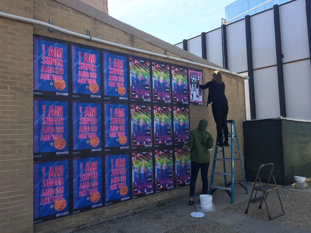
This thematic resurgence in the art world is now on public display throughout Southwest Washington, D.C. as part of Brand New SW, the newest project in the museum’s “Hirshhorn in the City” initiative. The project originated as a modern-day take on the museum’s ongoing exhibition Brand New: Art and Commodity in the 1980s, featuring such illustrious artists as Koons, Kruger and Lum whose 1980s work played on themes of branding and consumer culture.
In recognition of the innovative new collaborations that abound in Washington’s art community, the Hirshhorn selected three local artists—No Kings Collective, NoMüNoMü, and SUPERWAXX—to create posters inspired by the 1980s for public display in the city’s nearby southwest waterfront neighborhood. The museum’s staging of the posters in the public domain is intended to hark back to the decade’s subversive, democratized art scene. Street art and graffiti, for example, became hugely popular in the 1980s, especially among New York City artists who sought to make artwork accessible outside of the confining walls of museums. The art form has made a huge comeback in recent years, with enigmatic artists like Banksy reaching international renown for their political and subversive murals.
The democratic, accessible nature of Brand New SW’s public platform is reflected in the project’s contributors themselves. No Kings Collective, for one, is a collaborative studio founded by Brandon Hill and Peter Chang, who work with local artists to create and distribute multidisciplinary, innovative artwork. In a similar vein, NoMüNoMü is, according to its co-founder Joseph Orzal, an “intersectional artist collective and curatorial platform” working to eliminate marginalization from the art industry. And though SUPERWAXX is a single artist, the inspiration that she draws from public art reflects the democratizing exodus of modern art out of the museum and onto city streets.
“We’re trying to create shows that are less hierarchical,” Orzal says regarding NoMüNoMü’s mission of furthering equity within the art community. “We try to empower artists to do what they want and see what they want seen—we’re creating a space for that within the art scene.”
For pedestrians strolling around Washington’s southwest neighborhood, where the posters are wheat-pasted on office buildings, in subway stations, and in highway underpasses, the installation is inexorably eye-catching. It’s an almost lurid display of text and color that puts an inarguably modern spin on 1980s aesthetics.
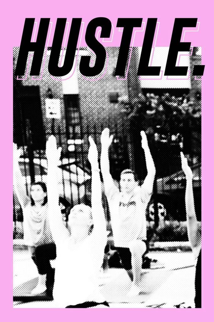
Big block letters on No Kings Collective’s piece remind them to “hustle,” a decidedly modern mantra that takes on special meaning for the poster’s ambitious and fast-moving creators. A black and white retro-style photograph of millennials practicing yoga sits within a distinctive orchid-pink border.
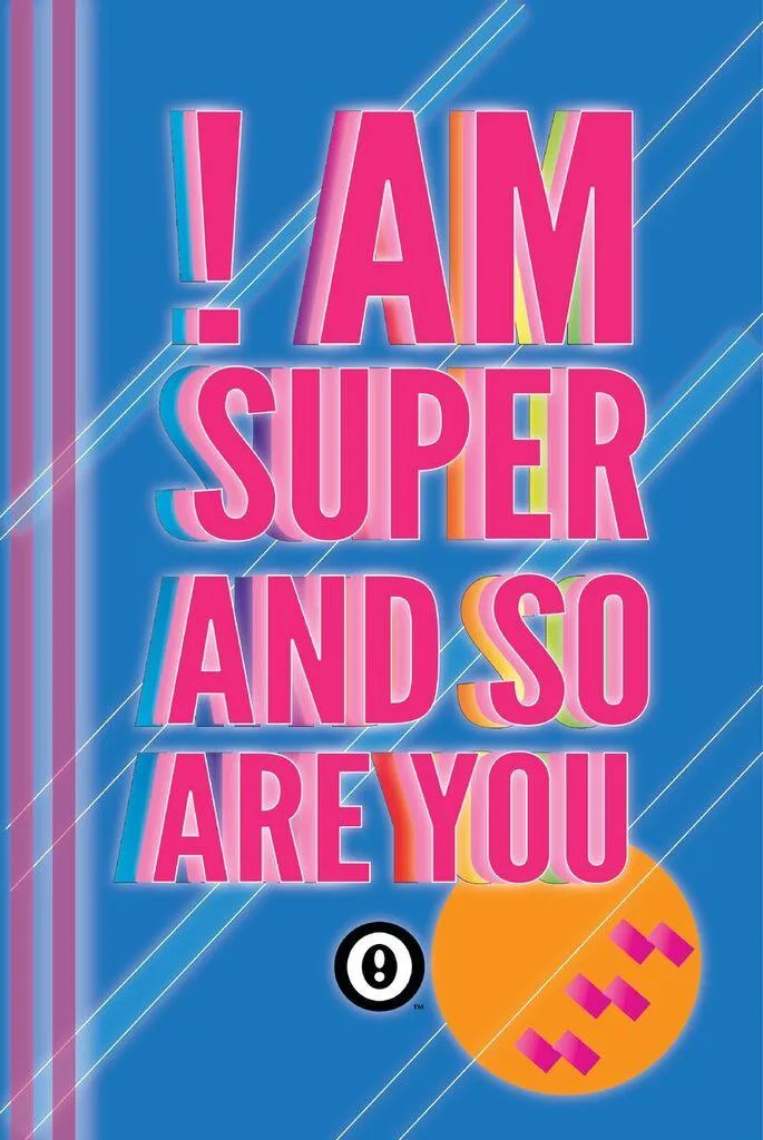
SUPERWAXX’s stylized message “I am super and so are you” jumps out in bright magenta atop an equally bold blue background, with varied neon shadows accenting the lettering. In the artist’s signature style, the “I” in the message is written as an exclamation mark, and her logo—concentric circles with an exclamation point in the center—is visible beneath the text. The decidedly loud poster’s play on slogans and recognizable branding puts an uplifting, individualistic spin on the exhibition’s commercialist themes.
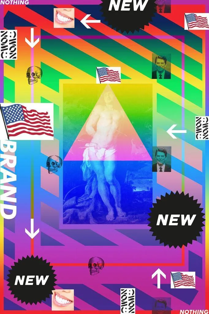
The technicolor stripes from NoMüNoMü draw the eye toward the piece’s more subtle political imagery. The middle of the poster features a Baroque painting of St. Sebastian overlaid with the iconic LGBT image of the pink triangle, and smaller images of American flags, Ronald Reagan, and skulls surround this centerpiece. The artist’s inclusion of the words “brand” and “new” confronts the exhibit’s advertising themes—creatively “marketing” the exhibit itself.
Brandon Hill and Peter Chang of No Kings Collective drew inspiration for their poster design from the repurposing of advertising and print featured in the 1980s work on display at the Hirshhorn Museum. “We were looking for that seal of pixelated or halftone images that would have reflected the printing process of the mid to late 1980s, and we thought to dip back into our own pool of imagery,” Hill explains. The image that they decided to use for the poster was a photo from a buzzworthy event that No Kings Collective put on last summer: a “pizza yoga” class next to one of their downtown D.C. murals.
“It’s definitely an ode to our time: worshipping your body and then also eating pizza,” Hill says with a laugh.

NoMüNoMü’s outpouring of color was an intentional nod to 1980’s artistic trends, which drew upon the technology of the time for visual inspiration. “I got the color from TV. When the TV would go blank, and it would just be color bar—a test of the emergency broadcast system,” explains Orzal, who created NoMüNoMü’s poster for Brand New SW. “In my research, I realized this was an ongoing reference. People would constantly refer to the TV and the emergency broadcast system as an aesthetic.”
Orzal’s retro visual reference was accompanied by his thematic nods to 1980’s political movements that he believes are relevant to the current day. He drew specific inspiration from Act Up, the late-80s advocacy group that pressured the Reagan administration to respond to the AIDS crisis. Act Up’s effective use of the media and advertising to increase the visibility of their cause was especially impactful to Orzal’s design process.
“That was my whole starting point: Act Up’s aesthetics, using the triangle and other gay imagery. I was trying to figure out a way to relate what was happening then to what is happening today,” says Orzal. He concluded that this connection is rooted in what he sees as a resurgence of Reagan-era political rhetoric. “Dealing with the Trump administration now, I was just sort of inspired by how organized and effective Act Up was,” he says. “There was so much at stake, but the way they used the visual arts was genius to me.”
Act Up’s blurring of the boundaries between advertising and artwork was a popular theme on the 1980s art scene, and Brand New SW’s artists demonstrate the modern comeback that this trend has made. Peter Chang sees this resurgence exemplified in the increasing popularity of collaborations between artists and private companies in the promotion of products.
“A lot of artists—especially street artists—are working with different brands, collaborating on products and releasing products of their own,” says Chang, referencing soda, liquor and apparel companies whose public art advertising campaigns have contributed to this combined artistic-consumerist mentality. “In the 1980s, there was so much collaboration happening with brands. It was very relevant back then, and with today’s come-up of street art, brands came back around to that. It’s so powerful.”
Though Brand New SW didn’t involve any commercial collaborations, the concept of branding and “shameless self-promotion,” in Orzal’s words, still makes its way into the artists’ work. SUPERWAXX’s logo appears not only on her Brand New SW poster but also in almost all of her pieces in some capacity. No Kings Collective, for their part, dubs their artwork’s recurring “Hustle” motif a “brand” in its own right—not an official trademark, says Hill, but just a recognizable identifier of their raison d'être.
The artists did not confer with one another in creating the posters, but nevertheless, the three works in Brand New SW share thematic similarities that contribute to the overall cohesion of the project. According to No Kings Collective, these organic synergies speak to the wide reach of the artistic resurgence of 1980s’ aesthetics.
“We designed our poster blind—we weren’t aware of the other posters until after they were produced,” says Hill. “Once they gave us a glance at SUPERWAXX’s and NoMüNoMü’s design, it was pretty weird and amazing to see just how close everybody was, at least in terms of general cues from the 1980s design aesthetic.”
“Retro is very in right now. Millennials, the people in prime purchasing age, like to go back to things that bring them nostalgia,” adds Chang. “A lot of people are taking advantage of that nostalgia to recreate new experiences and new stories based on all the things that happened in the 1980s.”


