People Are Lying on the Floor To See this Dazzling Ceiling Puzzle
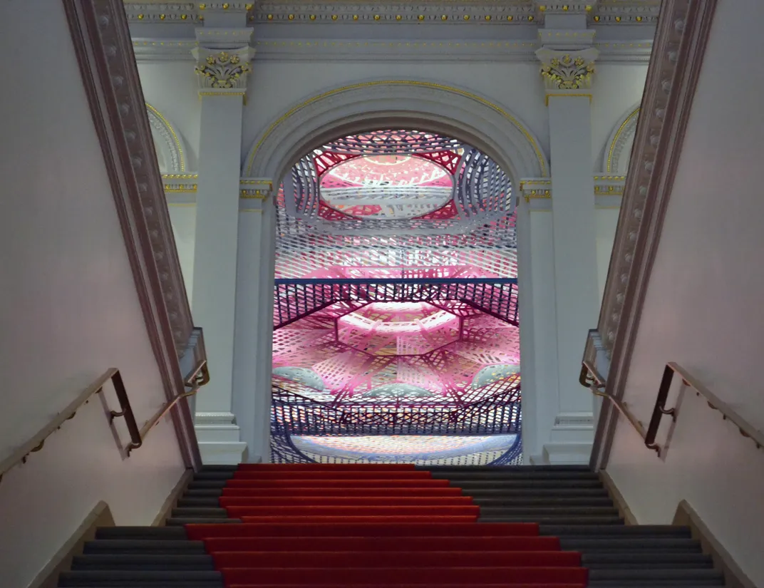
The work pays homage to the vaulted domes, ornate Italianate arches and Art Deco geometric forms of nine of the nation’s historic ceilings
/https://tf-cmsv2-smithsonianmag-media.s3.amazonaws.com/filer/b5/97/b5973842-8731-49b7-85cd-092317abfc98/parallax_gap_04.jpg)
When the Renwick, the nation’s oldest art gallery, steps from the White House, was reopened after a two-year, $30 million renovation in 2015, eyes naturally were drawn to its architectural details, right up to the ornate ceilings.
Visitors kept looking up when the ceiling of the Renwick Gallery’s upstairs Bettie Rubinstein Grand Salon was festooned by Janet Echelman’s colorful net titled 1.8 Renwick. It was the one installation from the gallery’s popular "Wonder" exhibition that stayed up the longest. Viewers were invited, in fact, to sprawl on the carpeted floor and look up.
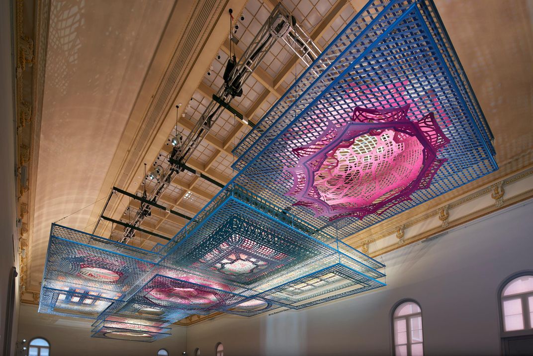
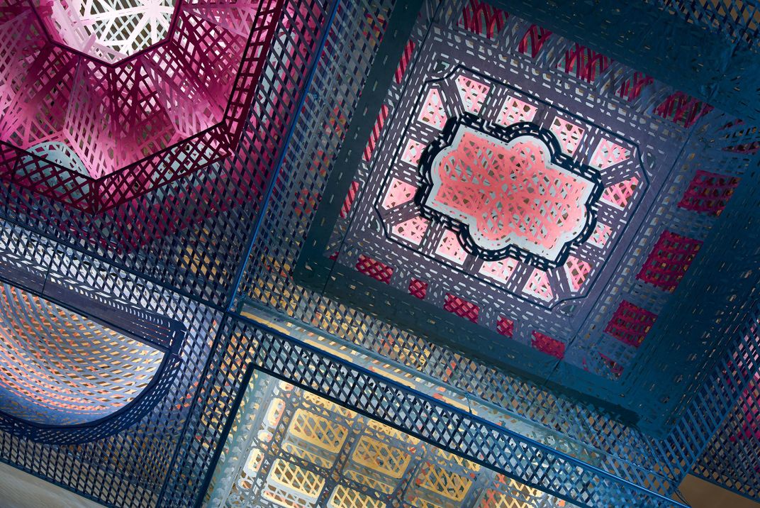
The floor sprawling continues with the gallery’s current installation Parallax Gap—a second commission for the Grand Salon airspace that, like the first, plays with fabric, color and perception as well as offering constantly shifting perspectives depending on where one stands (or lies) on the carpet beneath it.
FreelandBuck, an architectural design practice based in New York and Los Angeles, won the commission among eight invited proposals for a site specific installation in a competition titled "ABOVE the Renwick." The idea was that since the Grand Salon was the main location for the museum’s events and lectures, the floor space needed to be kept clear, allowing only the overhead space for a piece that aligned with the Renwick’s continued mission to showcase craft and decorative work.
“We definitely gave invited architects a challenging set of constraints,” says Helen B. Bechtel, the independent curator who coordinated the installation. Besides the ceiling suspension, she says there was a tight timeline and very limited budget.
“Traditionally, architects are trained to handle that type of constraint, it’s familiar territory for them. But it was exciting to see the breadth of approach that everybody took,” she says.
Architects are always eager for opportunities to experiment or play with ideas on such a scale, especially one covering 4,300 feet. “We were looking for pieces or spatial experiences that would really activate the room and create an ongoing culture of a social space and a special experience in the room,” she says. “It was a great opportunity to exhibit some of the ongoing research in contemporary architectural practice that dovetails nicely with the Renwick’s expanded definition of craft and searching for evidence of craft in fields beyond just traditional understandings of craft.”
“Like all of the people asked to propose for the project, we were asked to limit everything we did to be higher than 15 feet above the floor,” FreelandBuck partner Brennan Buck says. “So it was natural for us to think about ceilings and think of our project as a way to make a new ceiling and put it into the traditions of ceilings. Trompe l’oeil was one thing that came to mind.”
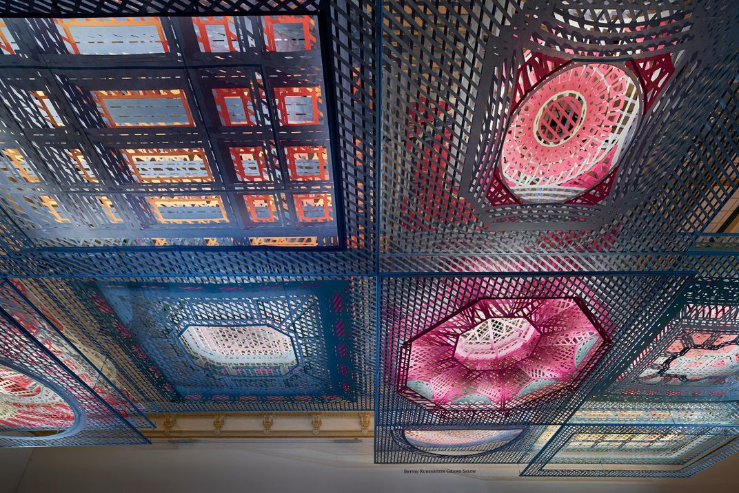
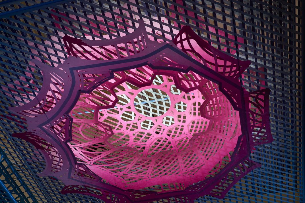
Their idea was to pay homage to nine iconic American ceilings by presenting a kind of 3D blueprint in many colors that suggests the shape and depth of the originals using layers of latticed fabric work.
Presented next to one another, they range from the square design of the Indian Treaty Room of the 1879 Eisenhower Executive Office Building located just across the street, to the 1914-15 dome of the San Francisco Palace of Fine Arts, nearly 3,000 miles away.
There are also the circles of New York City’s Federal Hall (1833-1842), the Art Deco semi-dome of the Cincinnati Union Terminal (1931-33), and the Italianate Renaissance Revival of the dining room ceiling at the Chateau-sur-Mer mansion in Newport, R.I., (1873-1880).
“We were initially inspired by the history of the Renwick building,” Buck says. “It was a building built in a very eclectic period when a lot of specific architecture styles were being invented. This was the first in this style—the Second Empire—built in the United States. So that was pretty fascinating for us.”
Indeed, the nation’s first purpose-built art museum is now named after its architect, James Renwick Jr., who previously designed the Smithsonian castle and St. Patrick’s Cathedral in New York.
When it opened after the Civil War as the first American building designed expressly as an art museum, it was called by some “The American Louvre.”
Delving into the ornate American ceilings of that era, “there was an affinity between the highly decorated, ornamental articulated architecture of that era and the patterns that we were producing through the drawings,” Buck says.
The firm collected 40 different examples of ornate ceilings from the late 19th century before they had to begin cutting it down, with a mind to how they worked together and representing the whole of the U.S. “It was partly a compositional choice and partly a choice about where these ceilings were coming from and what styles they were in,” he says.
That meant some favorite ceilings had to go, Buck says. “One thing we really wanted to include but was actually removed in the end was Union Station in Washington,” Buck says. “It’s a really great ceiling,” he said, but its proportions didn’t work with the others selected.
In fact, it was hard to guess at first which ceilings would eventually fit best.
“What seemed like the ceilings that might work best initially from photographs weren’t necessarily the ceilings that came out best in the final installation,” he says. “They get translated into drawing and what they do in that form differ from how they work as an image or in space.”
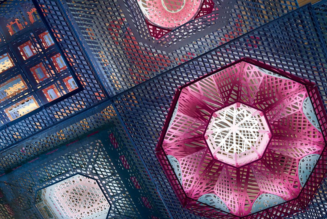
The drawings were rendered in cross hatches that resemble lattice-work. The work recedes into the space with two to four levels of specially cut fabric that Bechtel describes as “not unlike Tyvek, the plastic fabric that buildings get wrapped in for waterproofing.”
“It’s a very strong plastic fabric. It’s very lightweight. The whole piece packed up very, very small,” she says. “ It was rolled up not unlike a bunch of carpets. We carried them right up the stairs of the museum and unrolled them in the space for installation.”
Stretched tight between aluminum tubing, the pieces are printed in colors that originated in the Victorian era—a time when people were still inventing new hues of various greens, pinks and vermillion.
“Today we think of color as this kind of infinite spectrum of any possible color,” Buck says. “But it was a very limited palette back then, so we took some of the newly invented colors from that time and started to build a color palette around those.”
They glow in part due to up-shining LED tape light woven into the layers. “We tried to produce a glow that would draw your attention to each of the ceilings,” Buck says. “It’s something we couldn’t have done 10 years ago. LED tape technology was crucial to the project.”
Accent lights glow, too, from the corners—a remnant of the Echelman’s overhead project.
And viewers are reacting to Parallax Gap the way they did with the previous one.
“We are continuing the unexpected traditions set by the preceding Janet Echelman piece of people coming in and lying on the floor to just pause and let the piece sink in,” Bechtel says. “Which has been wonderful. Museum environments can feel formal and when people feel comfortable enough to do that, it can be a wonderful testament to the type of environment that you’re creating.”
“When I was there,” Buck says, “there was a couple talking about who knows what, but doing it while lying on the carpet, looking up at the ceiling for hours. I think it’s a great setting for the piece and it’s been really exciting to see how people engaged with it and how interested they’ve been in trying to understand it.”
Parallax Gap has been promoted as a kind of visual puzzle that reveals itself as one moves through the room to view different lines of sight. “I think that’s been engaging for people to try to figure out from which point of view the layers of each ceiling align,” Buck says. “But we’re also very interested in making something that people can see and interpret in different ways. There’s no single solution to that puzzle. It’s very much something that’s intended to be open-ended and interpreted in a lot of different ways.”
“It’s not a puzzle in the traditional sense,” Bechtel says. But she adds, “by nature of the distorted perspectives used in the creation of the drawings, the ceilings are all overlapped and split across layers in such a way that, from certain vantage points, the ceilings provide the notion of a spatial illusion above your head where the perspective locks into place.”
As for its place in a crafts museum, Buck says the idea is to show that “craft is not purely about the authenticity of something handmade, but there are other modes of craft that might involve technology and new ways of doing things and making things.”
“The Renwick is continuing to expand its notion of contemporary craft,” says Bechtel. Parallax Gap and its predecessor “are two examples of how to use the full volume of the space of the Grand Salon, and I think the Renwick is hoping that these are two examples of what can be a regular offering on this scale that explores themes of craft and fabrication in architecture and design.”
Parallax Gap continues at the Renwick Gallery in Washington, D.C. through February 11, 2018.
/https://tf-cmsv2-smithsonianmag-media.s3.amazonaws.com/accounts/headshot/RogerCatlin_thumbnail.png)


/https://tf-cmsv2-smithsonianmag-media.s3.amazonaws.com/accounts/headshot/RogerCatlin_thumbnail.png)